Colour is not to be underestimated and is such an essential element of any brand identity, it can make you feel safe, sad, excited. It can help you feel calm, relaxed or energised and so many other emotions in between. Colour is the thing that people remember most about a brand, closely followed by the shapes and symbols of a logo, and finally, the numbers and words. By using the ‘right’ combination of colours, it can influence how someone feels, and how they think about the product or service you are trying to sell.
‘Research has discovered that up to 90% of snap decisions made when purchasing products can be based on colour alone’.
The type of image you want to portray can depend a lot on your choice of colour. Is your company youthful and energetic? Then maybe yellow is the colour for you. Do you want to exude trustworthiness and maturity? Let’s try blue. Or, do you want to be perceived as modern and loud? Then red could be what you are looking for! Whatever colour it may be, it needs to resonate with its desired audience and express what your brand stands for.
Consistency is key
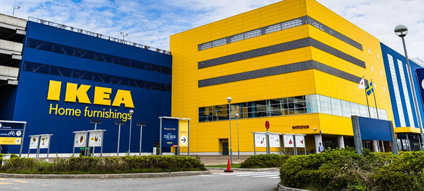
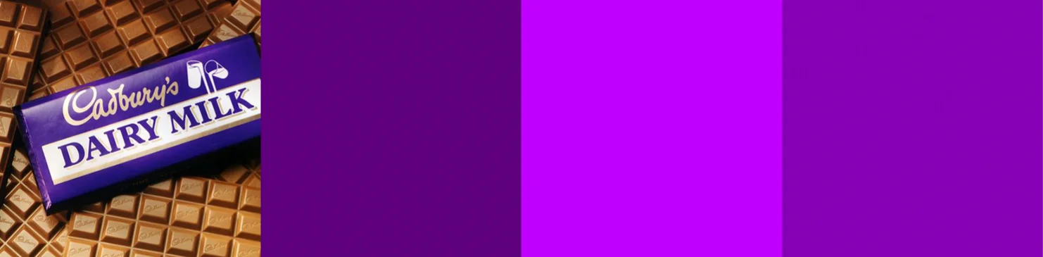
Consistent use of the brand colours is just as important as the correct usage of the logo and fonts. A company can become instinctively known for their constant use of colour… think of John Deere, EasyJet and Ikea to name a few. What brands automatically come to mind when you think of a ‘Purple’ chocolate box? A ‘Red’ can of cola? Or a ‘Black’ & ‘White’ pint of stout?
Consistency in a brands colour palette strengthens its identity in the market and helps it to stand out and become instantly recognisable. Furthermore, it helps the brand to gain the trust, loyalty and familiarity of its customers, communicating certain feelings or moods to its target audience.

What’s your colour?
What’s the message you want to convey about your brand… are you Rebellious & Edgy? Fun & Wacky? Or are you Honest & Friendly? Whichever you may be, think long and hard before matching a colour scheme that reflects your personality.
Below is a quick overview of colour and their perceived meanings!
BLUE
The colour of trust.
Blue is the shade of the sea and sky and is thought to induce calmness and convey tranquillity. The most popular colour worldwide, blue invokes trust, security and responsibility making it a favourite colour of many corporate and financial institutions across the globe.

RED
The colour of passion and love.
Red is a very emotionally intense colour and attracts the most attention. It is strongly associated with energy, danger, strength, power & determination, as well as passion, desire, and love. It’s used to grab attention and is often used in clearance sales.

GREEN
The colour of growth and health.
Green is the colour of nature and symbolises growth, harmony, freshness and fertility. It has a strong association as a refreshing and peaceful colour. Favoured by brands and products that are natural, eco-friendly and have a strong connection to the land.

YELLOW
The colour of optimism and happiness.
Yellow is the colour of sunshine and associated with success and confidence. It can also be motivating, uplifting and stimulates mental activity. A very effective colour for attracting attention, it’s widely used in shop window displays.

PURPLE
The colour of creativity.
Purple is linked with sensitivity and compassion, it inspires reflection and self-awareness. Darker shades of purple are often used to reflect a feeling of sophistication and exclusivity, and often associated with royalty. While lighter shades are viewed as feminine and even nostalgic.
PINK
The colour of sensitivity.
Pink represents caring, compassion and love and is often associated with words such as feminine, romantic, cute, sweet, playful and tenderness. However darker more vibrant shades of pink can instil excitement, energy and passion.

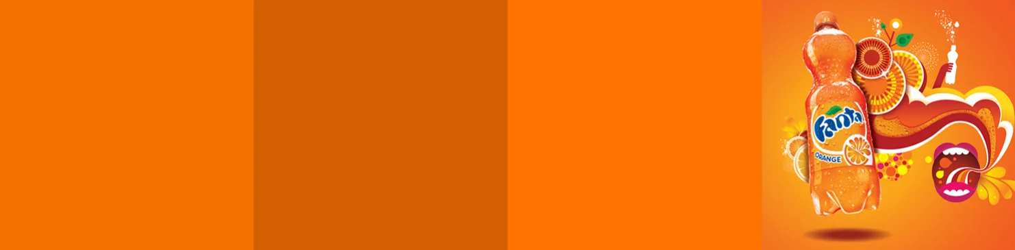
ORANGE
The colour of encouragement.
Orange is a motivating and encouraging colour, it conveys excitement, warmth, enthusiasm, activity and energy. It creates a buzz and attracts attention and is a popular choice when selling children’s toys because of its cheerful, friendly and fun feel.
BROWN
The colour of the earth.
Brown is among the least favourite colours but conveys honesty, sincerity and reliability. It relates to things that are natural, simple, organic and wholesome and can really come into its own when combined with other colours.

BLACK
The colour of mystery.
Black is used by many brands that to maintain simplicity. A powerful colour, black is strong, sophisticated, sexy and secretive. Perceived as luxurious, elegant and refined it works well with exclusive and expensive products.

WHITE
The colour of purity.
White is associated with light, goodness, innocence, purity, and virginity, and is considered to be the colour of perfection. Used to convey a minimalist, clean and modern quality, the colour white is often used to suggest simplicity in high-tech or high-end products.