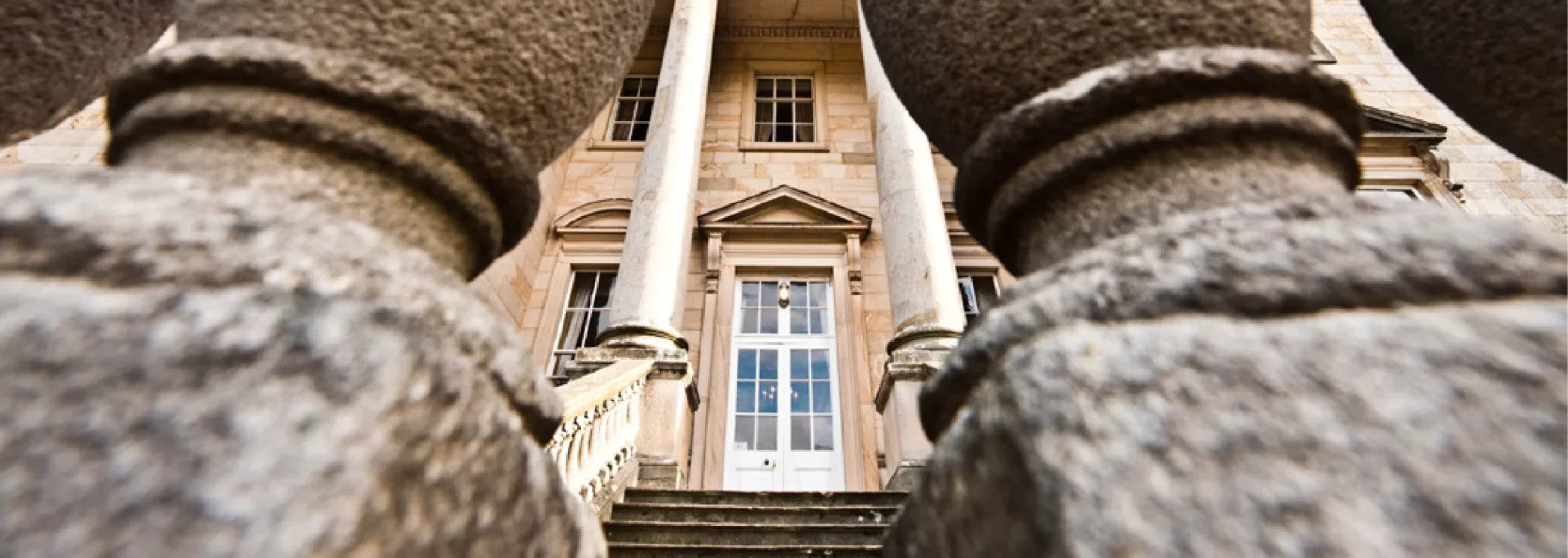
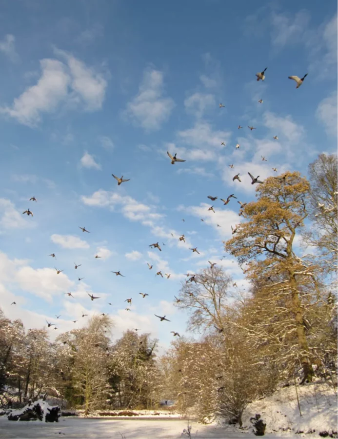
A beautiful Grade I listed Georgian house set amongst extensive formal and woodland gardens in the heart of Wensleydale
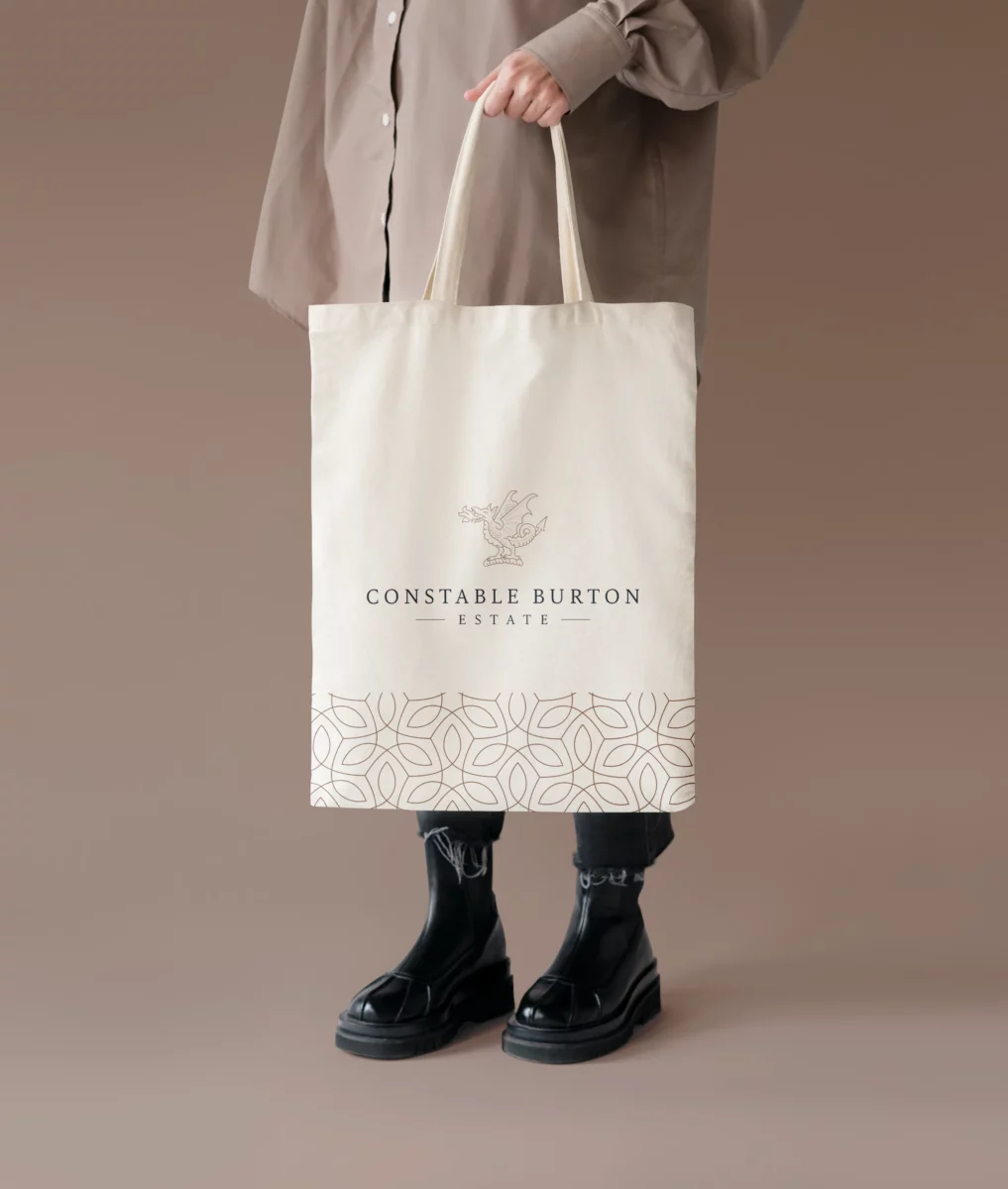
When I initially met with Imogen from Constable Burton Estate, she needed my help finessing and fine-tuning their brand identity. At the time, they were currently using a logo created by another agency of a ‘Wyvern’, a legendary winged dragon that sat at the top of the Wyvill family Coat-of-Arms.
The family felt strongly that they wanted the Wyvern to stay and be the emblem that people come to recognise as Constable Burton Estate. But, they thought it looked messy and didn’t give off a look and feel they wanted. Also, during our initial meeting, I discovered they had many future plans to develop the Estate and their resources to cater for events, a campsite, and the Grouse shooting season. So, as well as developing their overall visual identity, I had to recreate the logo to lend itself to designing future sub-brand for the Estate in the same design style.


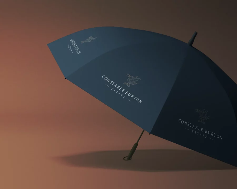

The family felt very strongly that they wanted the Wyvern to be the emblem that people come to recognise as Constable Burton Estate. So I created a simplified and modern version that could be replicated across all future sub-brands.
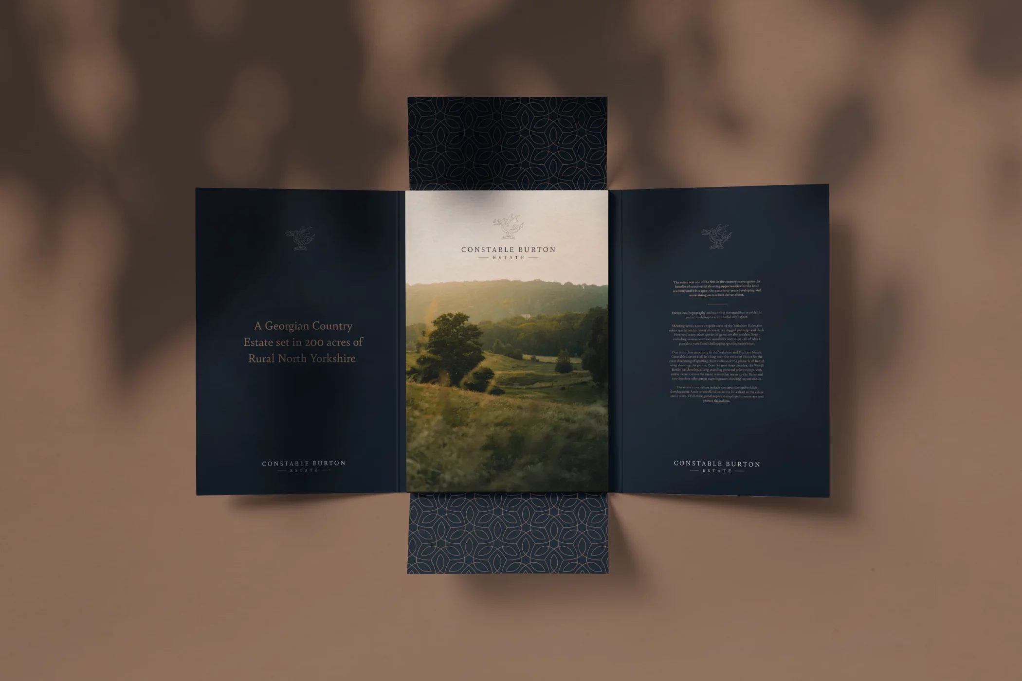
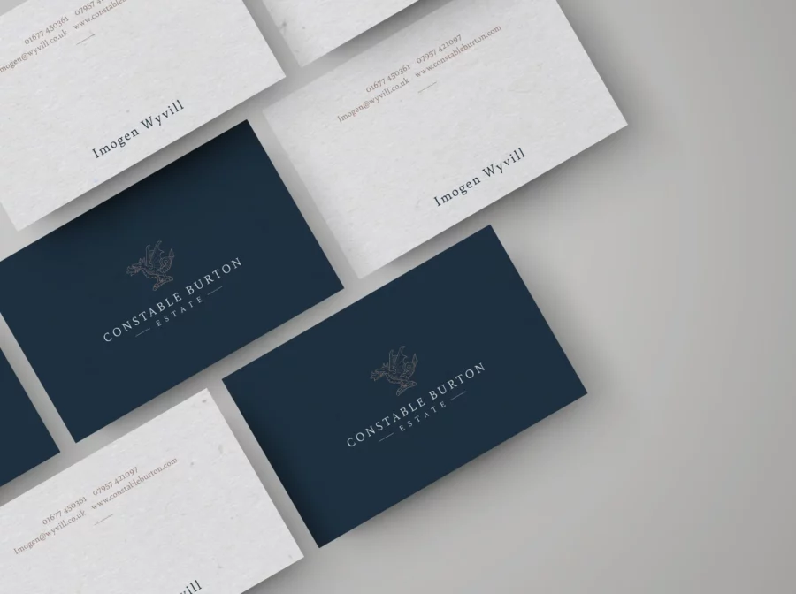
The primary Estate logo was designed in a simple linear style, using only two different line weights so it could be replicated across the creation of additional sub-brands.
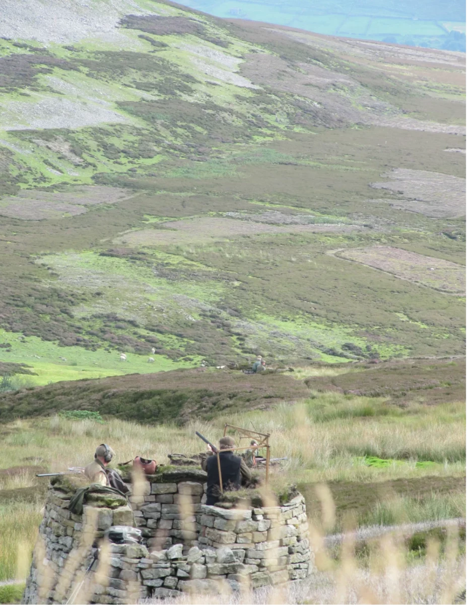
The three initial sub-brands to follow were for the ‘Gun Room’ ‘Events’ and the ‘Campsite’.