Cherry Orchard Counselling is a start-up business where people can be supported to explore their feelings and emotions in a warm, safe environment.
Lucy approached me to create an identity for her new business Cherry Orchard Counselling. A lifetime ambition to work for herself and genuinely help people.
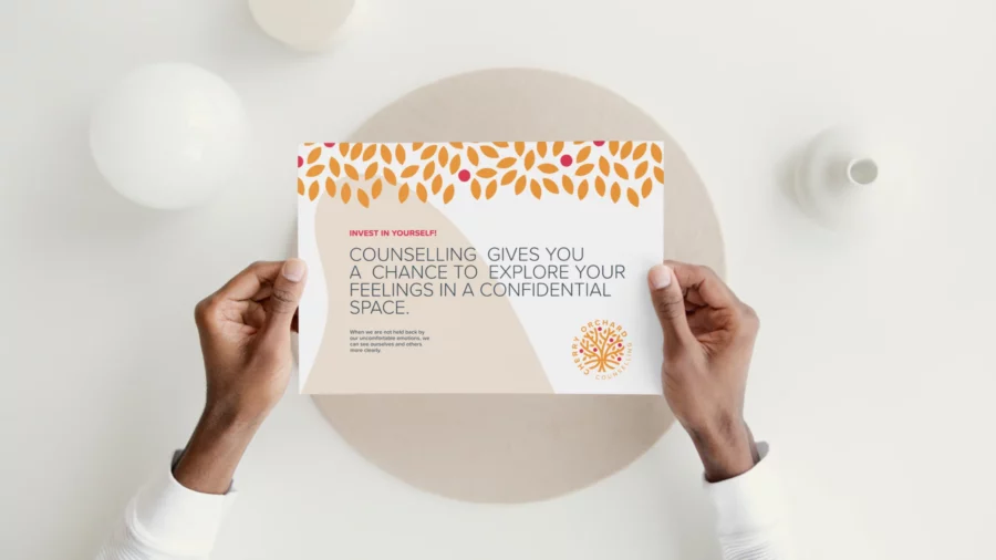
My goal was to develop a fresh, instantly recognisable, modern identity and separate herself from all other counsellors in the local area. With a strong emotional meaning behind choosing the name Cherry Orchard, I wanted this to be reflected in my design decisions when creating the logo and developing the visual identity.
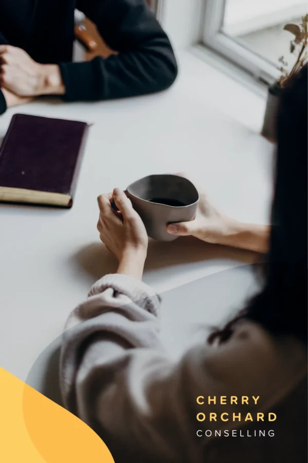

I wanted to evoke a warm, positive feeling with the colour palette for Cherry Orchard’s new visual identity, so I took my inspiration from the sunset to represent calmness and a new beginning.

I had the pleasure of working with Richard from Rebus Design as he created a logo and brand design for my private counselling practice. Richard has an excellent eye for design and conception, but he also really took the time and effort to work with me to understand the essence of my business and the messages I wanted to express. He has managed to encompass my values in an aesthetic form, which is impressive considering I couldn’t articulate precisely what I wanted!
He has a knack for just getting it.
Lucy Edwards, Owner Cherry Orchard
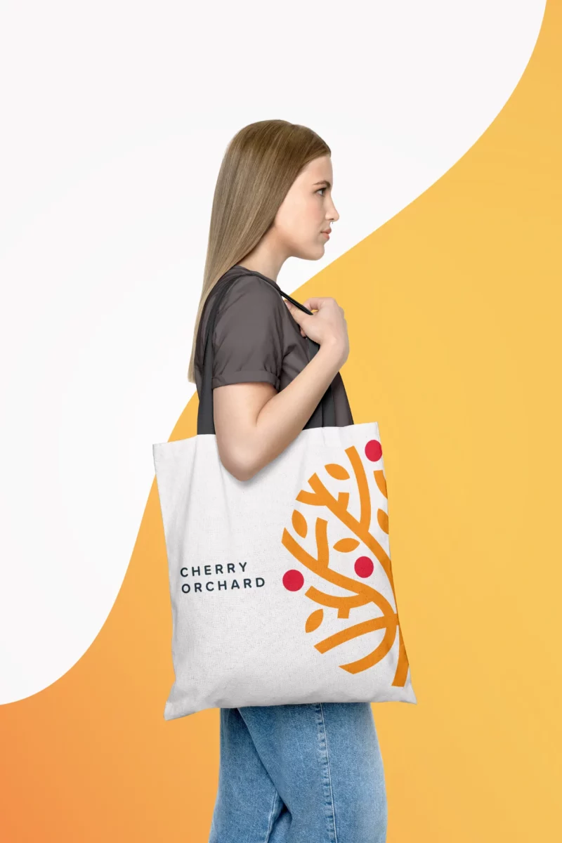
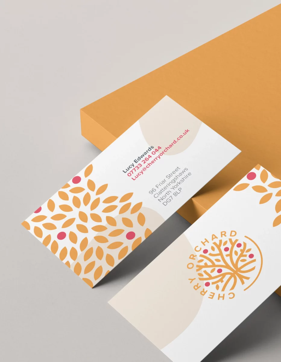
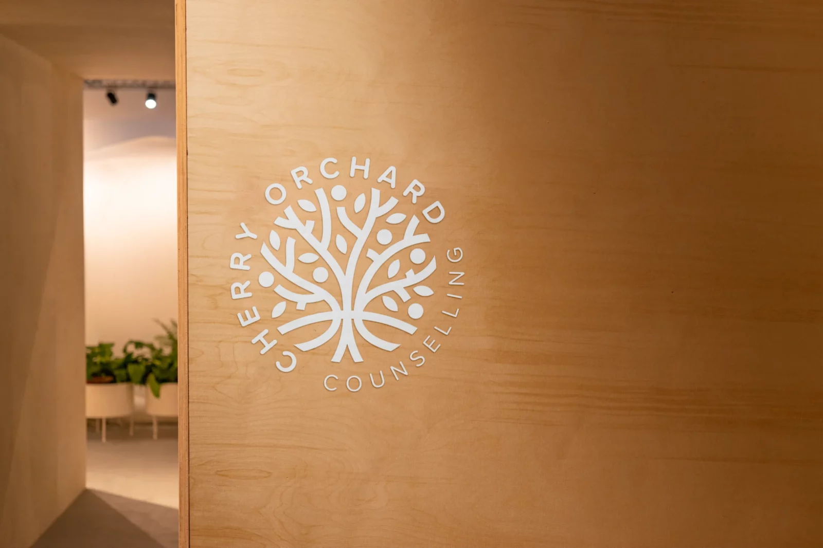
I was very keen to design the new logo around a stylised Cherry Tree as this has a strong personal and emotional meaning to the client… her grandparents Cherry Orchard, somewhere she always felt safe during her childhood.
The tree for me symbolises growth and nurturing, and with incorporating the roots of the tree, this represent strength and stability.