Diligend is an enterprise-grade digital platform that has been designed to transform investment management due diligence. They work with asset managers, investment managers, sovereign wealth funds, pension funds, foundations, endowments, family offices, banks, insurance companies, fund of funds, wealth managers and investment consultants.
When approached by US-based company Diligend, they had a very obvious problem they were struggling with. They had no consistency across any of their visual branding. They’d had a logo designed when the company was formed, but since then, all the work had been created on an ad-hoc basis and lacked any continuity; different fonts, imagery, and even colours were being used. My task was to streamline their identity and develop a flexible system to allow it to be used seamlessly across multiple applications. But, also, retaining a very similar look to what they currently had as a complete rebrand was out of the question due to the substantial cost implications of changing everything.
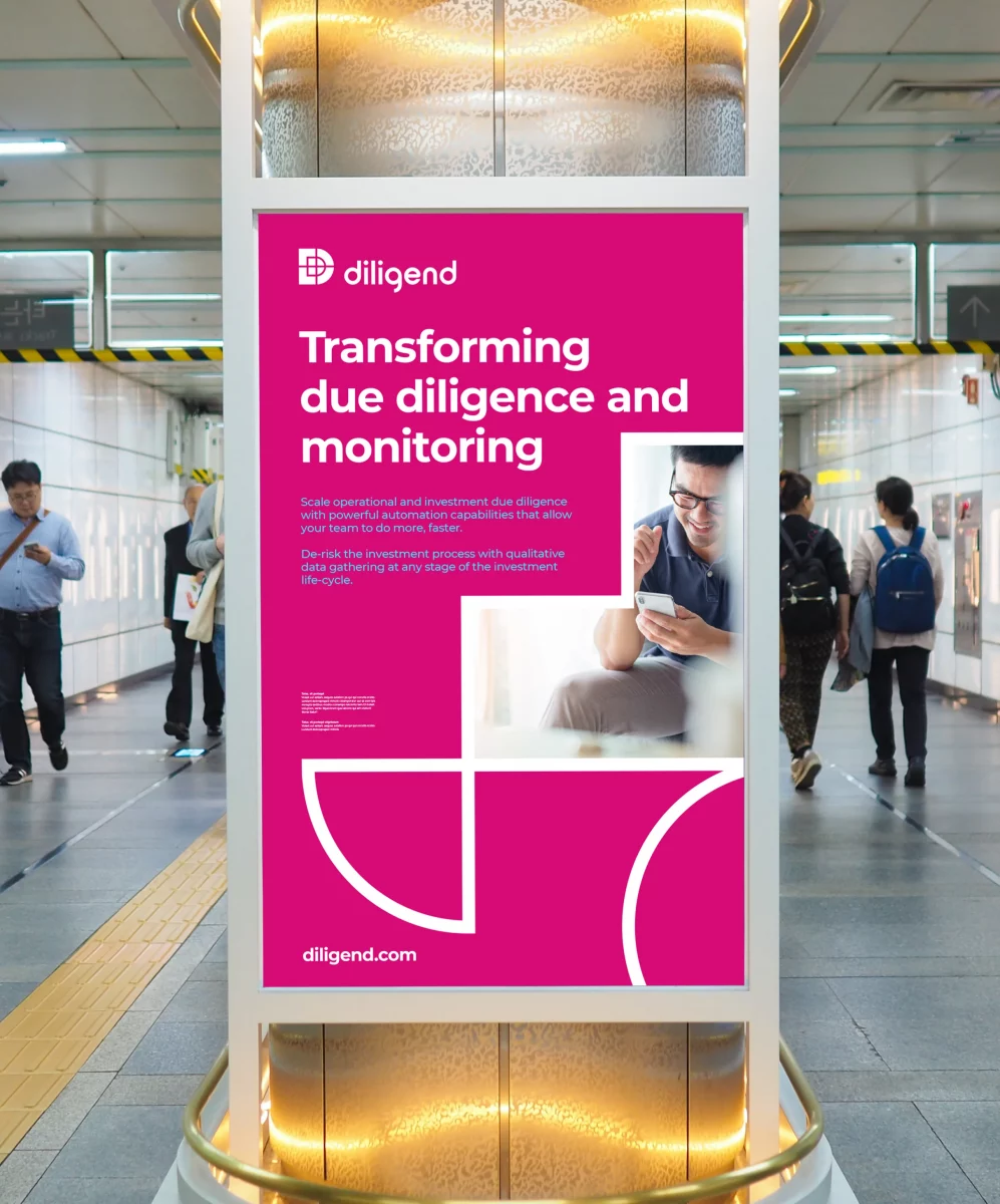
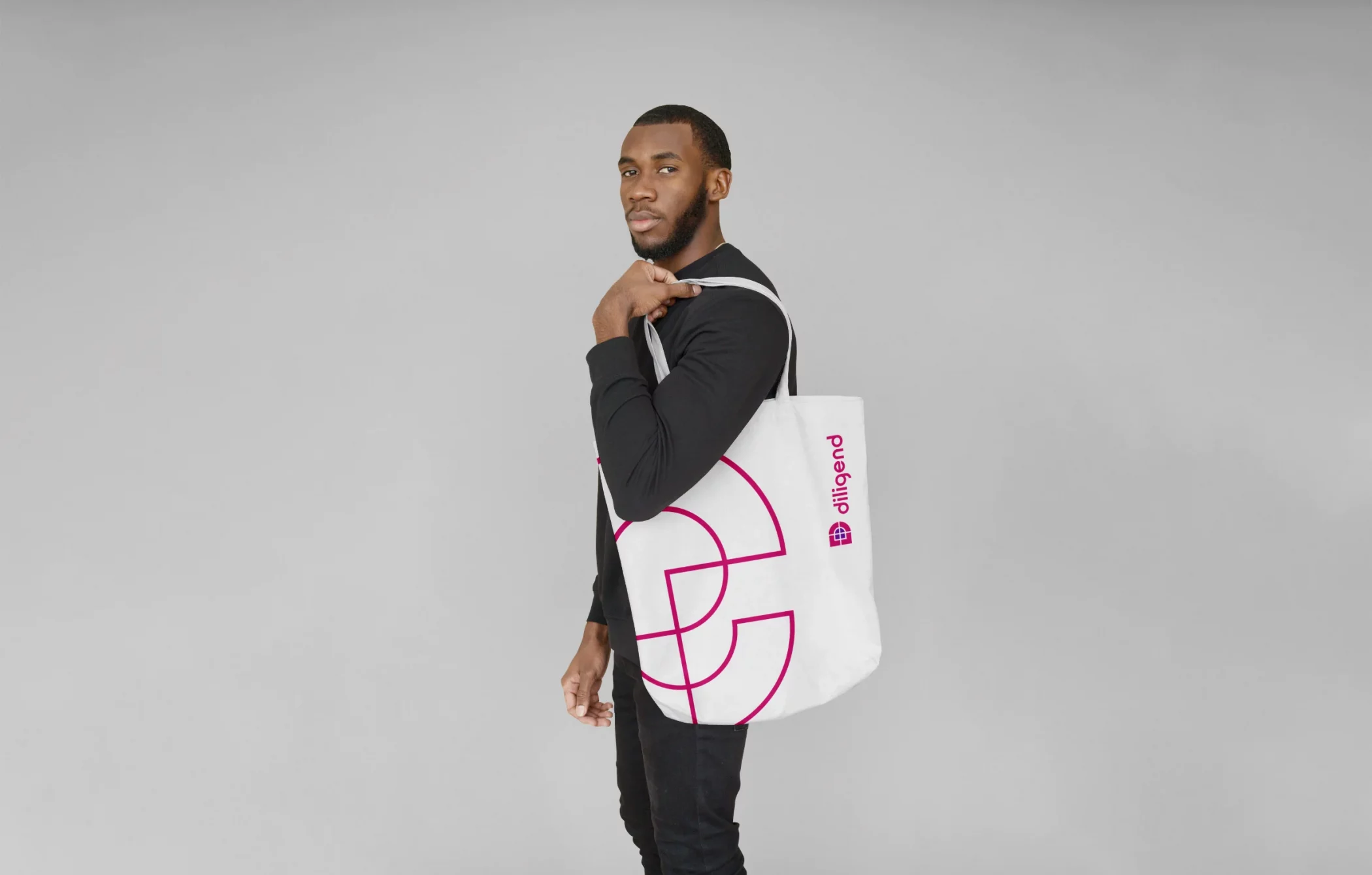
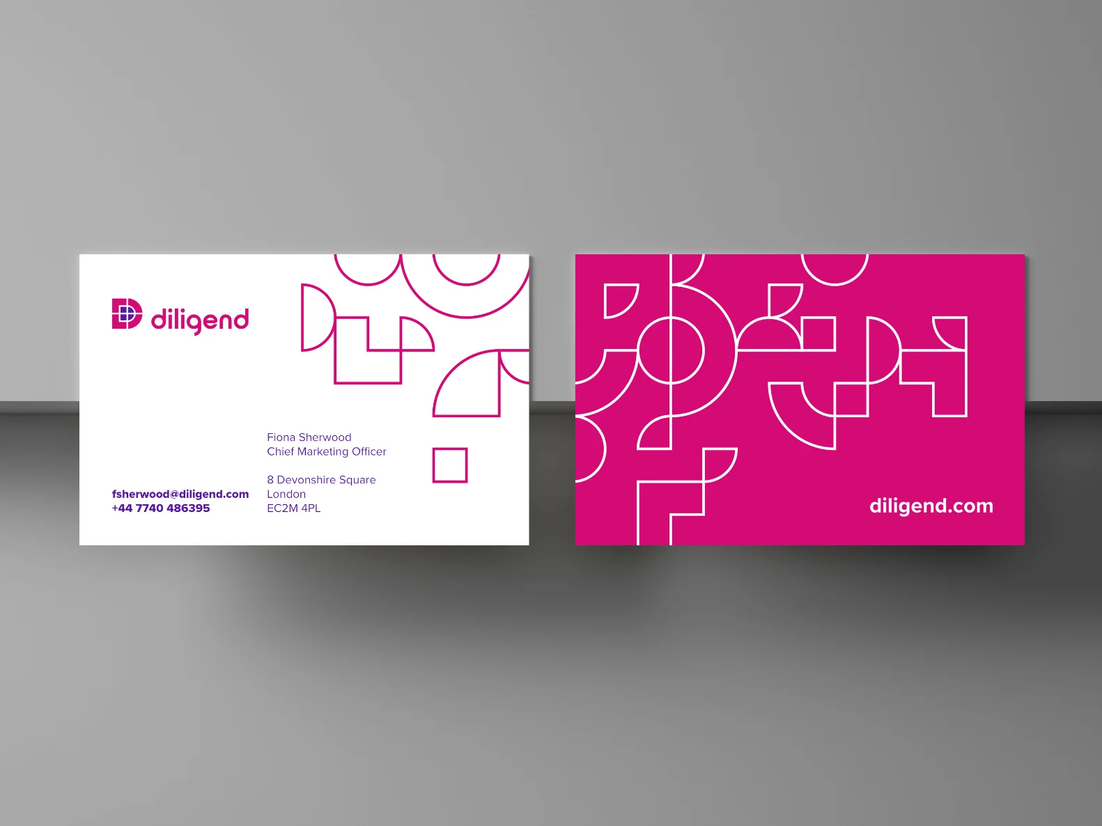
My first port of call was to address their existing logo, which looked fine, but after receiving the files, I noticed the alignment, spacing, and somewhat bizarre use of gradients were all in need of attention. After reshaping some of the letters, adding a secondary colour and generally simplifying everything, I created a new logo with a very similar essence to the original. An identity system was developed using seven shapes taken from their brand mark that could be used together within a grid to give infinite possibilities and flexibility when designing branding material. When all the design elements were finalised, I put together brand guidelines to maintain consistency with all future work.


The Diligend brand patterns are made up from a mixture of seven shapes created from their brand mark. For consistency these shapes should always be displayed using an outline and no fill, and never be altered in proportion to each other.

Richard took our tired brand and gave it a completely new lease of life whilst retaining some familiar features. No mean feat. The new brand is so fresh and easy to work with. It looks excellent on print and digital mediums, small or large scale. We also have some really flexible graphic elements that add a level of class to every piece of branded material.
The new brand has elevated the status of the business immeasurably, thanks to Rich.
Fiona Sherwood, Chief Marketing Officer Diligend
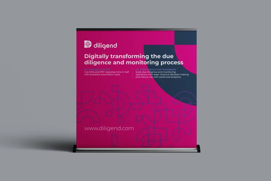
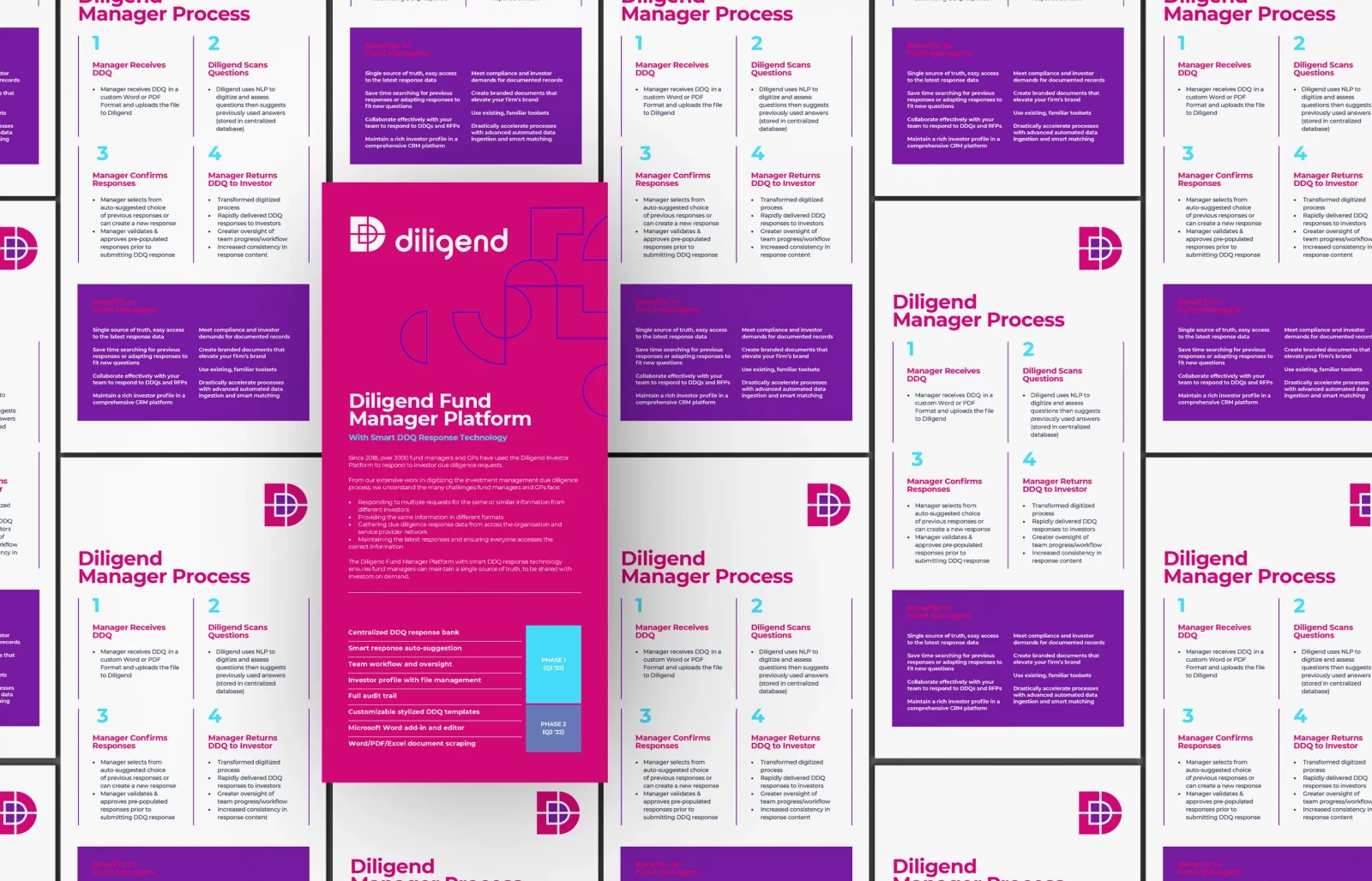
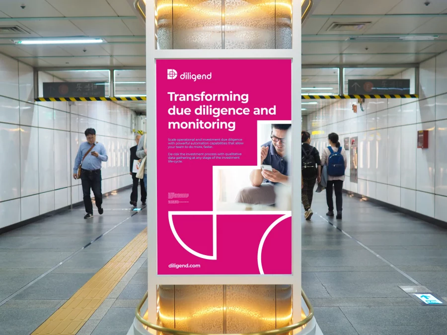
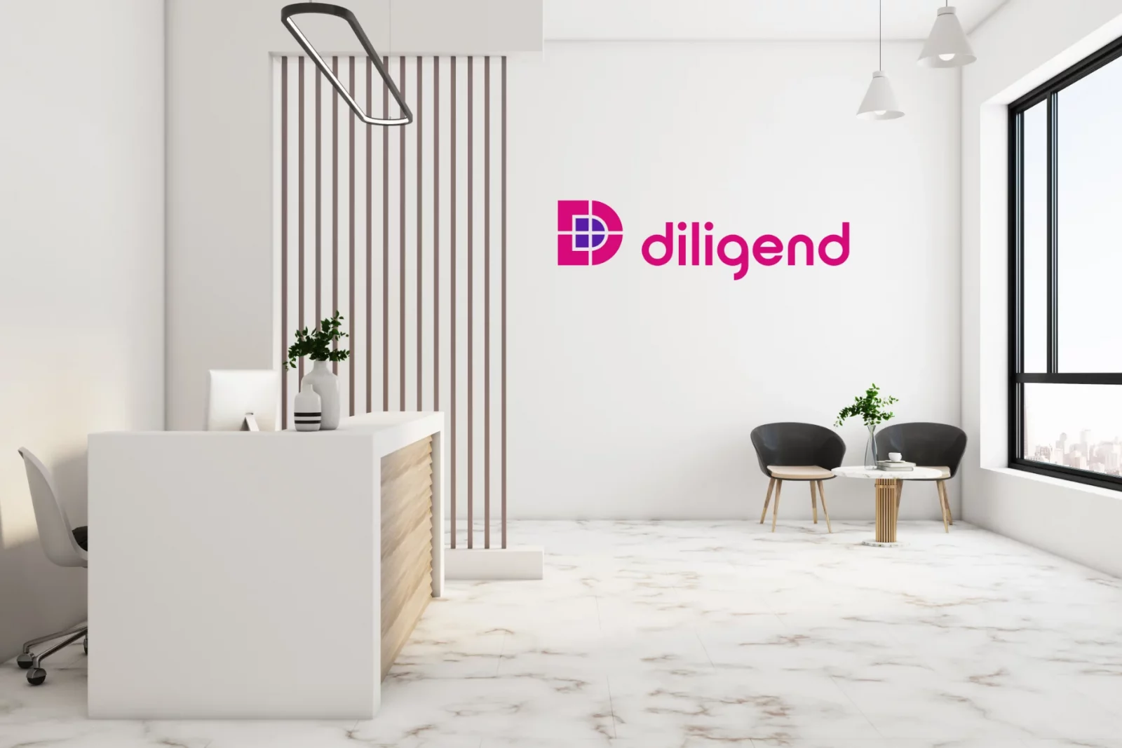
The result was a much more contemporary look and feel with infinite possibilities that could be applied consistently to any application. Since finalising the new identity, I have developed it across stationery, printed literature, digital presentations and exhibition stands.