Embracing Future Potential’s aim is to provide access to employment, work-based learning, and career support for all. Through their specialist jobs boards and wealth of resources, they focus on supporting those early in their career and those who face barriers to employment opportunities, such as disabled people, those returning to work, women, refugees and many others.
With the devastating impact of the COVID-19 pandemic being felt across the UK, the team at Embracing Future Potential wanted to ensure the range of skills in our workforce is not wasted. My challenge was to create a new identity that was clean, professional and appealed to a vast target audience.
Embracing Future Potential was to be the umbrella brand still; I also needed to create a brand family for the four divisions tailored to a specific section of the workforce, Employing an Apprentice, Developing a Student, Refreshing a Career and Careers with Disabilities. The four divisions were to be created as part of the initial project, but it was almost certain new divisions were to be added as the business grew, so this needed to be part of my thinking.
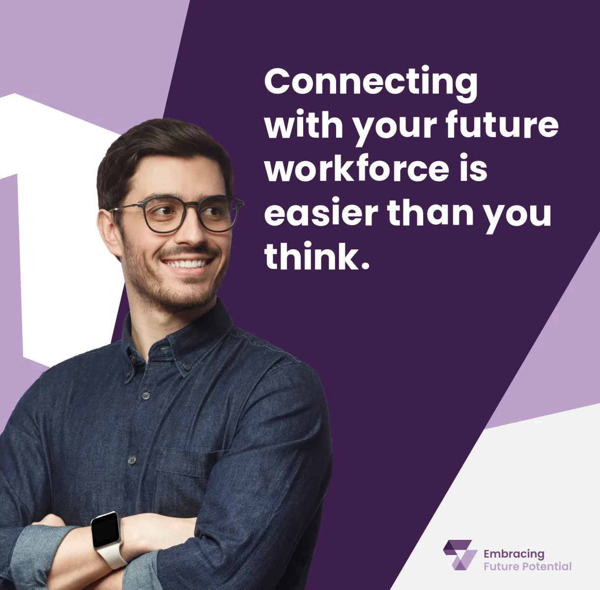
As the brand family was almost certainly going to grow over time, and the names would all be different, I decided to focus on developing an emblem or icon to tie all the brands together. After many iterations, everyone involved in the process was happy with the final design. A simple yet unique mark easily transferable across all applications, from badges and banners to merchandise and social media.
The thinking behind the logo is using two ticks to represent the company… 1. Enabling job seekers to find meaningful careers and connect with the right employers, and 2. They are enabling employers to find candidates that may have otherwise been forgotten. The arrows created within the negative space also represent the employer and employees coming together.
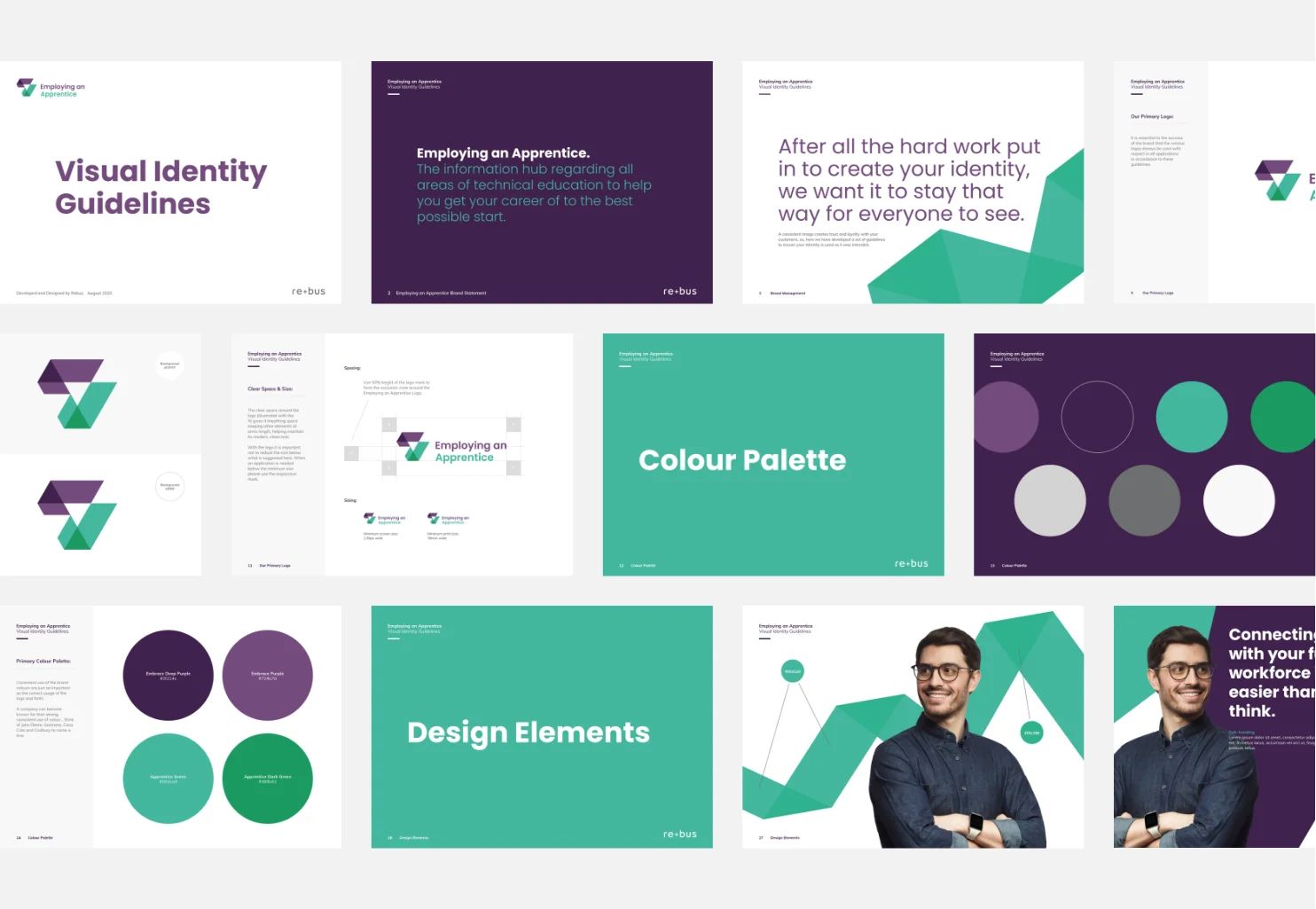
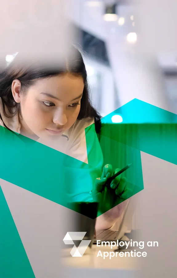
The arrows created within the negative space represent the employer and employees coming together.

“Richard was great to work with and was extremely patient! We couldn’t be happier with the end result”.
Luke Kitchen, Managing Director Embracing Future Potential
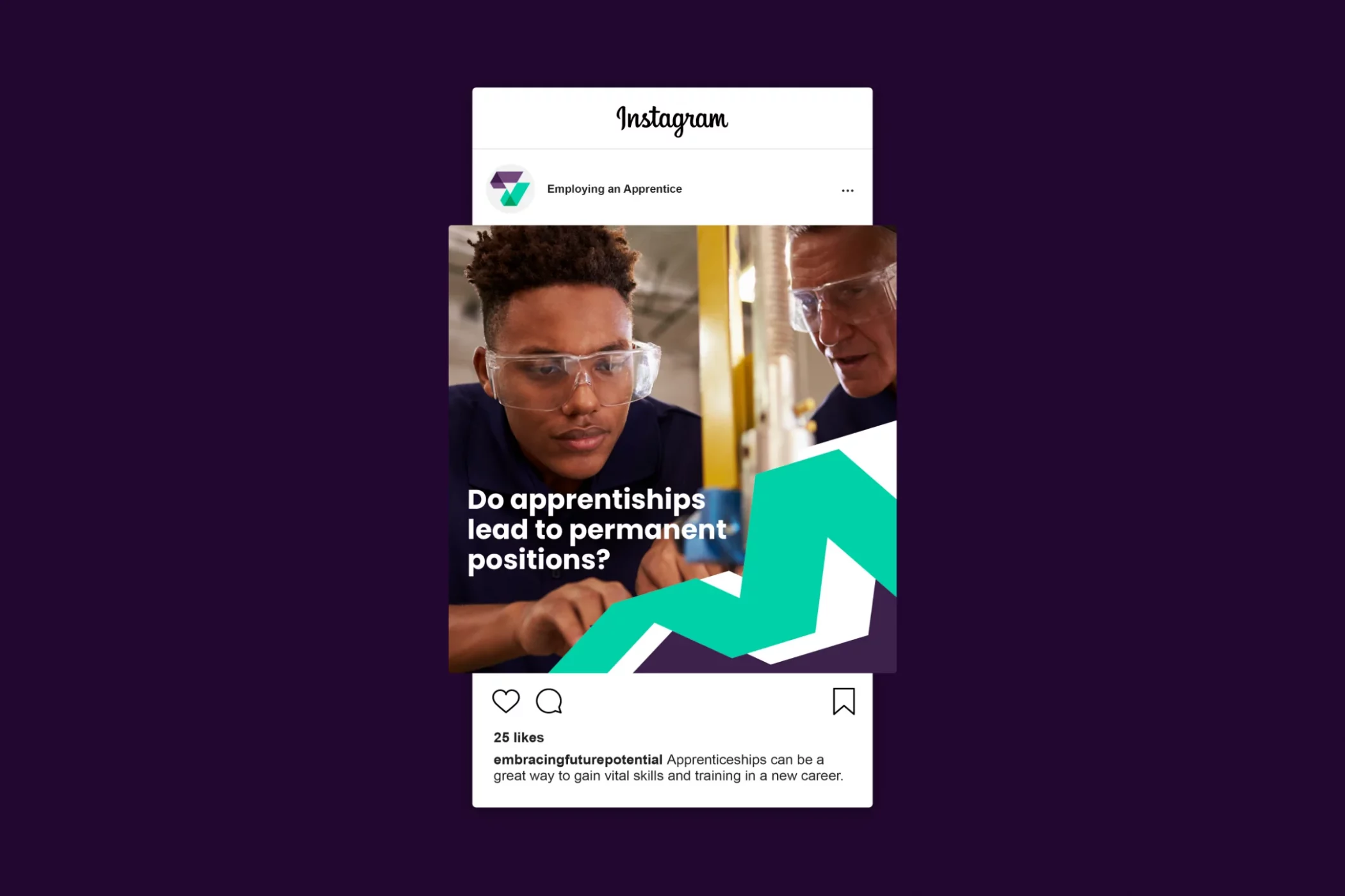
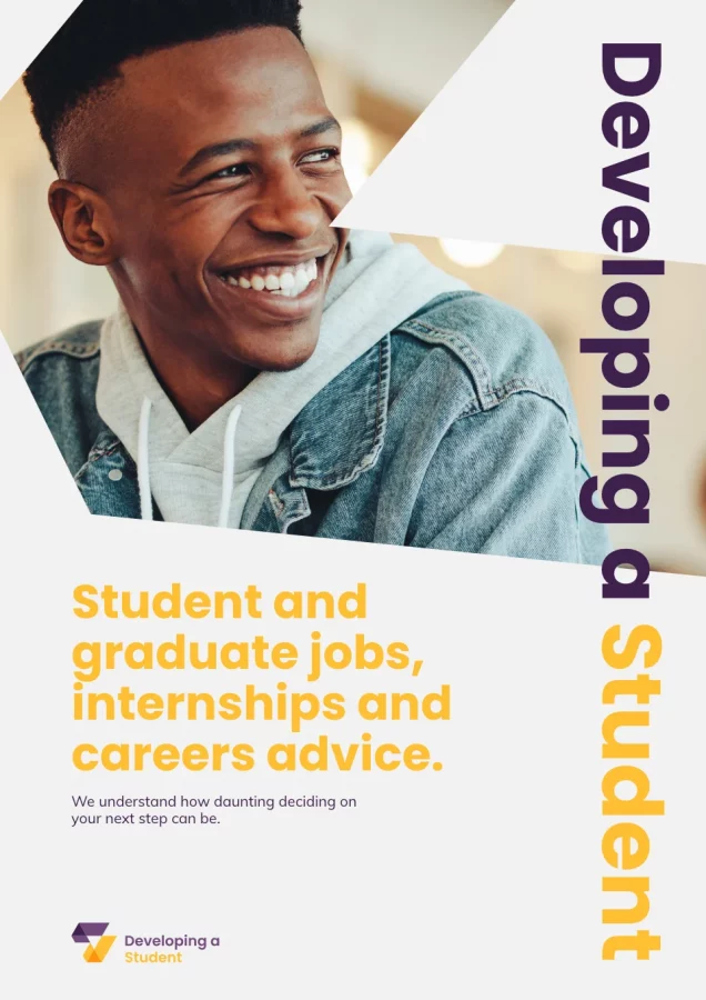
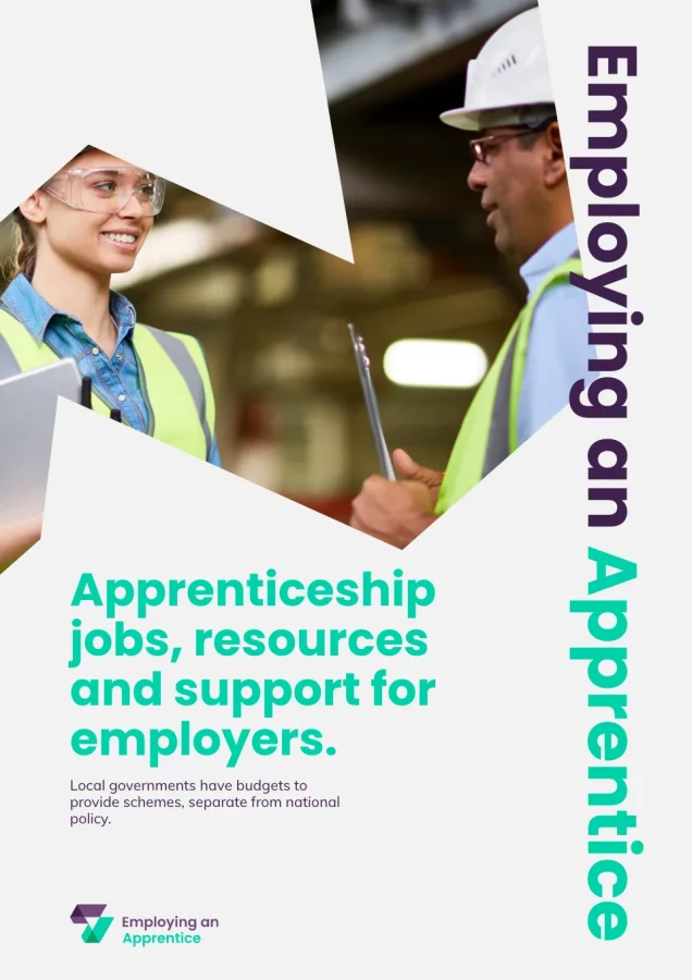
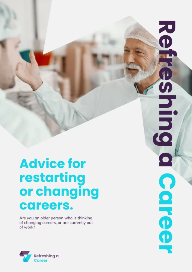
Through the simple use of colour, type and consistent brand identity, I could differentiate between the various networks within the business whilst giving them a distinctive look that made them all instantly recognisable as part of the family.
The family has since grown since the development of the initial network. The latest is ‘Aspiring to Include’ with hopefully more on the way. Check out the whole family of brands at https://www.embracingfuturepotential.com/