With a wealth of knowledge, JP helps companies as a Non-exce Director and experience as a property director.
Initially, I was approached by the client to design a simple logo for a new venture, JP Professional Projects (JPPP). It was a bit of a mouthful, but after some conversations, we decided to focus on just the JP, my client’s initials, as it was his expertise and knowledge used as his role as in Non-exec Director assignments and property developments. After further conversations, the logo was to be used across various applications, so I needed to think of this project as an identity rather than just a logo.
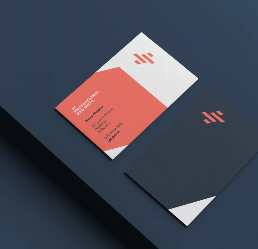
The shapes created within the new logo also gave me some great angles and elements to work with when developing the corporate literature.

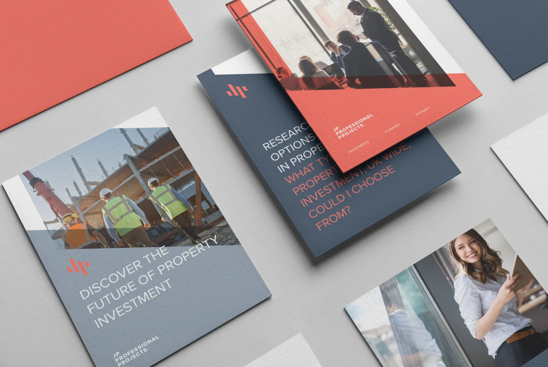
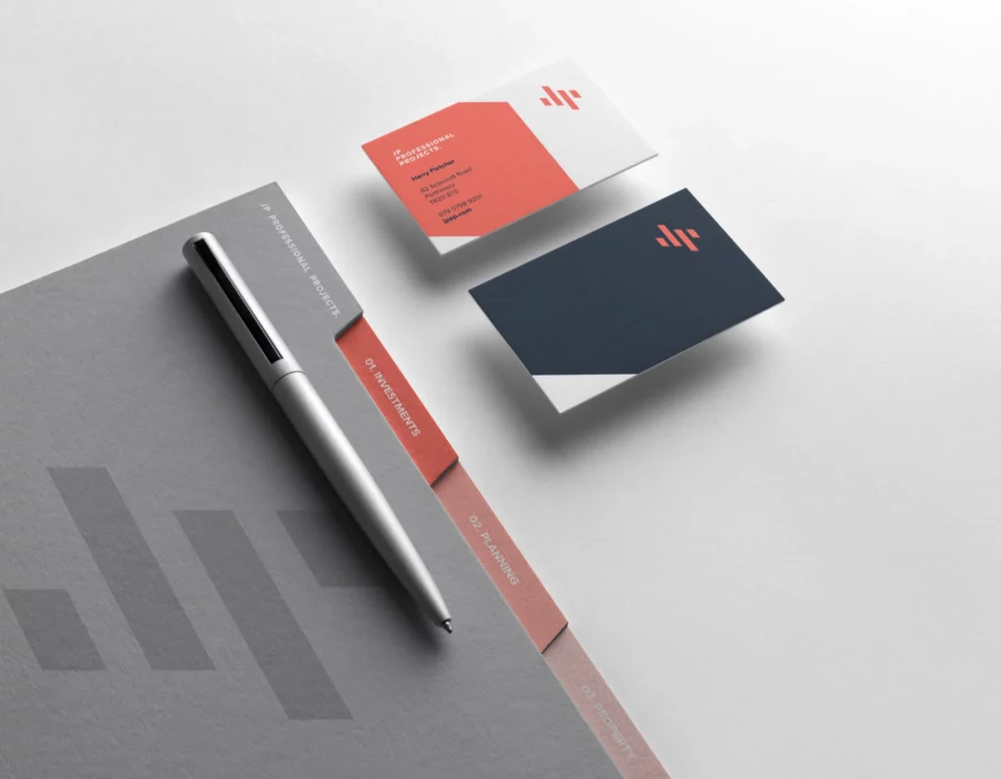
After a few concepts failed to capture what my client was looking for, we kept the logo and identity straightforward and bold, creating an abstract mark to form the JP, which was modern and dynamic in its appearance. Perfect for this new business, the shapes created within the new logo also gave me some great angles and elements to work with when developing the corporate literature.