As one of the UK’s leading social media agencies, Bee Social is a straight-talking team that understands their clients’ business to ensure they are engaging with the right people, on the right networks, at the right time.
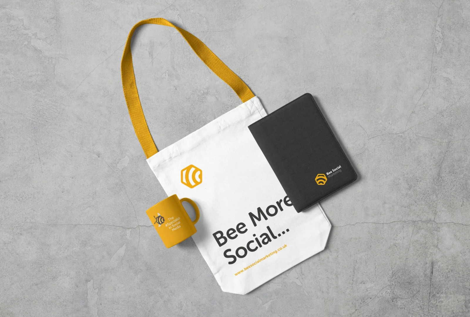
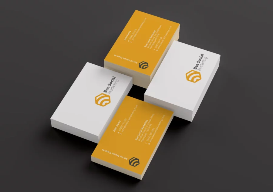
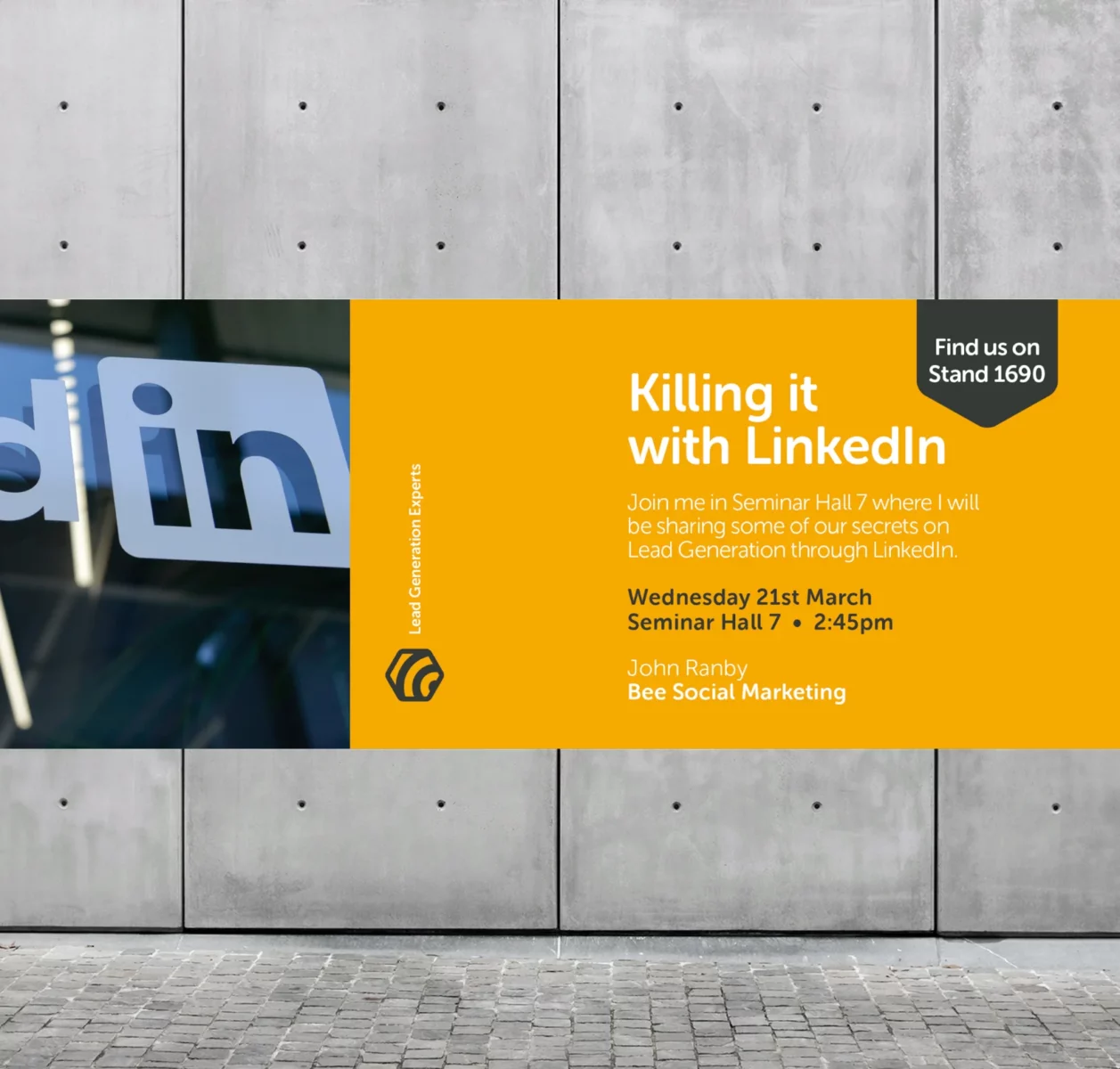
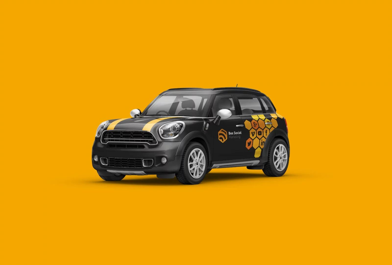
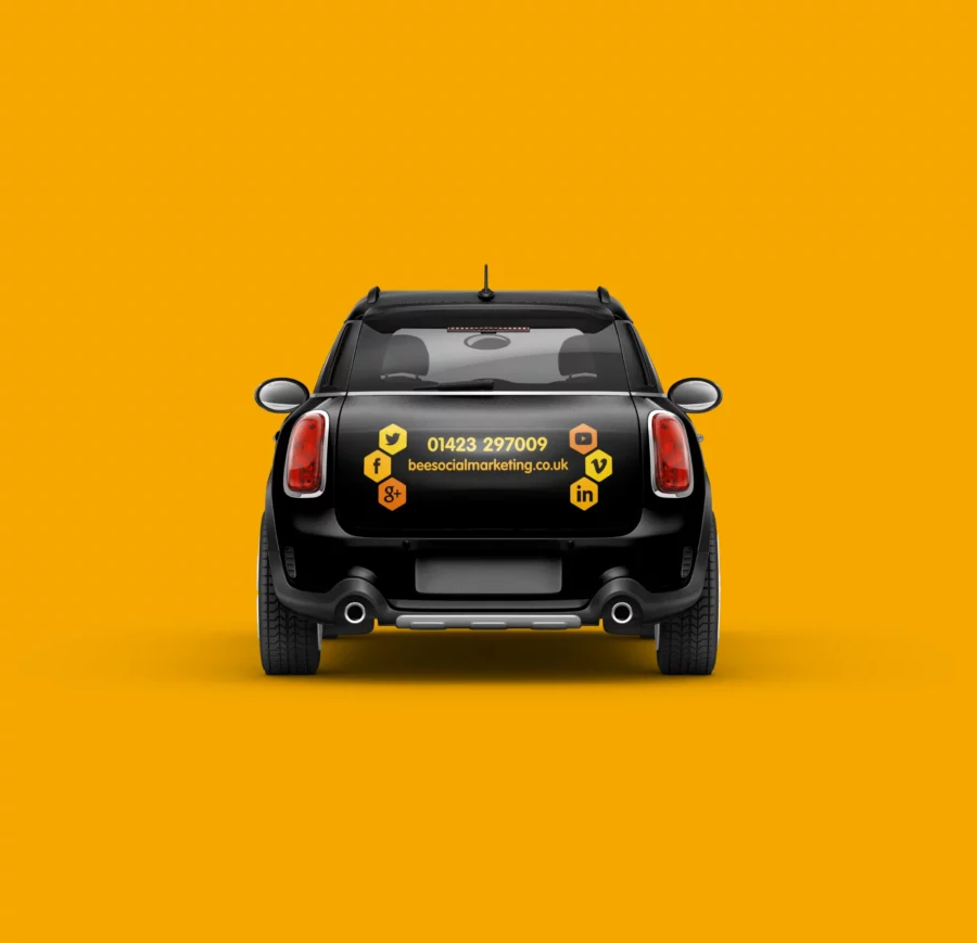
Having used a clipart ‘cartoon’ logo of a Bee for many years, it was definitely time for a change. Bee Social Marketing approached me wanting an entirely new look. My challenge was to create a new visual identity and graphic elements that would carry through all communications; print collateral, promotional materials, web, vehicle livery and more.

“I didn’t appreciate what great graphic design could do until I worked with Richard; he immediately highlighted the problems with my old logo and helped me to find an identity that worked for me and my business. I have no hesitation in recommending them to any of our clients”.
John Ranby, Managing Director Bee Social Marketing
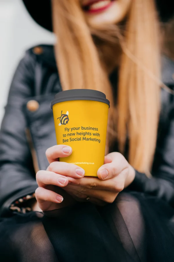
When I initially started working with Bee Social Marketing on their new identity, they wanted something more professional, modern and credible. My goal for this project was to create a new identity that was bold and simple and would work seamlessly across the many applications. I was also keen to keep a bee’s instantly recognisable colours, black and yellow, as the primary colour palette.

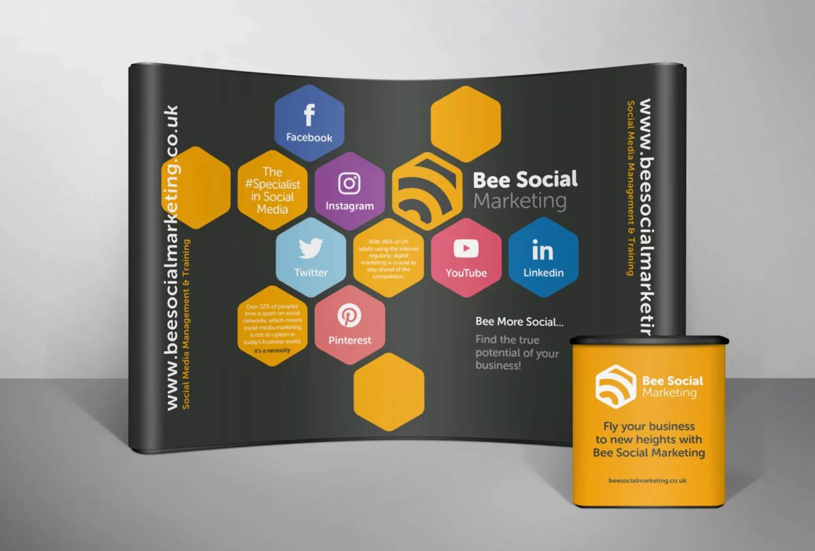
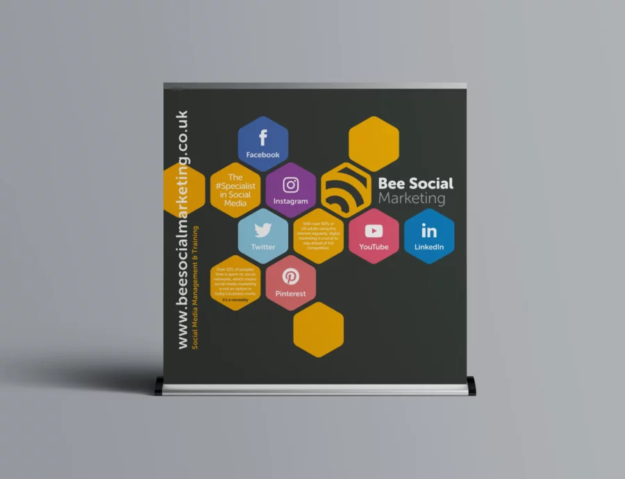
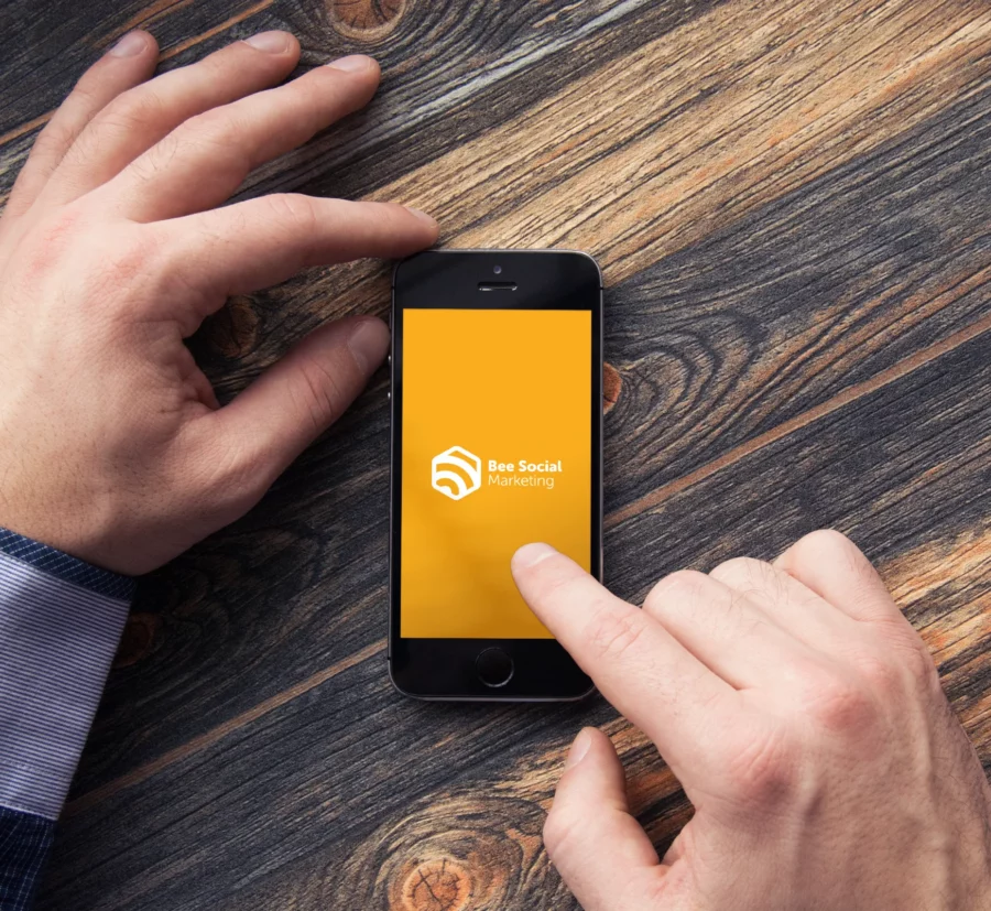
The logo created brings together the honeycomb shape to represent structure, strength and support, the wireless icon to express connection and the bee, which symbolises community. These three elements all come together to make a straightforward, robust and distinctive logo that translates well across all digital and traditional media. The new identity has since given the client a much more professional but approachable feel, which has given them much more confidence in the service they offer.
