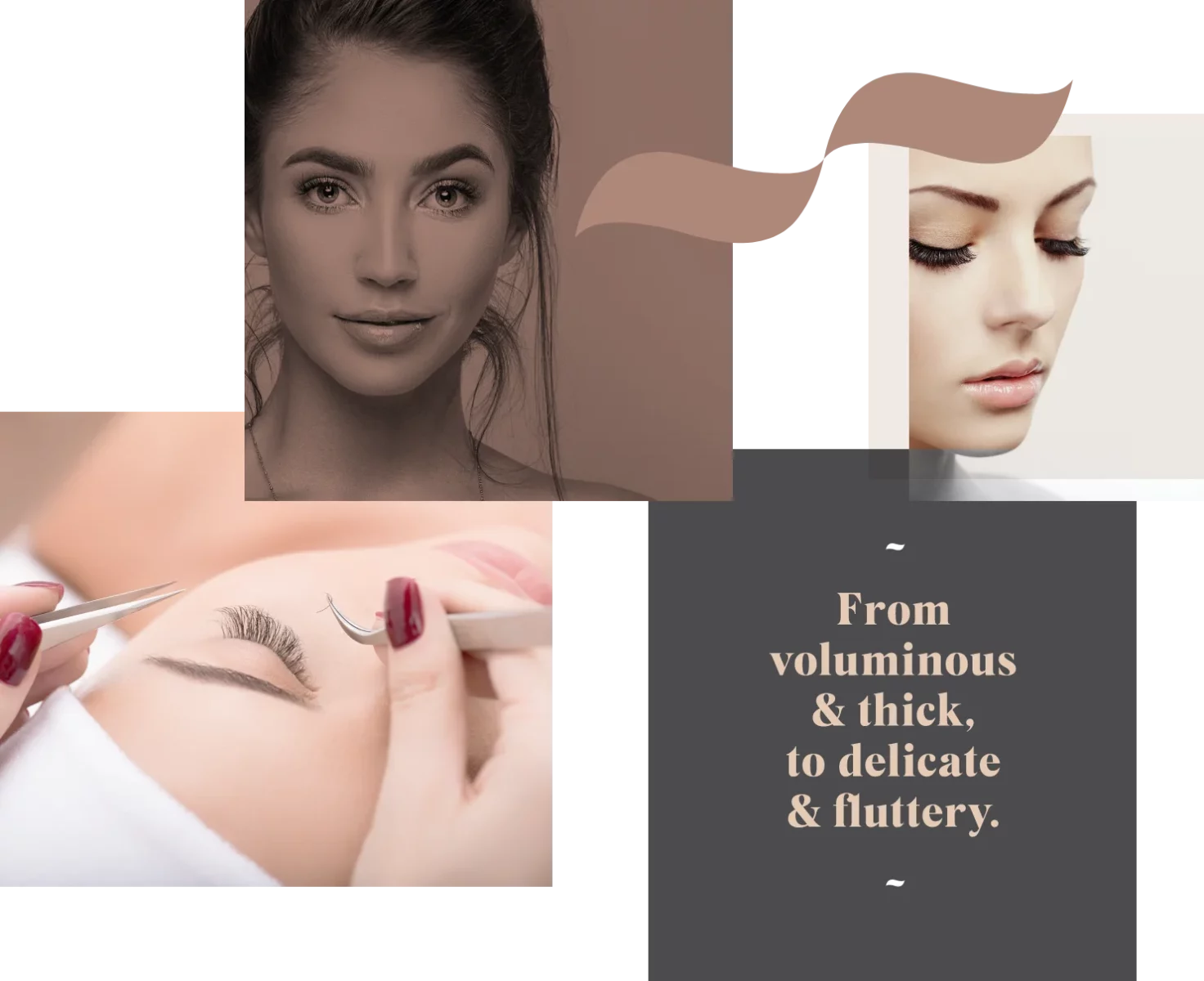
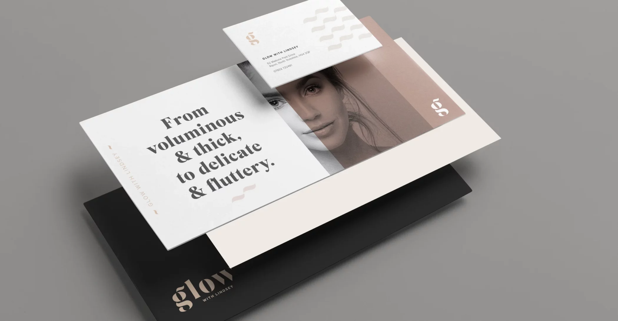
Based in Ripon, North Yorkshire, Lindsey offers fabulous lash extensions to enhance your natural lashes, from voluminous and thick, to delicate and fluttery.
For Lindsey’s new business, she wanted to start as she meant to go on. So, rather than cobble something together herself, she wanted a stand-out identity to reflect the services she was offering from day one. Initially, Lindsey was just going to focus on lashes only but had plans to develop her training and services to cover nails, brows and waxing.


“This is the second time I have worked with Richard to create an identity for a business, and yet again, he hasn’t disappointed. Richard has perfectly captured the look and feel I wanted for Glow, I can’t recommend him enough”.
Lindsey Stockdale, Owner Glow with Lindsey
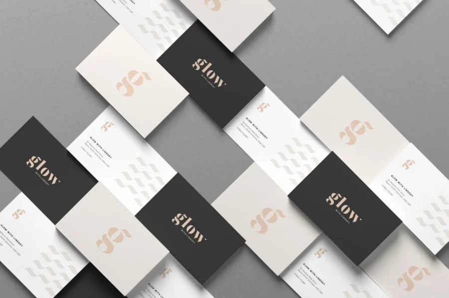
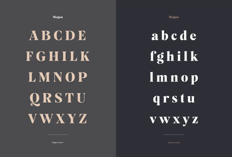
I chose to develop the logo based on the font Mogan and use it for all headings and statements due to its elegance and beautiful curves to symbolise lashes
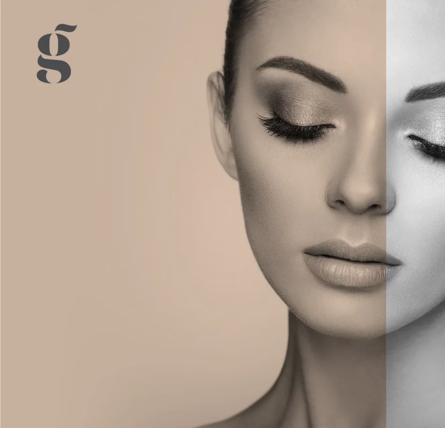
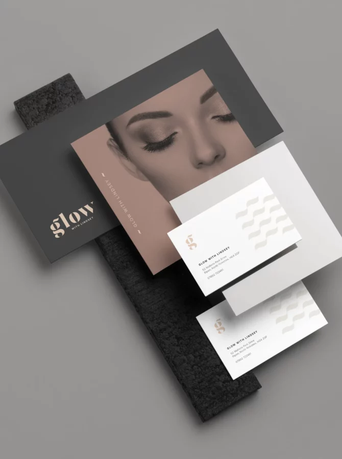

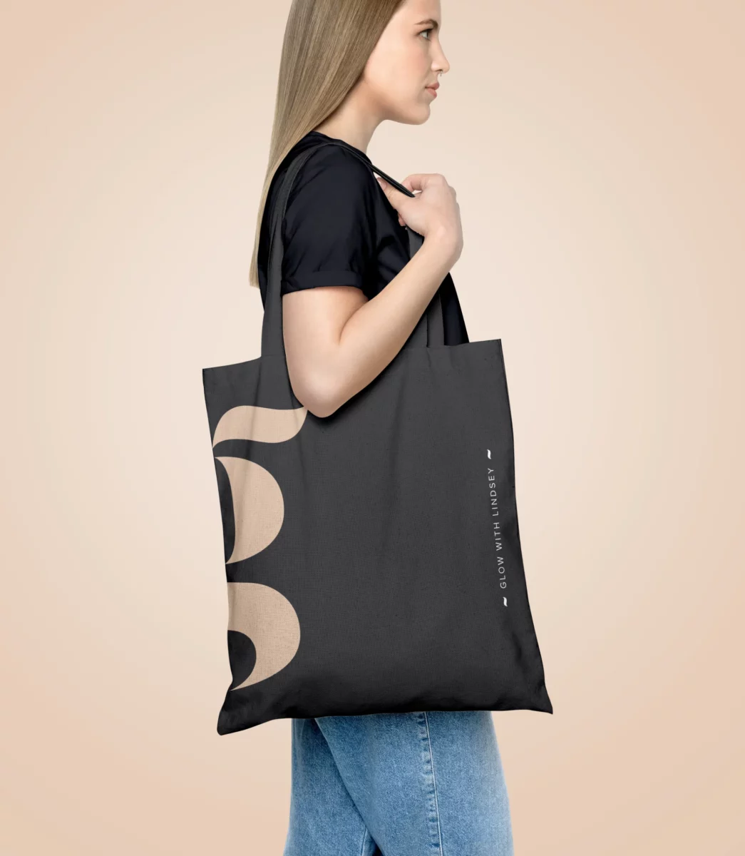
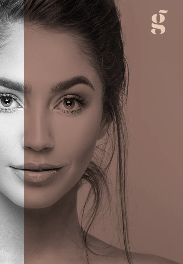
I created a simple but unique wordmark for Lindsey’s logo based on the font Mogan. The ‘g’ also acted as a responsive mark for multiple social media and merchandise applications.
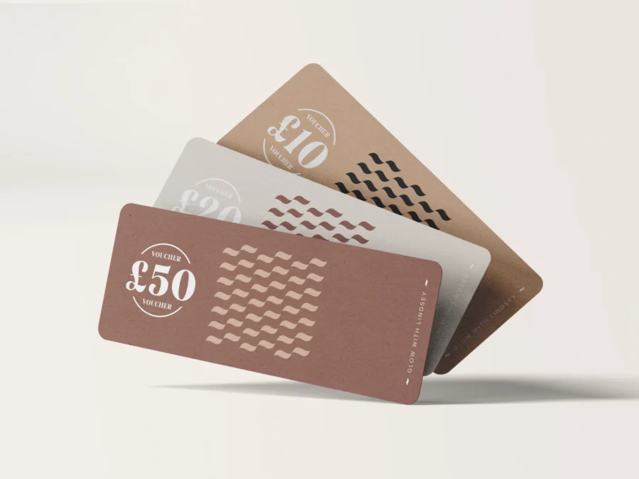
I wanted to subtly reflect the lashes within the wordmark; even though Lindsey may be adding to her list of services one day, I thought this would be a nice nod to where it all started. So, I adapted the flick above the letter ‘g’ to resemble the abstract shape of an eyelash; this also gave me a great elements to work with. A repeatable pattern was made and used in many different ways to create an adaptable and identifiable brand identity.