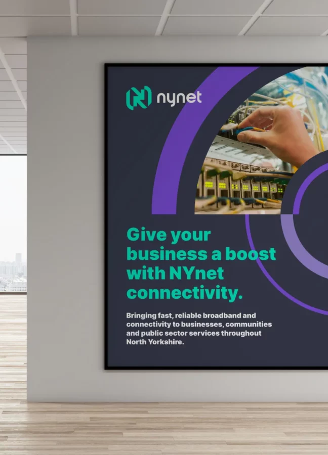
NYnet brings fast, reliable broadband and connectivity to businesses, communities and public sector services throughout North Yorkshire. They manage a high quality, well-serviced network to improve opportunities for education, healthcare and economic growth. Since 2007 NYnet has been dedicated to delivering robust technology, premium service levels and strong strategic partnerships.

My challenge with Nynet was to drag their dated and very uninspiring identity into the modern day. With a generic logo and lack of consistency across all of their visual branding, I wanted to create a unique and modern logo and identity system that could be easily applied with consistency to all areas of the organisation.

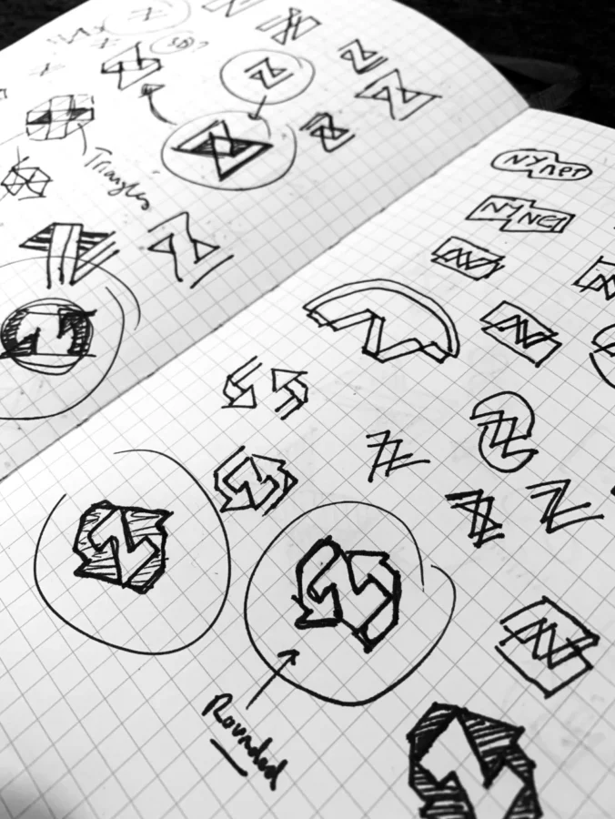

After our initial meetings and being given complete freedom to reinvent their visual branding, I was set on creating something that represented their mission and values. They are a forward-thinking organisation with a modern outlook and pride themselves immensely in their services. As they own their own network, they are proud of their response rates and ensure their customers have a robust and reliable connection. This started me down the path of incorporating a feeling of connection within the new logo and identity, with evolved into an infinity symbol (to symbolise a continuous connection), which then evolved into the letter N (for the company name), which in turn became into the two arrows (to represent upload & download).
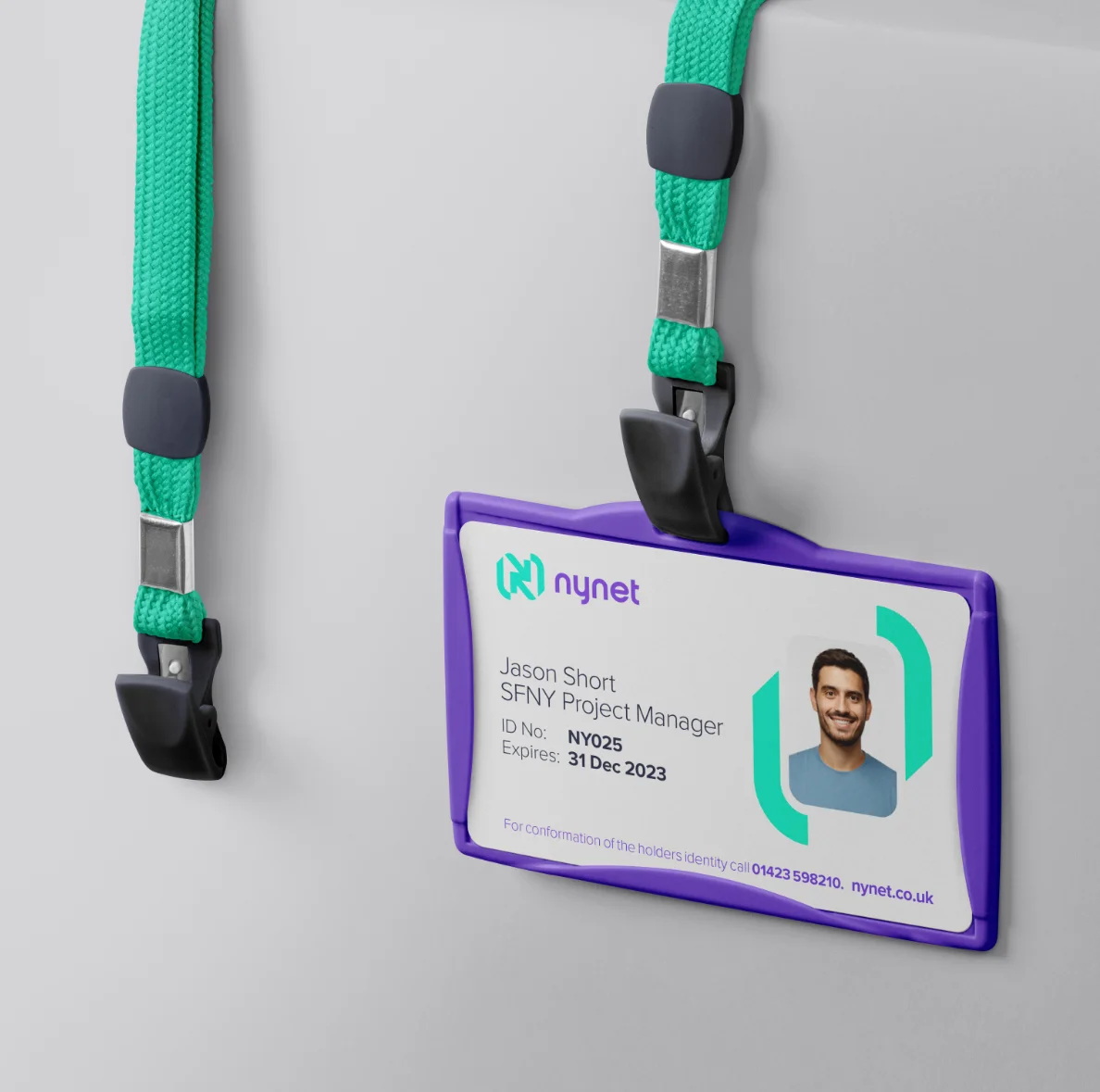
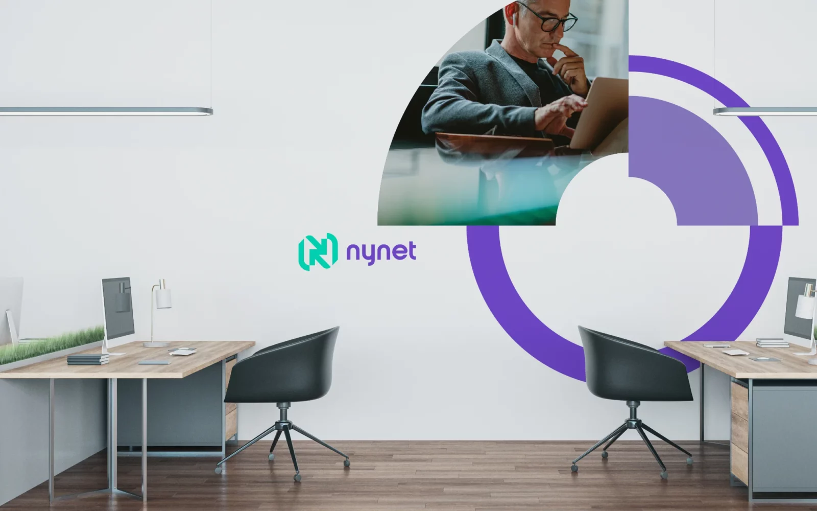
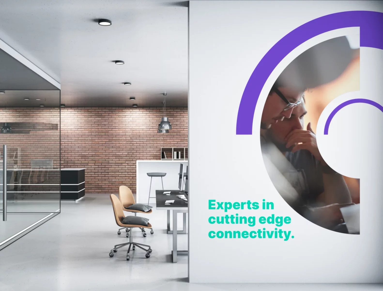
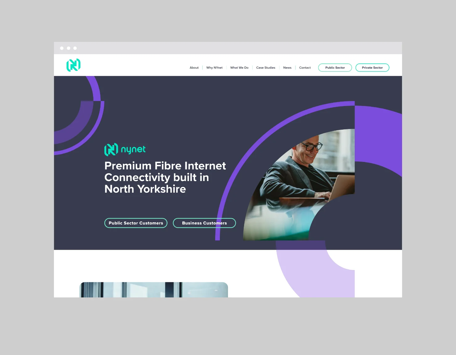
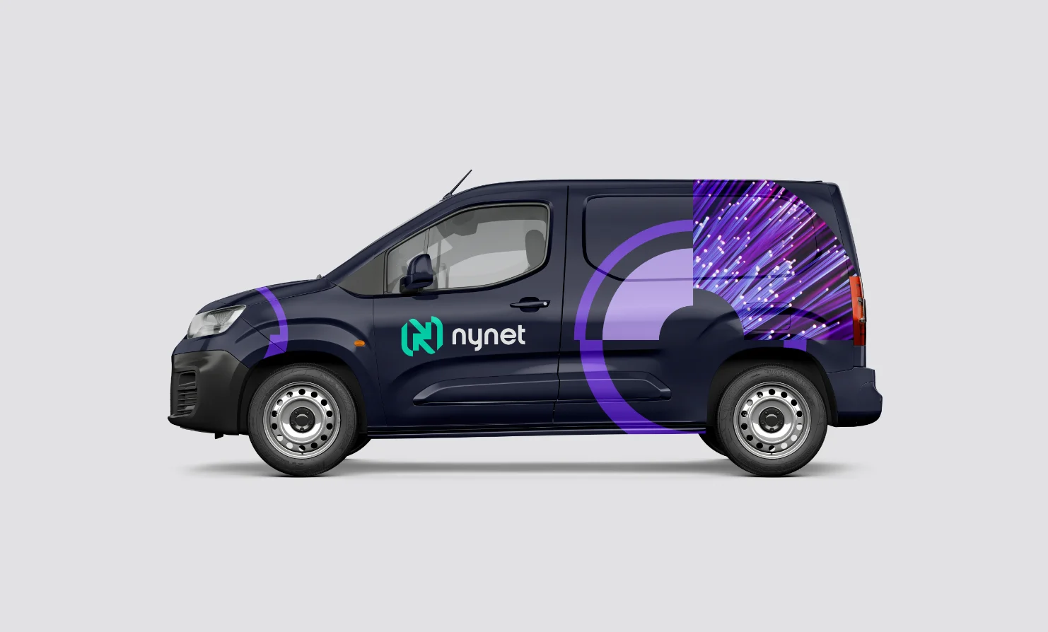
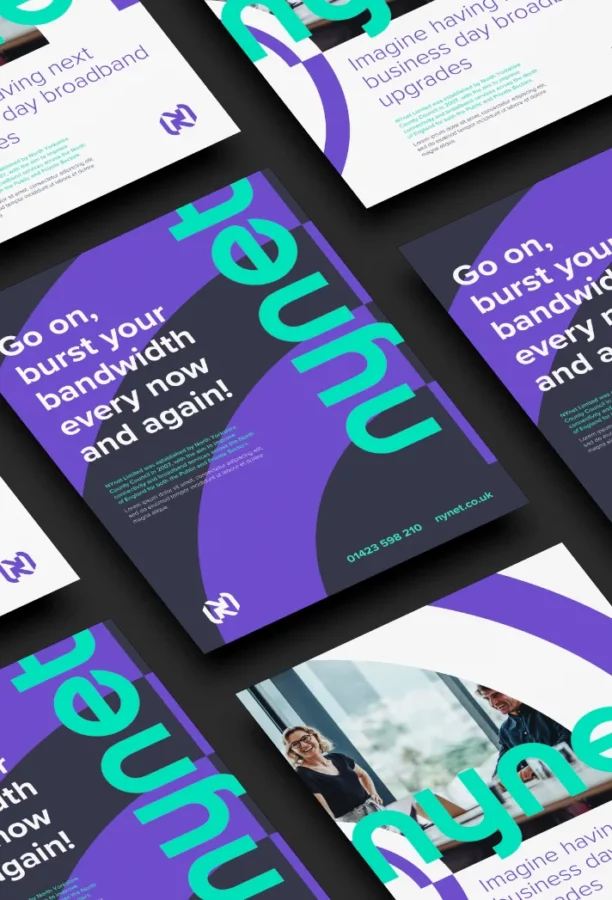
To continue the feeling of connection, I took shapes and elements from the new logo and created a simple, flexible and highly recognisable identity system that would give the new brand a modern look.

I created a simple visual system to give me total flexibility and infinite possibilities on any application.


Nynet employed Richard Stockdale of Rebus Design to re-design our company branding after being recommended by several businesses we work with. We are delighted with the results and feel that Richard’s interpretation of NYnet, our mission and our values have been thoroughly represented in our new brand.
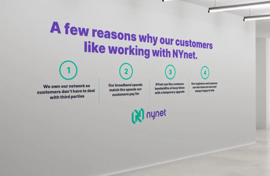
It was a pleasure to work with Richard; he took the time to get to know our business and its people. Richard asked some excellent questions, which enabled him to determine the key factors that make us our organisation. Richard was very good at changing things on the fly; at no point were we in doubt about where we were with the process. Richard has extensive experience, a keen eye and an appreciation of how colours, shapes and letters work together. He made us think differently, and we devised a plan, which is now active. Richard not only re-designed our branding, the website and our collaterals but also advised and designed internal signage that reinforces our values and messaging in our office space.
I can highly recommend Rebus Design. Such a personal service and a collaboration with a company that takes pride in its work.
Chantal Wilkinson Sales Manager
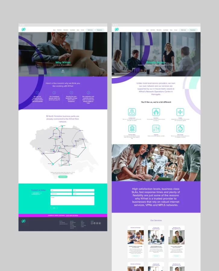
The new identity has given NYnet much more confidence to approach customers within the private sector, as they now believe the look of their new identity now matches the premium levels of services they have always delivered.