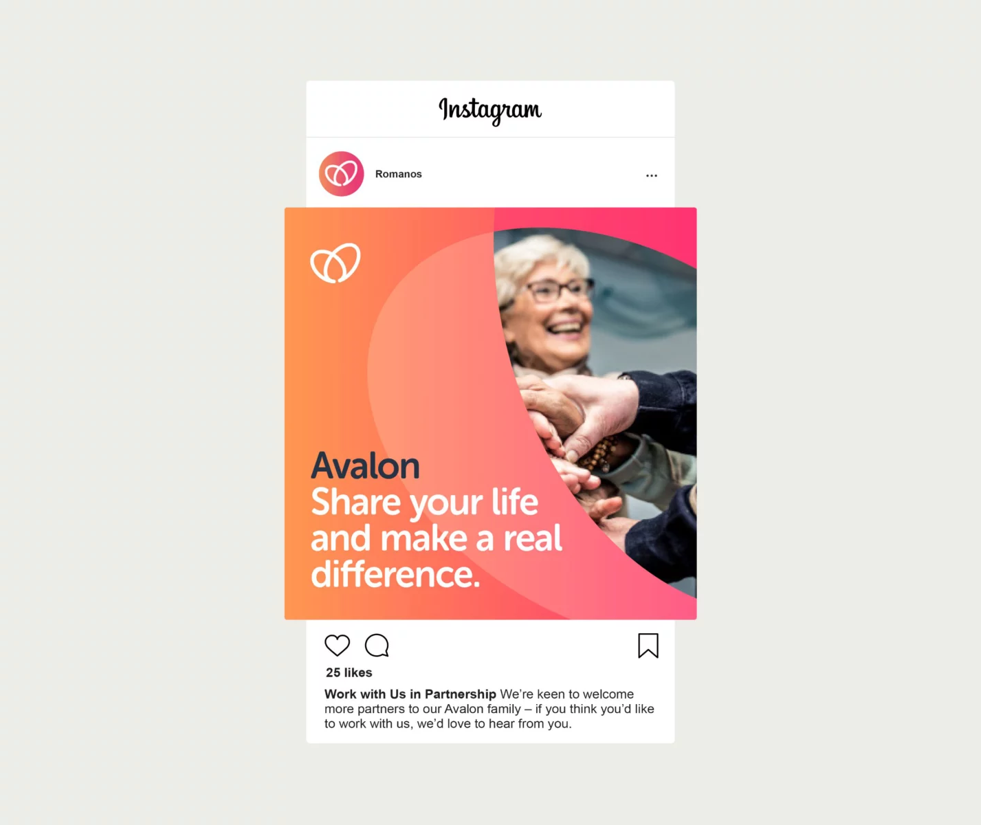
The Avalon Group is an award-winning charity centred around supporting our customers to live independent and fulfilling lives.
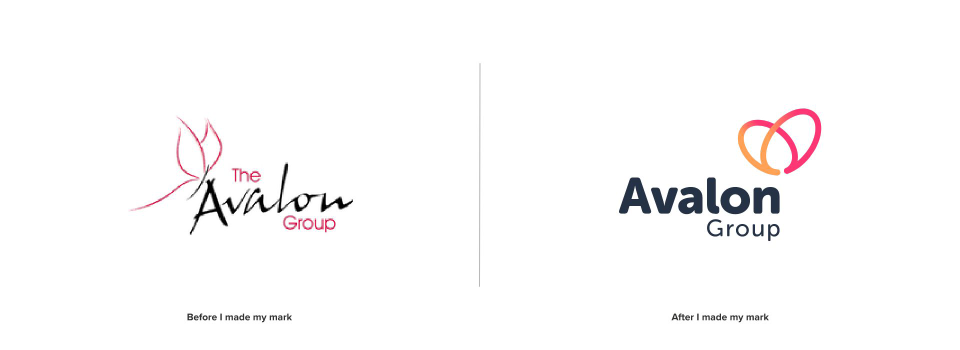

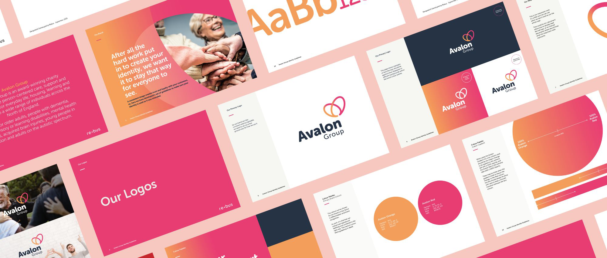
When approached by the marketing team from the Avalon Group, they were already aware of my work and thought we would be a great fit to work together. Their current identity and logo just did not align with who they were; the colours were too harsh and sterile, the typography too angular and unapproachable, and with no guidelines in place, it was impossible to monitor consistency across all nine of their registered offices.

As part of creating the new identity for the Avalon Group, the marketing and management teams wanted their customers to be involved in the whole process from start to finish, with them ultimately making the final decision on the logo & identity.
Surveys were created to send out to all customers, and the feedback was reviewed. From there, examples of the identities’ look and feel, along with colour palettes, were produced to gauge their reaction and steer the project’s direction. One thing that was paramount and seemed to be on most people’s wish lists was to keep the Butterfly as part of the company logo but represented in a much more modern, simple and approachable way.
Three different concepts were created and one won by a landslide for the new logo and visual identity. Sometimes not an easy way to work with so many people having a say in the final designs, but this project went extremely smoothly and was a please to work on.

After feedback from the Avalon Group customers, it was clear they wanted the new identity to be fresh, contemporary, and most importantly accessible.
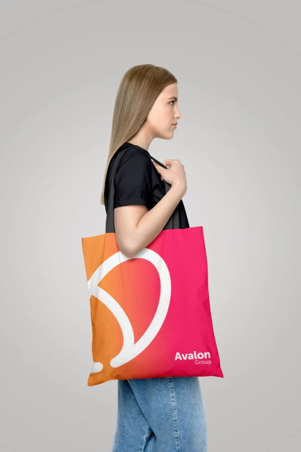
We worked with Richard at rebus to accurately depict who Avalon is and where we wanted to be in the future. Richard pulled together input and feedback from various stakeholders and presented us with options that each captured core elements of our vision, mission and values. Our customers made the final decision, and we are so happy with the brand. It goes beyond just the logo itself, with Richard providing us with an accessible brand usage document to support the rollout of the brand across our 9 registered offices.
Richard was great to work with; communication was excellent, and we always felt we had complete control over where the branding was going.
James Plummer, Head of Business Development and Communications Avalon Group
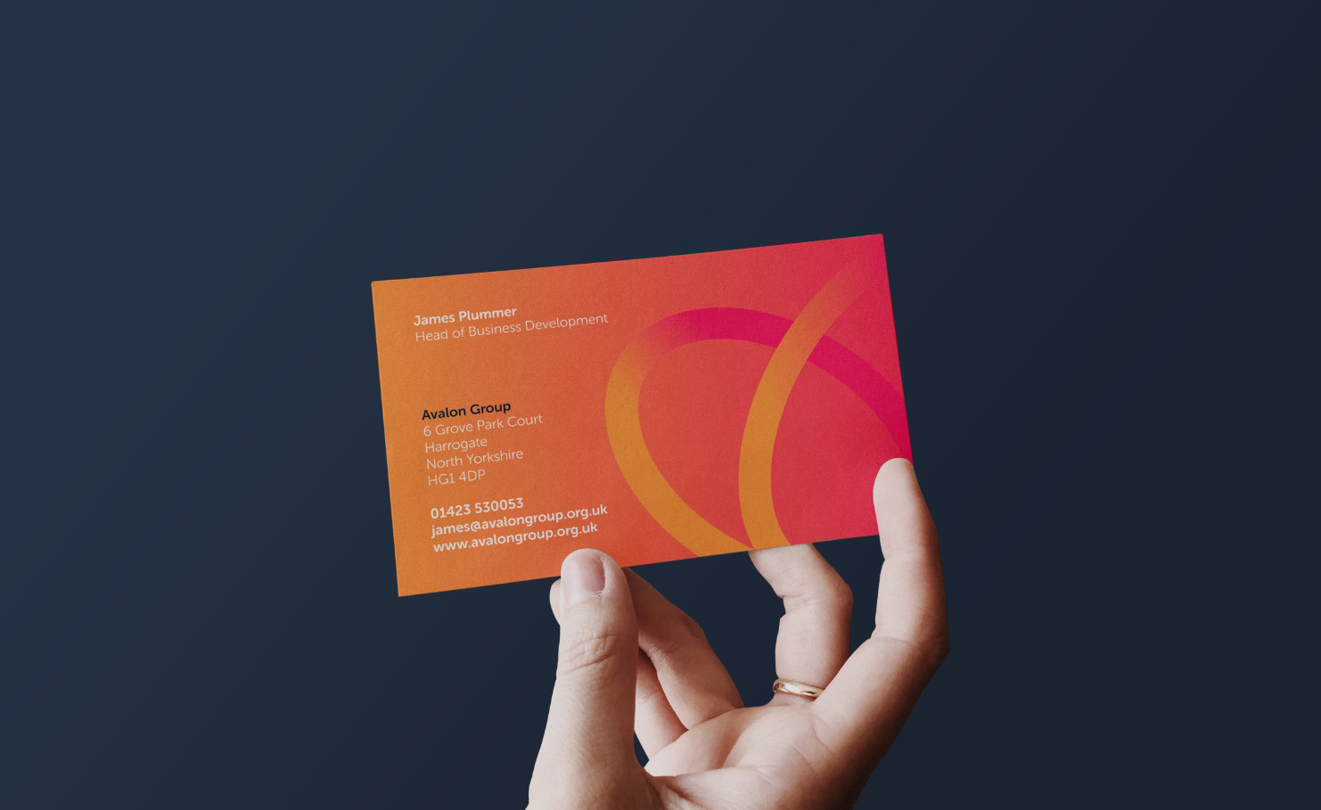
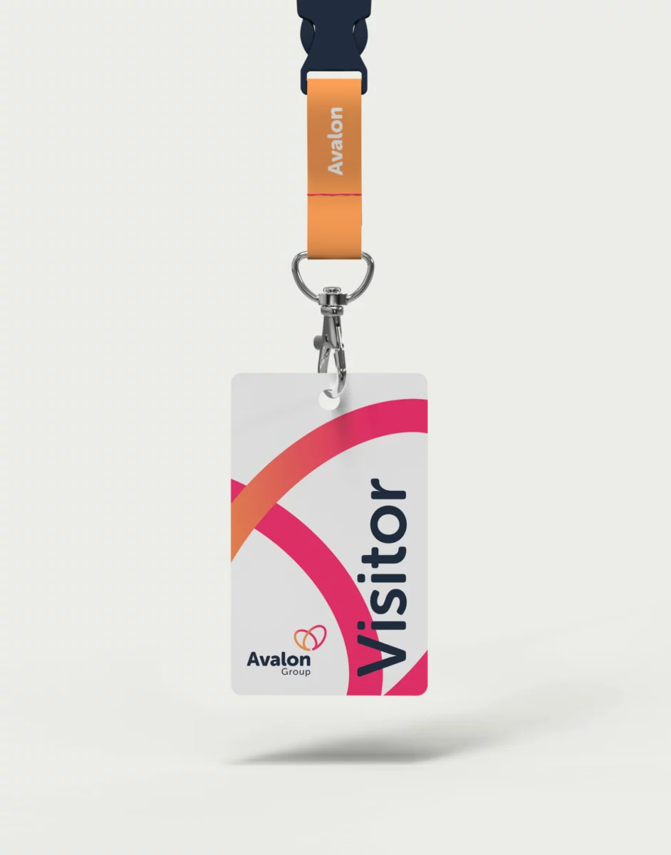
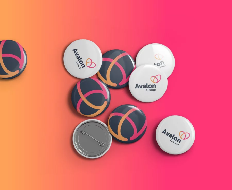
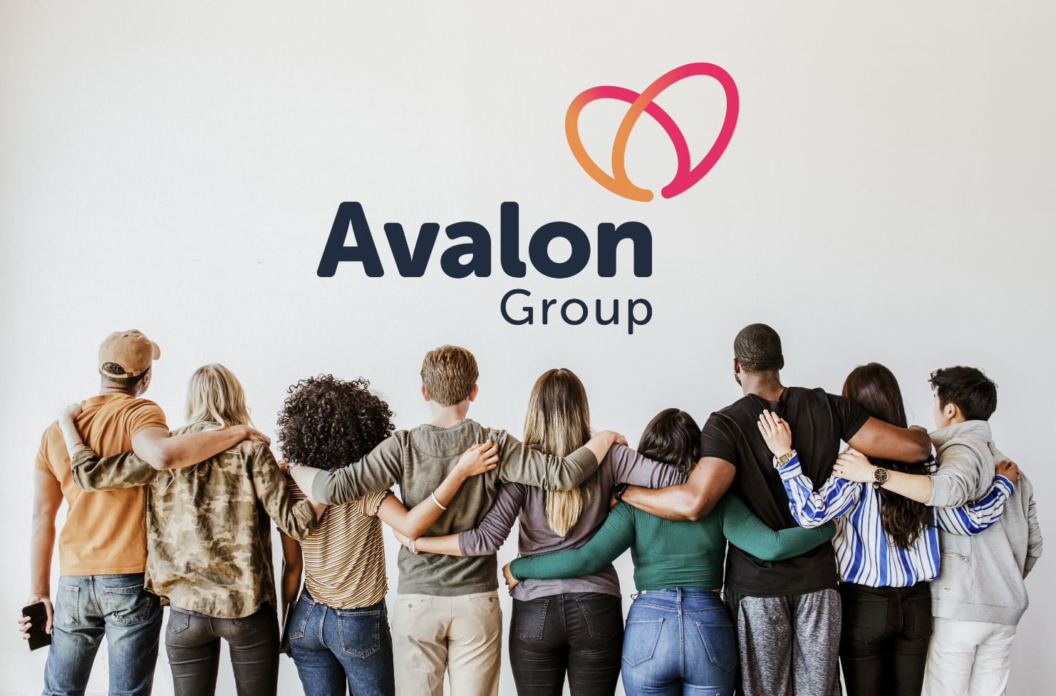
The final result was a huge success, and received excellent feedback from Avalon Group customers. They now have a much more modern, friendly and accessible identity that better reflects precisely who they are. In addition, with the development of the identity guidelines, a consistent look and message will be output by all employees.