A bike shop fuelled by a genuine passion for good old-fashioned customer service & all things bikes!
Such a great project to work on; when I first met with James and Gemma, who were setting up RedSky Bikes, they were more than happy to give me complete freedom on the creative for their new brand. They were just keen to create an identity with a modern dynamic feel.

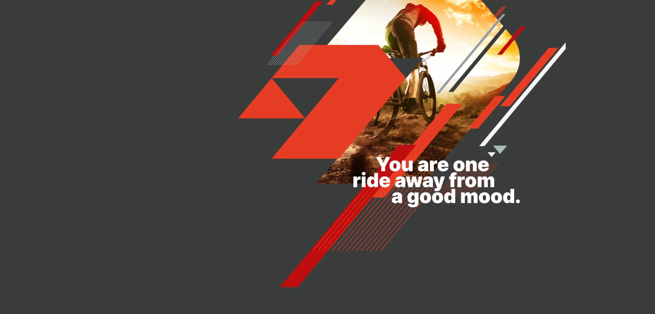
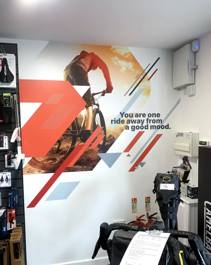
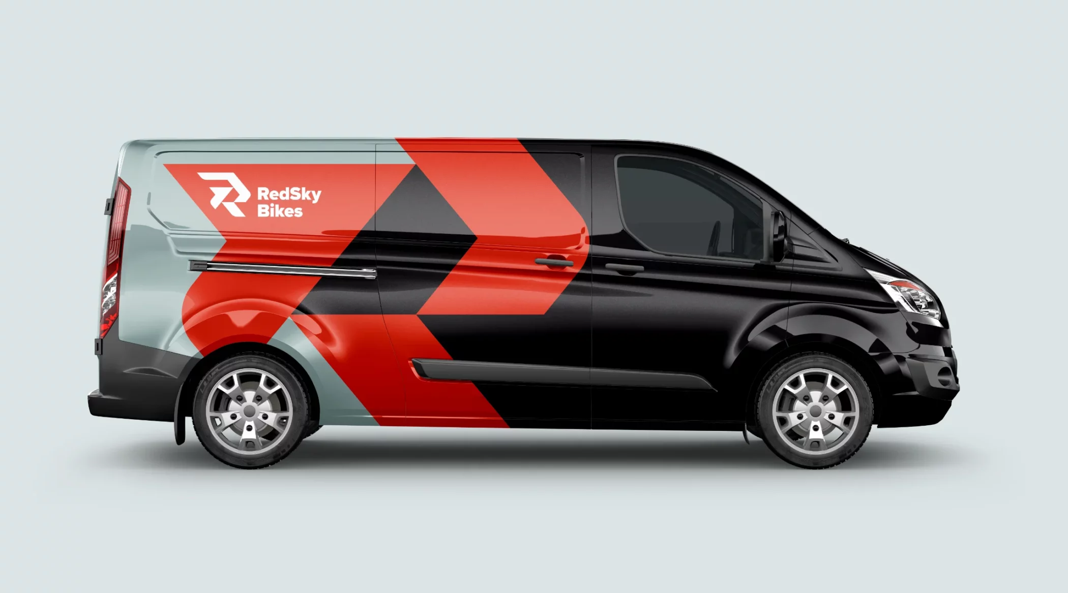
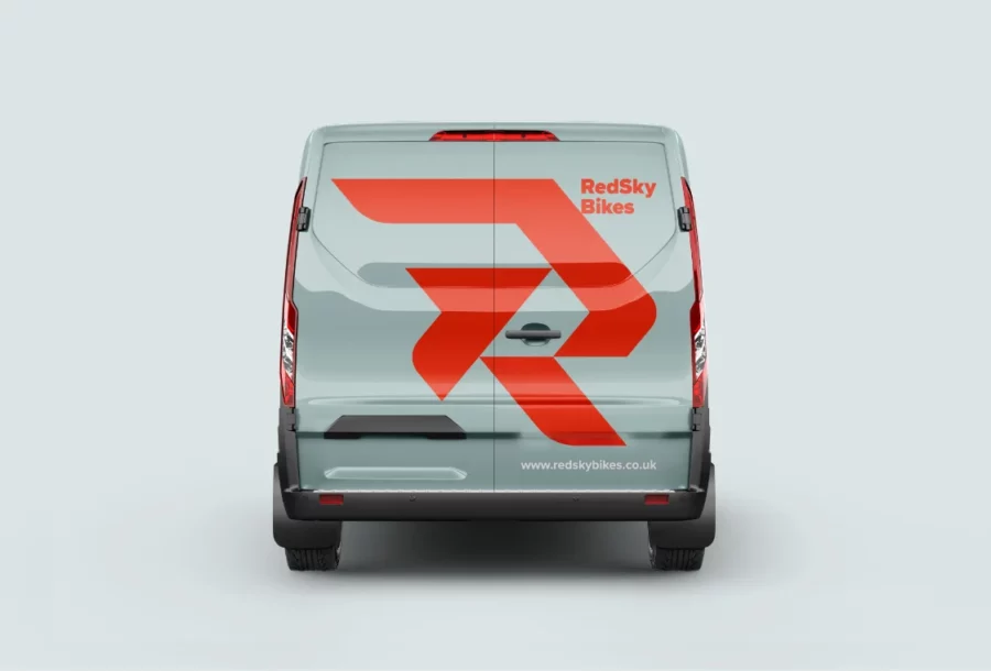
I elaborated on the grid system to create loads of great shapes to work with to help compliment the new logo.
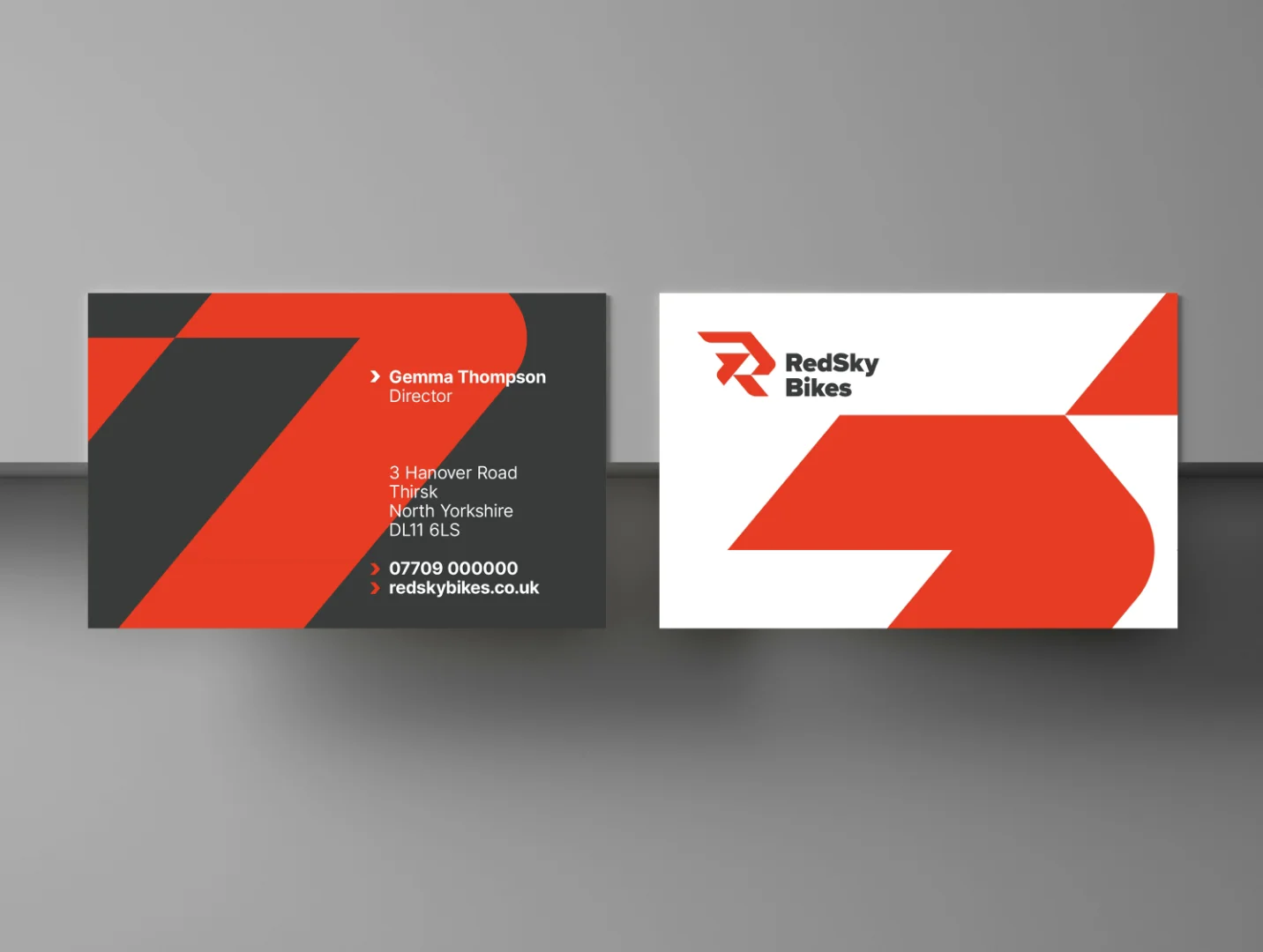
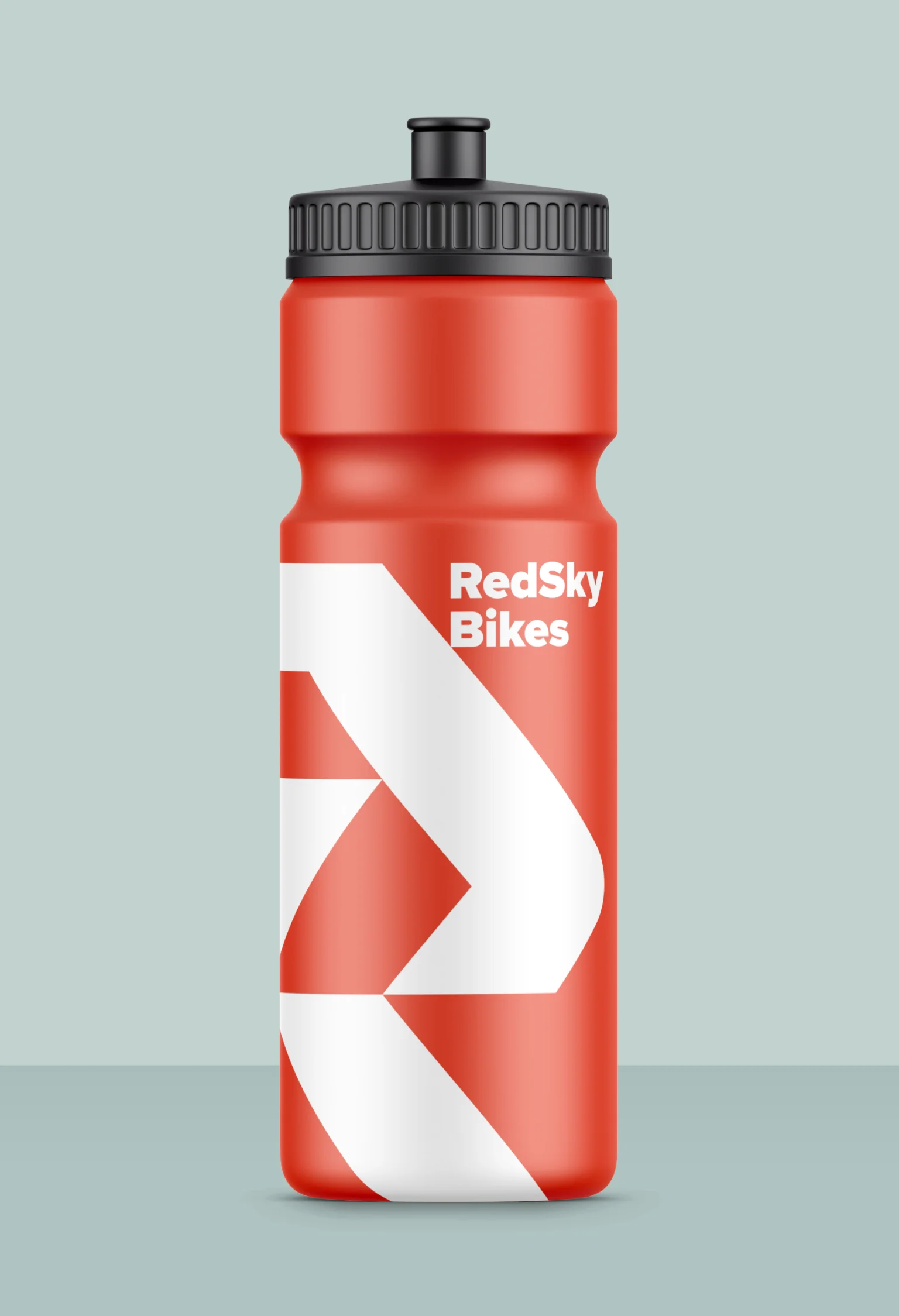
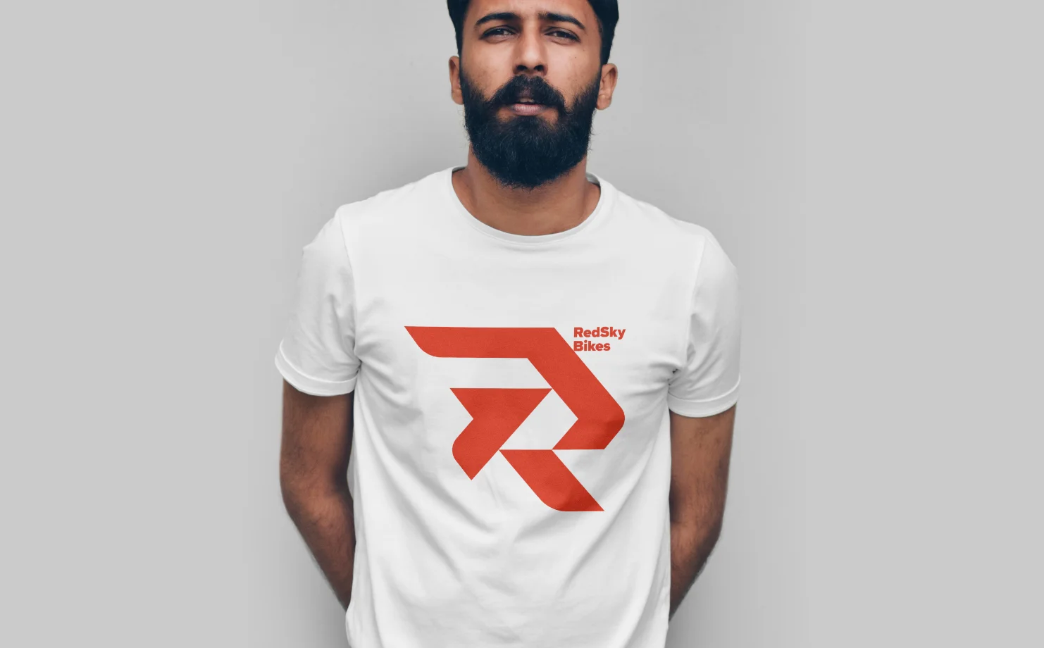
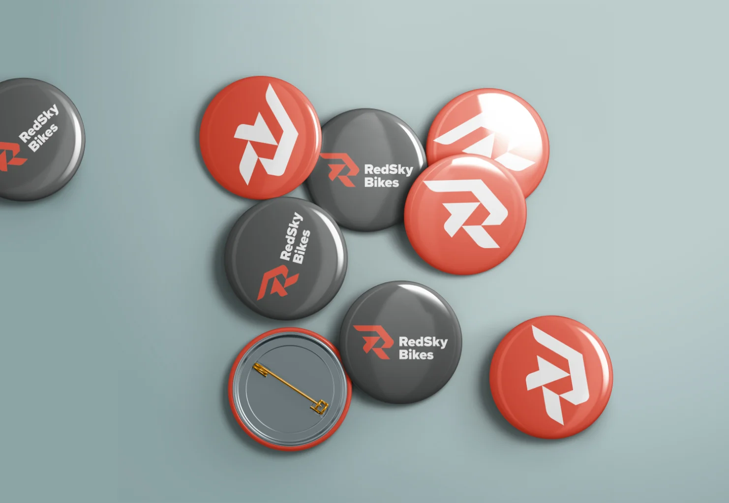
The clients sought an energetic, dynamic feel for the new brand identity. I wanted to develop different elements that I could pick and choose from to design bespoke graphics. As I am a massive fan of creating logos and identities using a grid system, I adopted this approach with the RedSky logo, making it out of a triangular grid. This allowed me to design the new ‘R’ icon, and then from there, I elaborated on the grid system to create loads of great shapes to work with to help compliment the new logo.
Richard was so easy to work with, so patient & calm throughout the whole project even when part way through we had a company name change! He is incredibly talented in how he brings your brand to life.
Gemma & James, Business Owners RedSky Bikes


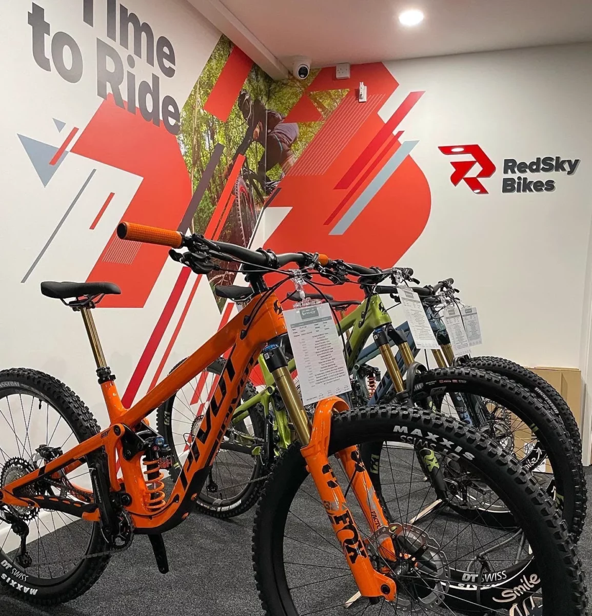
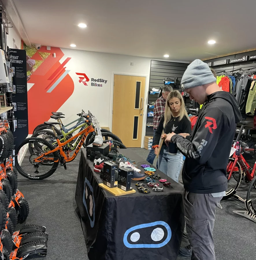

The final result was a huge success and has received some excellent feedback from customers of RedSky Bikes. Quoted by Gemma & James – We now have an identity that perfectly reflects who we are as a business. The new identity gives them great flexibility in presenting themselves whilst keeping a unique look.