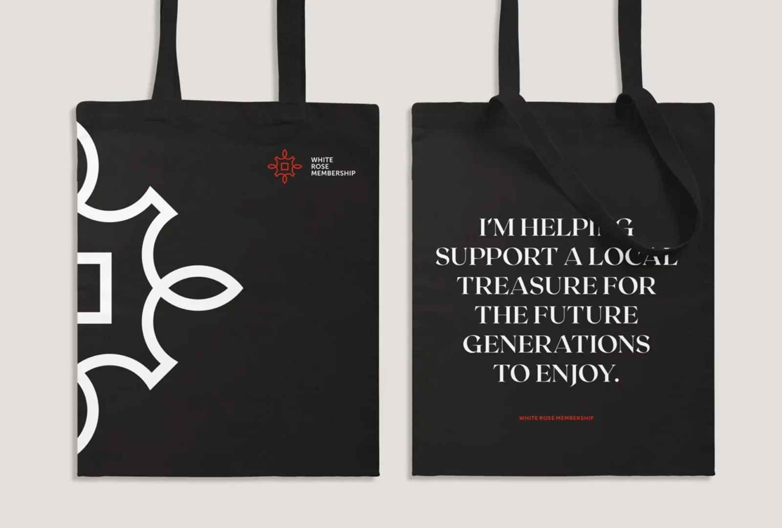
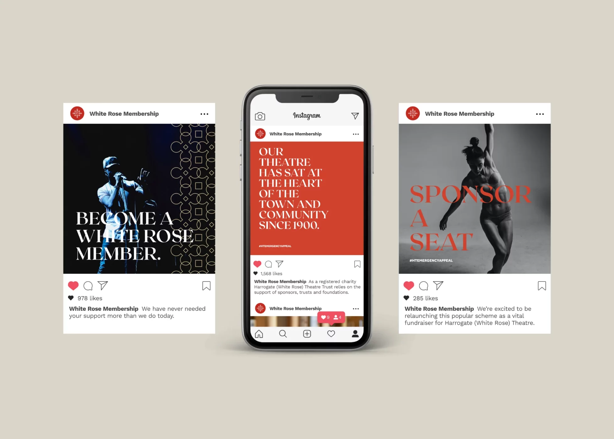
The supporters’ scheme for Harrogate Theatre offers a wide range of benefits to its members, from priority bookings, a glimpse behind the scenes and private member events. Helping them feel a part of safeguarding a piece of the past for future generations to come.
The re-brand for the Theatres’ membership scheme needed to appeal to a new, younger audience while at the same time not alienating their existing members, of which a very high percentage were 60 years old and above. It was also clear from our initial meeting that they were keen to somehow incorporate elements of their 119-year heritage.
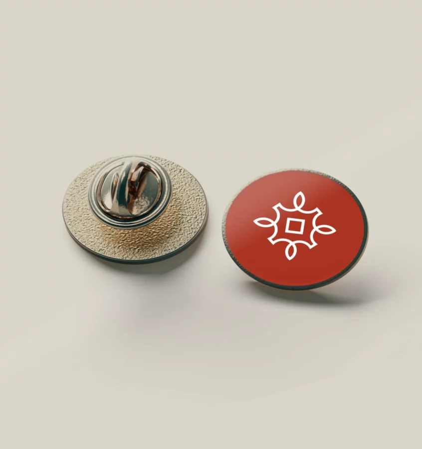
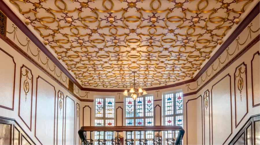
After I developed and presented the 3 different visual routes that the White Rose Membership could take, it was evident that they were keen to show off the history of the Theatre and the building itself. This was a big selling point for the Theatre and helped them stand out against their competition, so I took my inspiration from the building itself, with its many unique features.
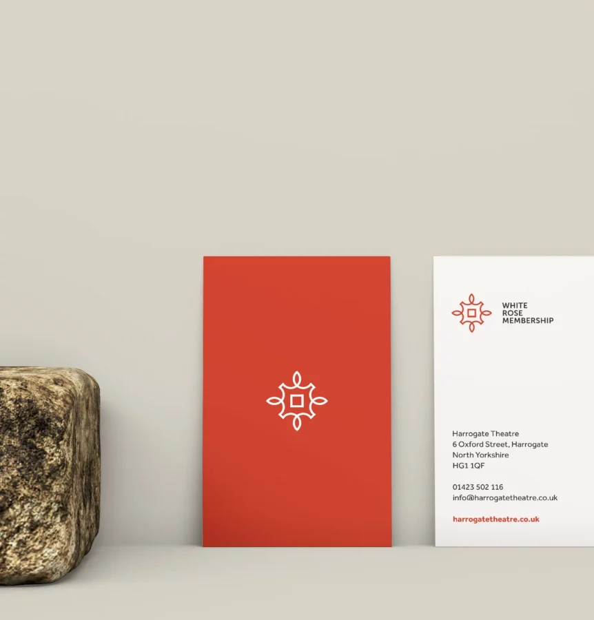
The beautiful ceiling design in the theatres entrance became a focal point for the design of the new logo and visual identity.
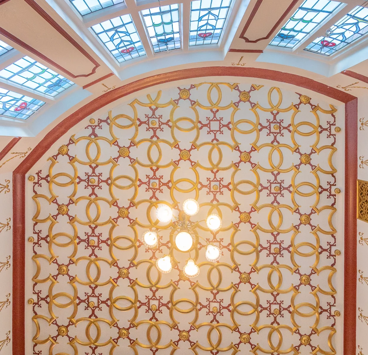
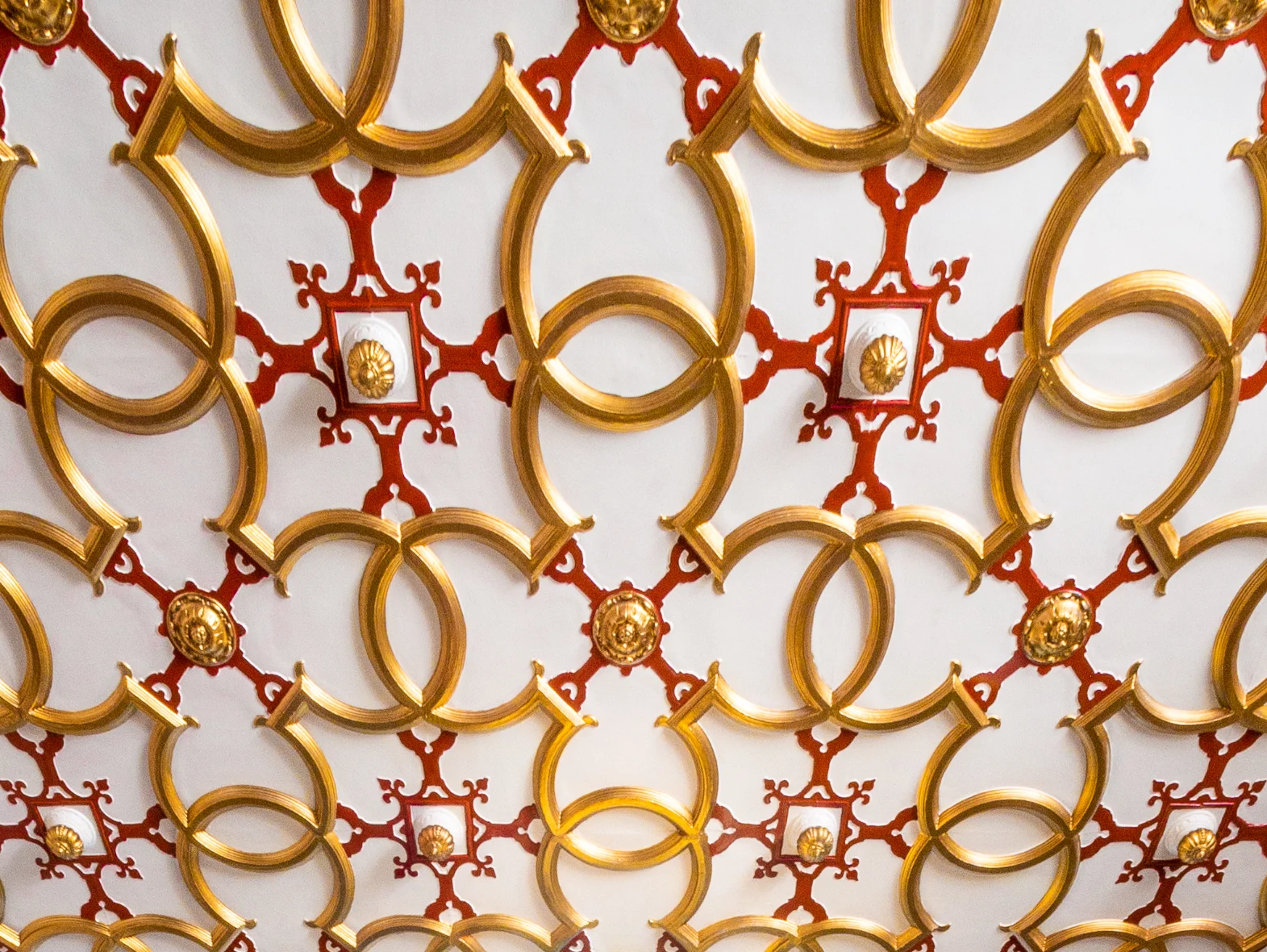
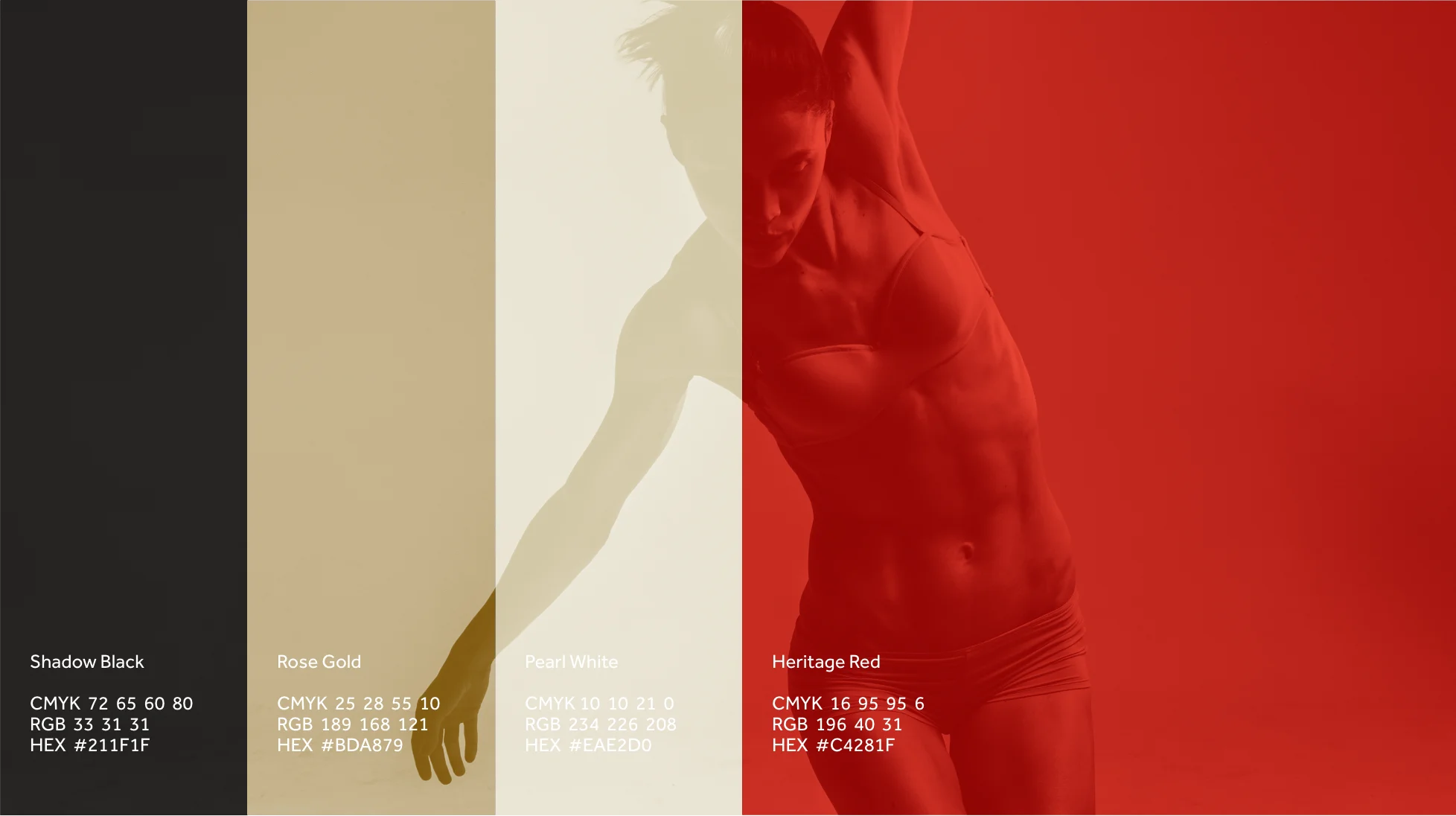

For the White Rose Memberships new logo and visual identity, I took my inspiration from the building itself, with its many unique features.
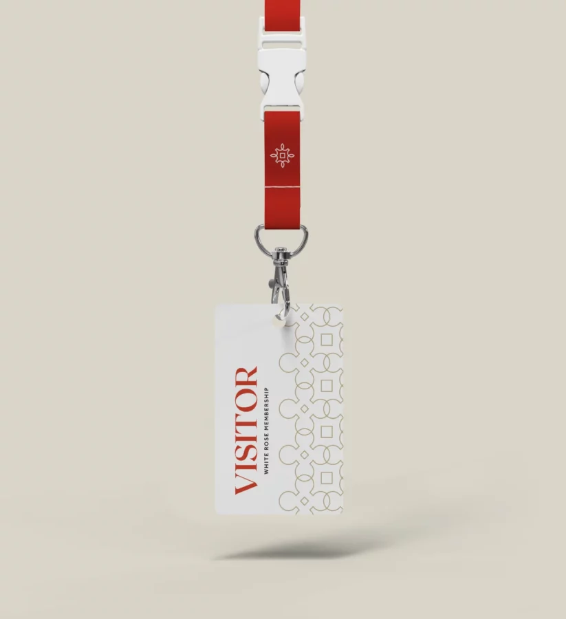
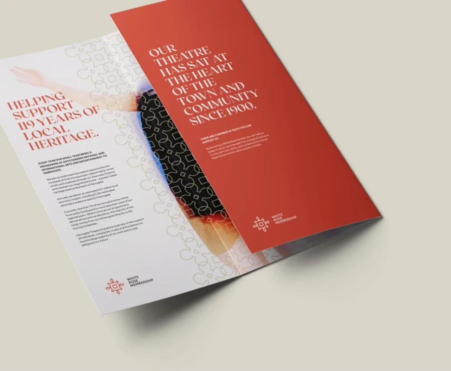
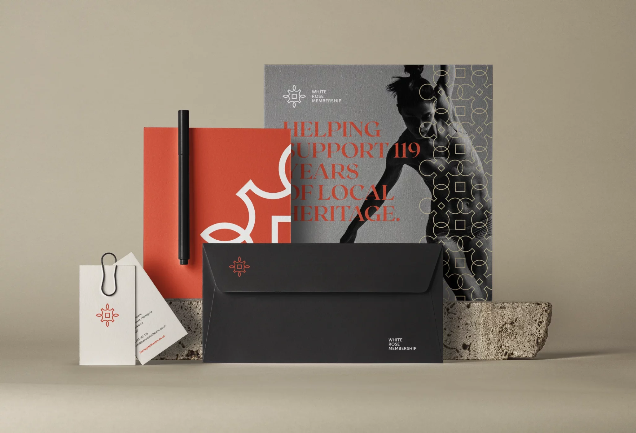
“Having worked with Richard at Rebus in the past on various design projects, I asked him to help us develop a new identity for our membership scheme. He worked with us to understand what we were looking for and presented three great options, any of which would have worked! The one we chose was particularly clever as he managed to use shapes from the ceiling patterns in our grade 2 listed building to create a contemporary design that reflects the treasured heritage of our theatre, which perfectly appealed to our community”.
Rachel Auty, Head of Communications Harrogate Theatre
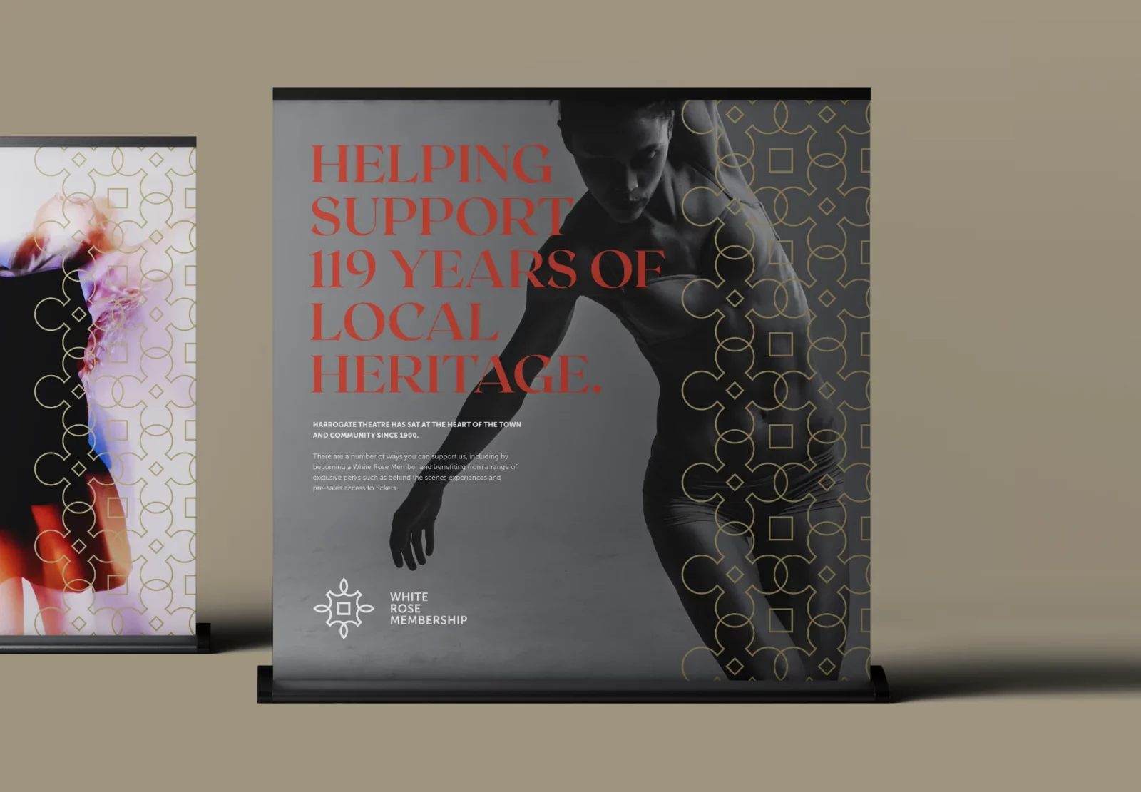
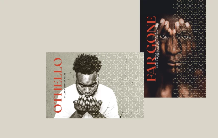
The goal for the White Rose Membership was to develop a traditional-looking identity but with a modern feel. To help me achieve this, I drew inspiration from the buildings architectural and historical features, which struck a chord with the existing members; I then paired these elements with contemporary imagery and layouts to help the new visual identity appeal to a much younger audience.
