Founded in 1871 by Jacob Stephenson, they are still a proud family-run firm in its 6th generation. From their traditional agricultural roots, the business has grown to the present multi-discipline professional partnership of today.
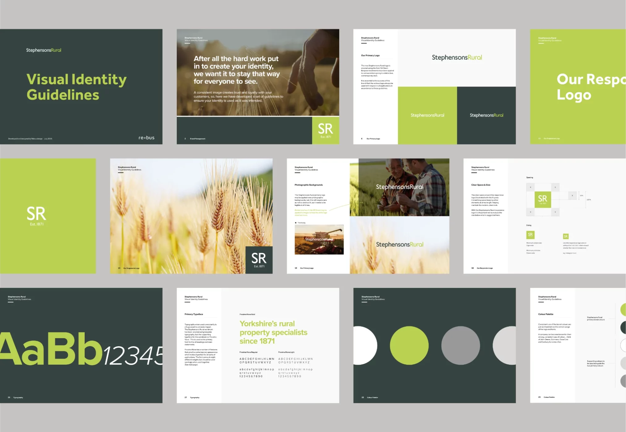
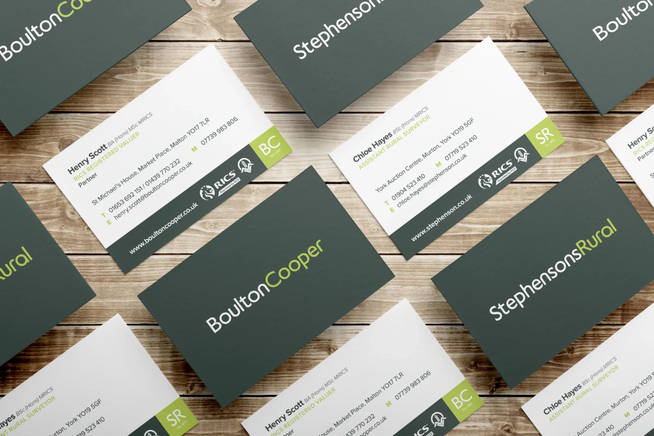
When approached by Stephenson & Son, they presented me with an interesting challenge. They have been a well-established business for many years now and a good client for some time. They wanted to change the company name from Stephenson & Son to Stephenson Rural to encompass all their agricultural services. This brand re-fresh also needed to include their partner business, Boulton & Cooper. Both companies wanted a consent brand image to be portrayed, but, to complicate things, I needed to develop the identity to mirror another division of the company, Stephensons Estate Agents, who had rebranded just a couple of years earlier.

Founded in 1871 by Jacob Stephenson, Stephenson Rural is a proud family firm in its 6th generation.
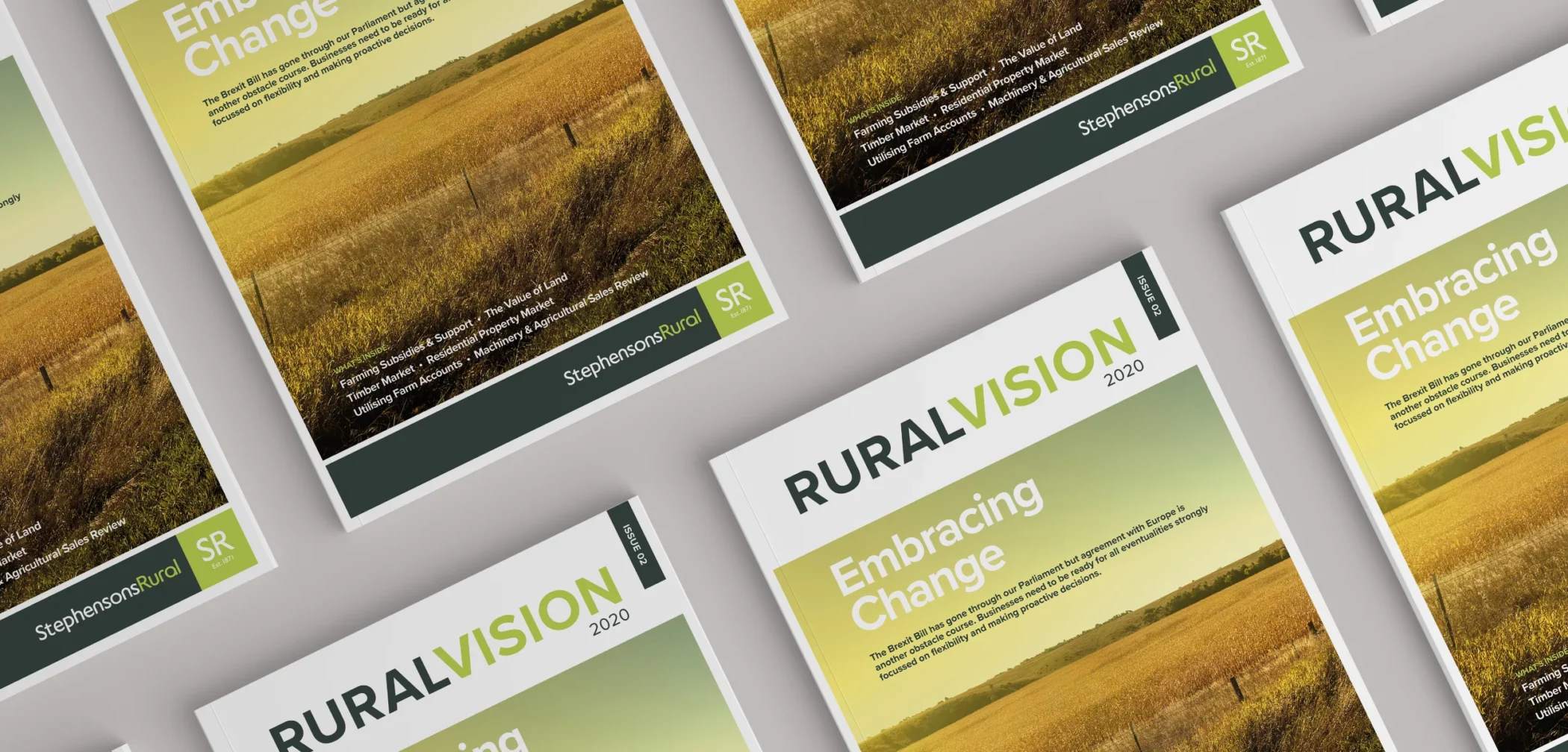
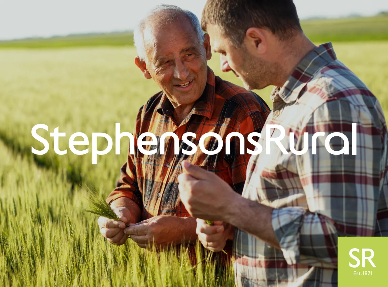
I needed to create the two wordmarks for ‘Stephensons Rural’ and ‘Boulton & Cooper’ to tie in with the recently rebranded Estate Agents. During this development phase, I advised that the client drop the ampersand in Boulton & Cooper and become Boulton Cooper. With the original Estate Agent wordmark having bespoke treatment to the typography, this meant I had to sympathetically hand draw the missing letters needed.
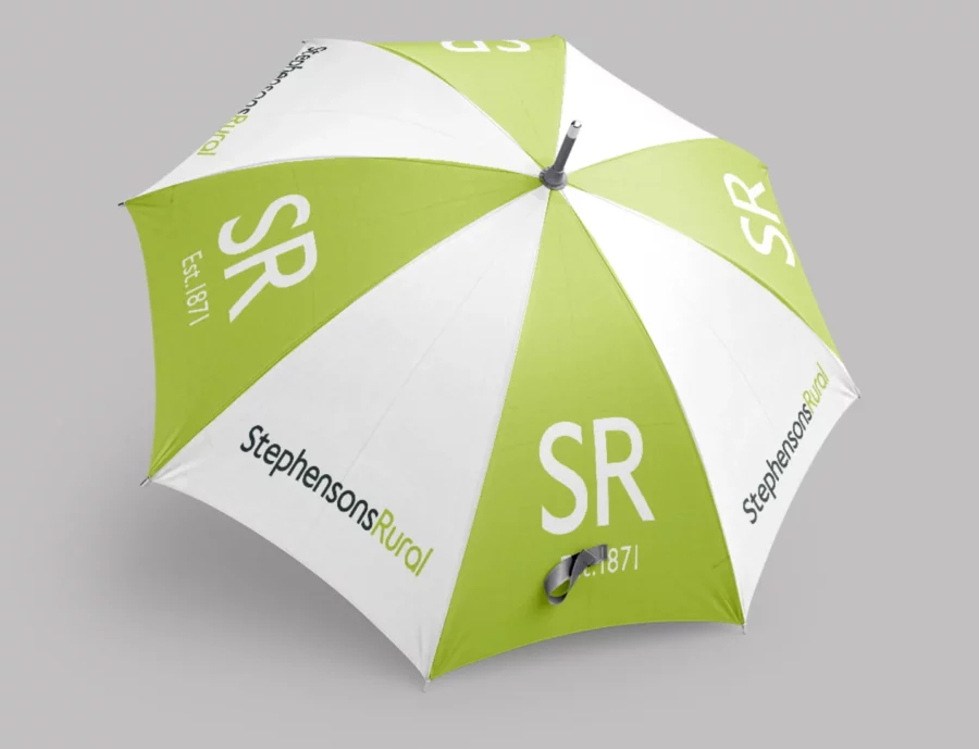
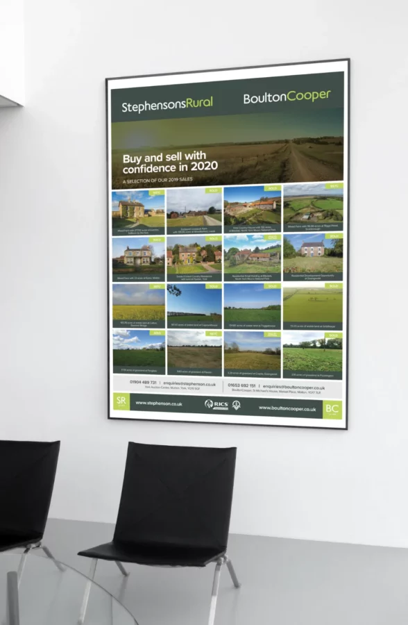
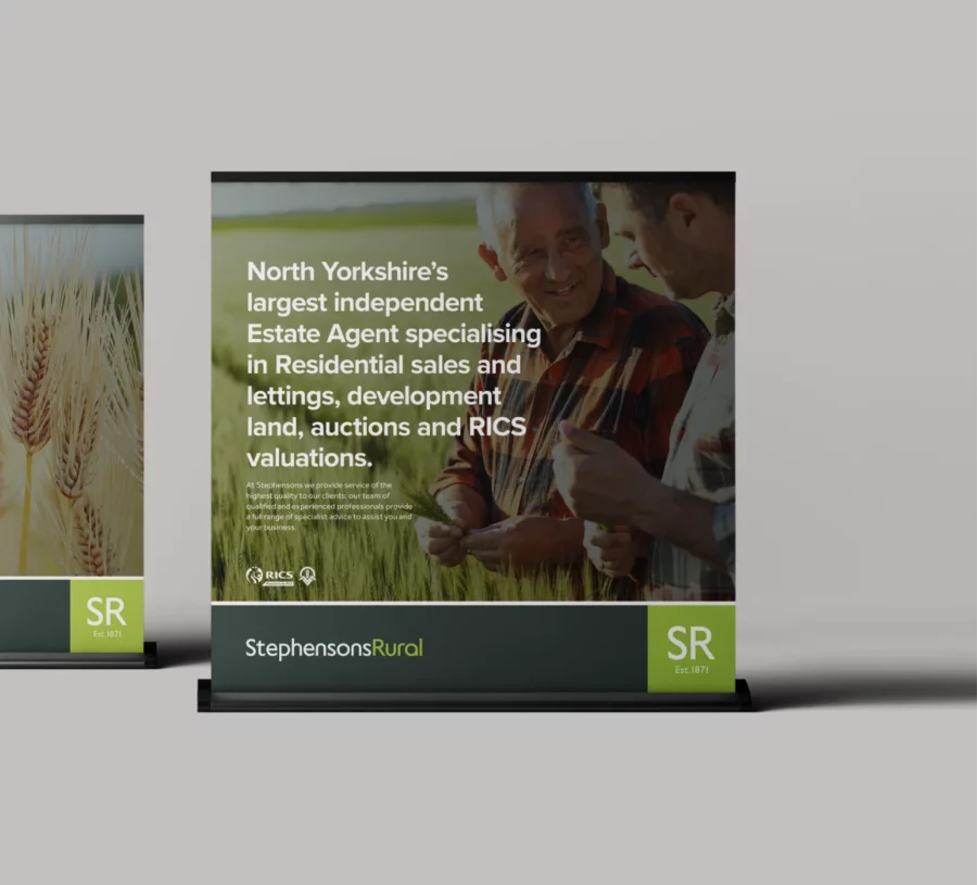
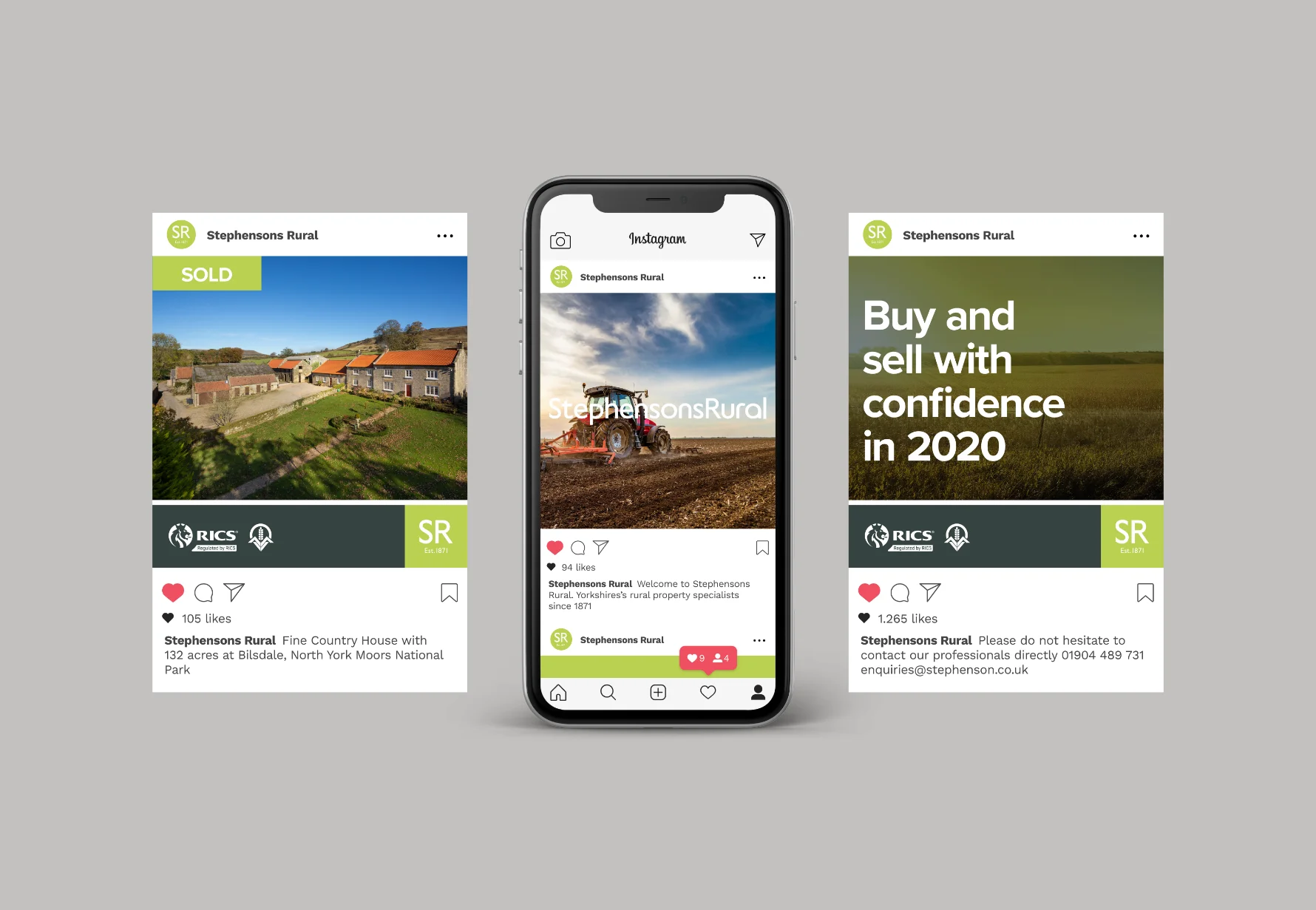
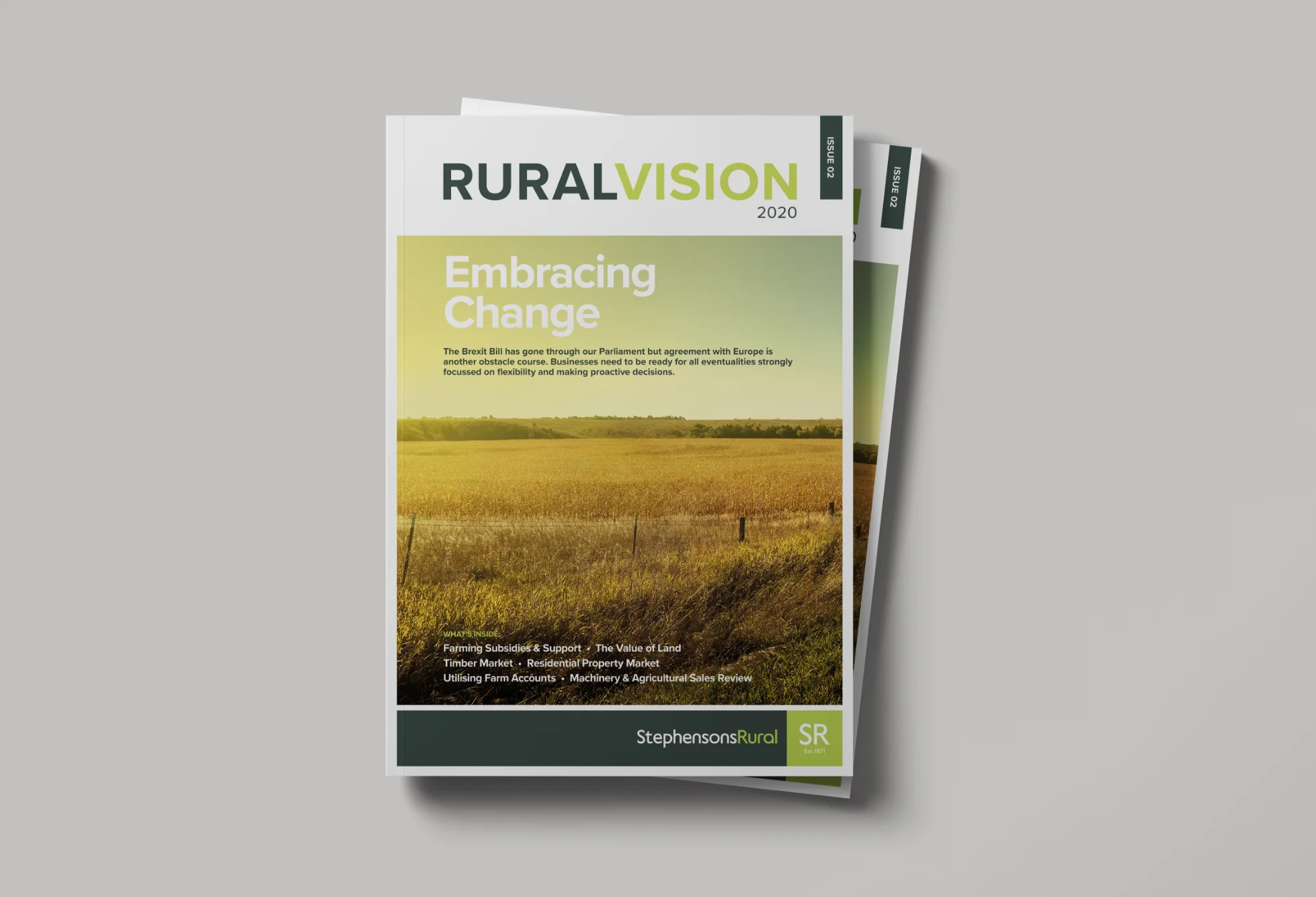
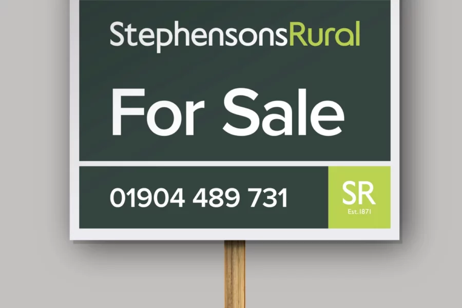
Once completed, I developed the identity across a wide range of advertising, printed collateral and marketing materials such as Sale/To Let boards, property particulars, branded merchandise and much more.