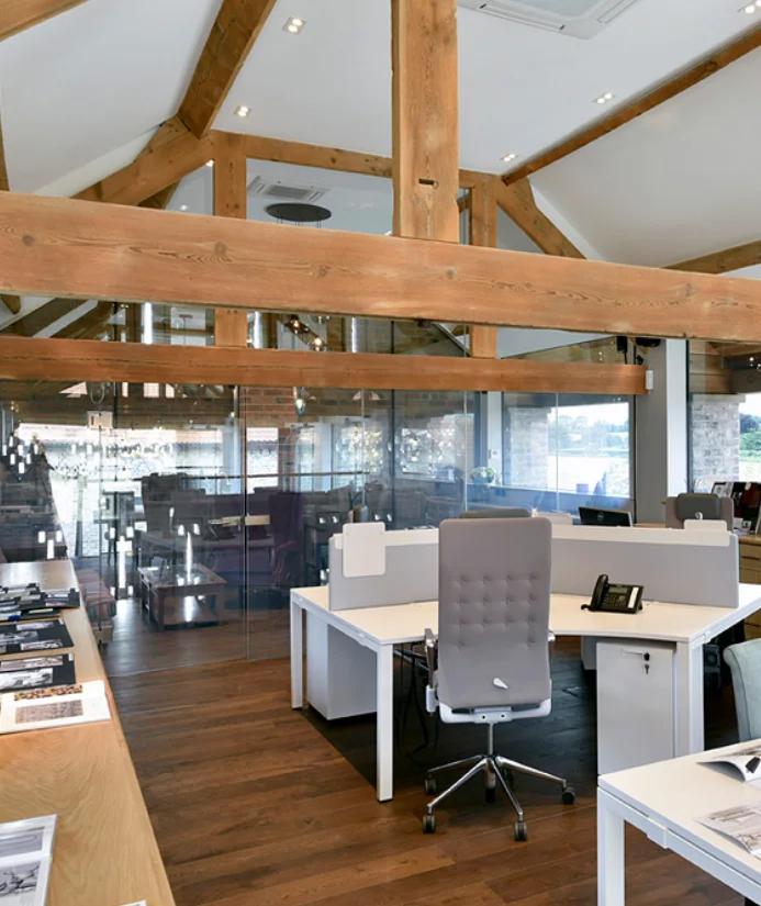
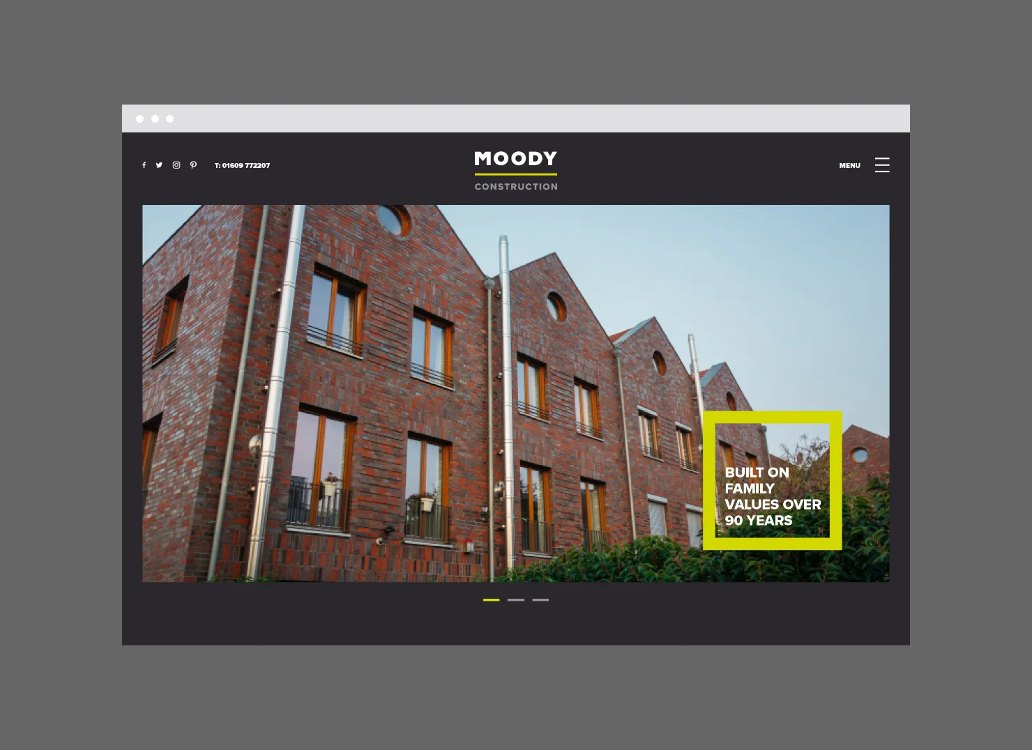
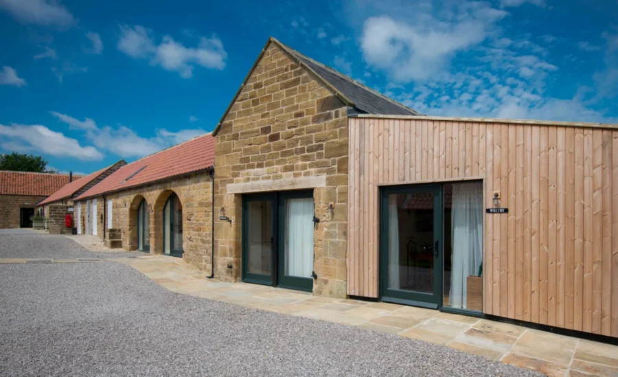
Built on family values for over 90 years, Moody Construction prides itself on being one of the premier building contractors in Yorkshire.
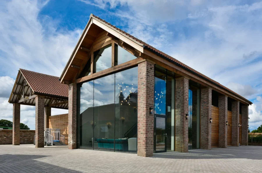

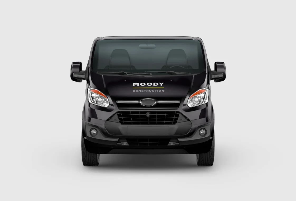
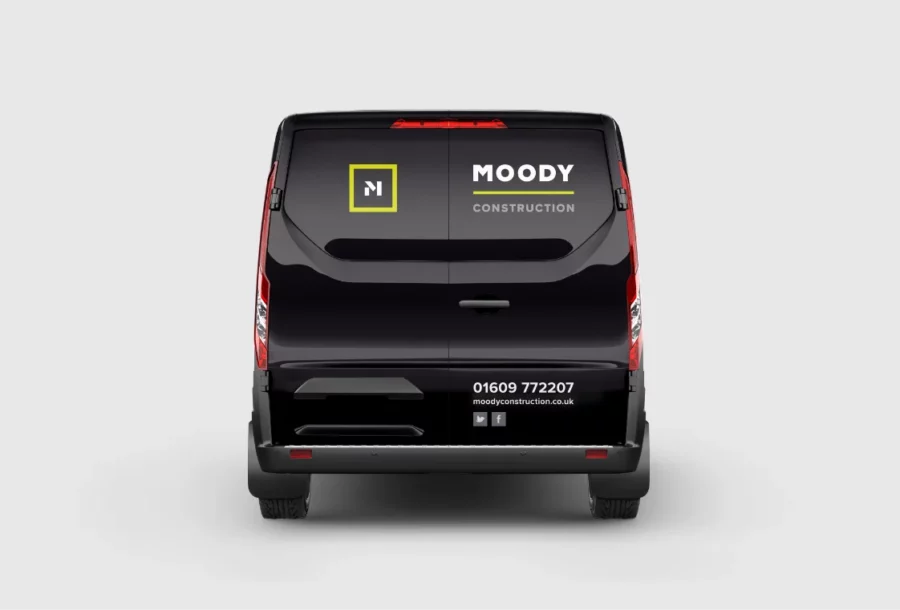
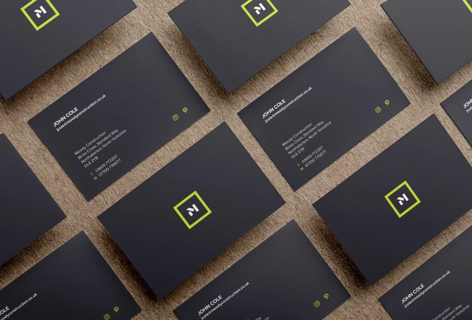
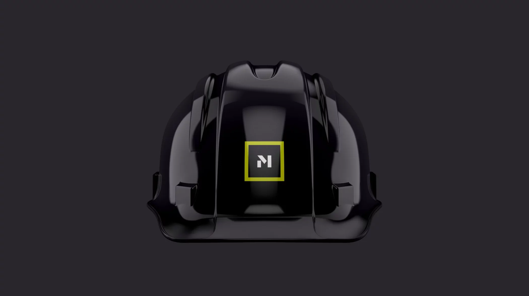
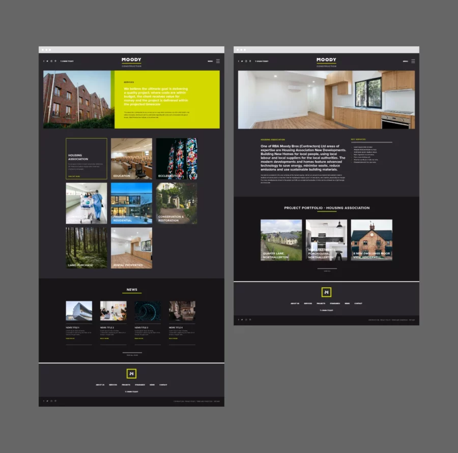
A family run business for over 90 years, Moody Bros did not feel their identity reflected who they were and how the company had evolved. They are now well-known for their modern, innovative approach to projects. My challenge was to create an identity that reflected this and be consistent in all brand applications: digital presence, vehicle livery, workwear, and company literature.
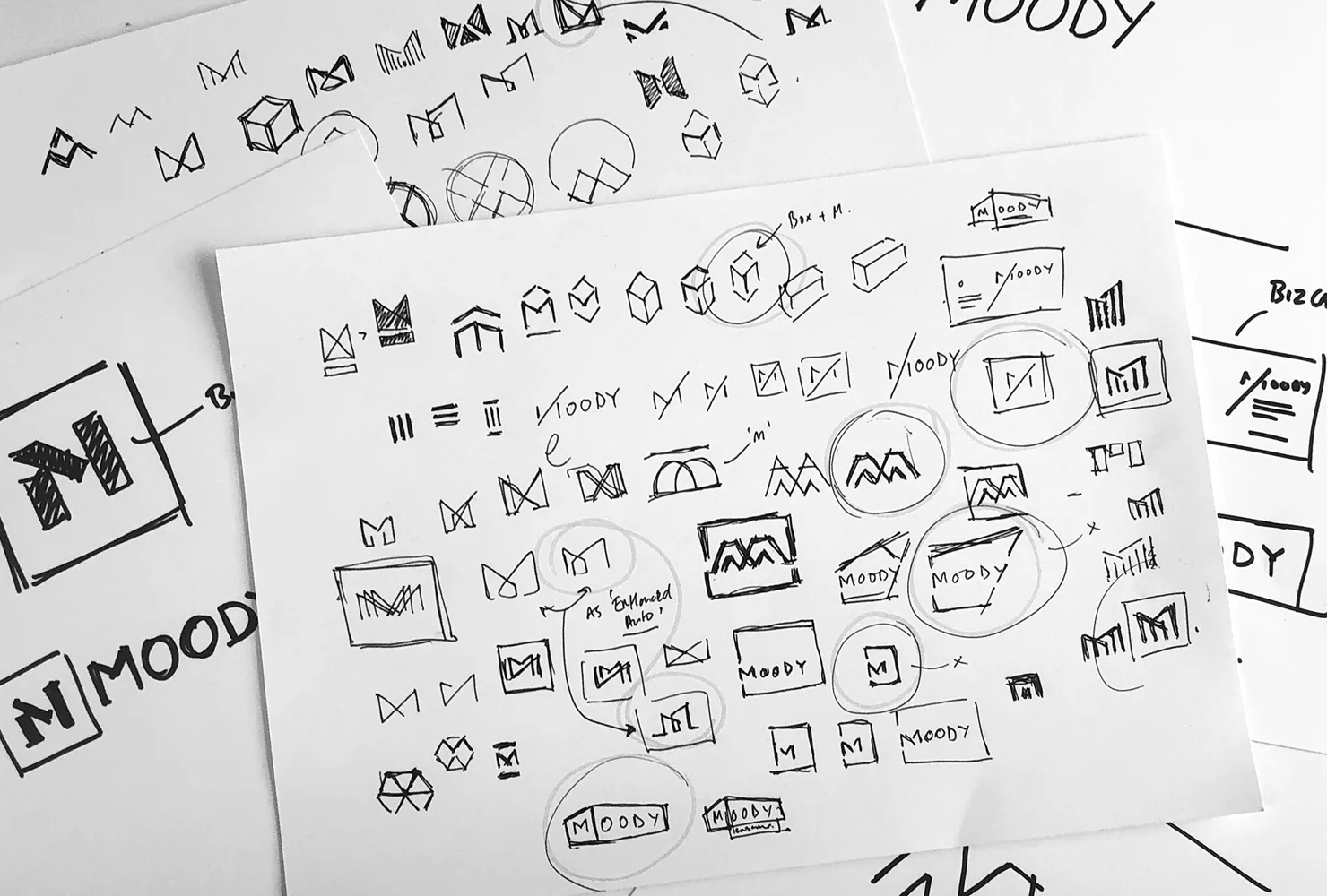
The ultimate goal of the rebrand was to create a simple, distinctive and own-able logo and identity. Inspired by shapes and how they are constructed and fit together to form structures, I wanted a logo that showed this innovatively and authentically.
“We appointed Richard to help us with our company, rebrand. He produced several options for us to consider, and once the preferred option had been chosen, he worked with focus, drive, attention to detail and used his creative magic to bring the design to life”.
James Moody, Construction Director Moody Construction
The ultimate goal of the rebrand was to create a simple, distinctive and ownable logo and identity.
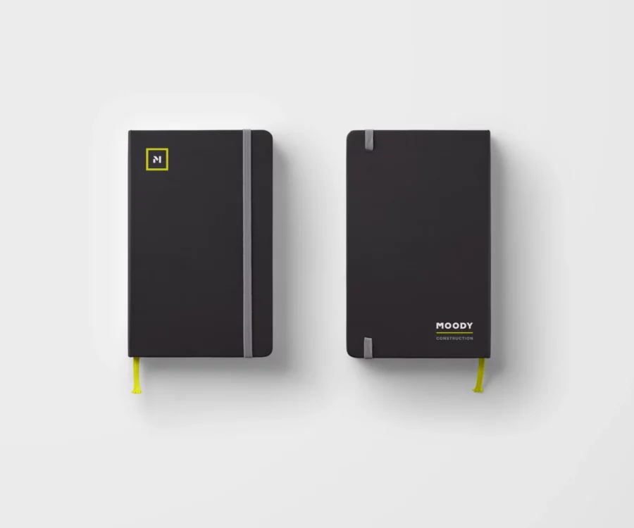
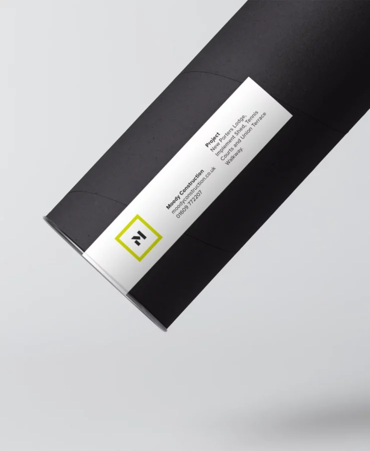
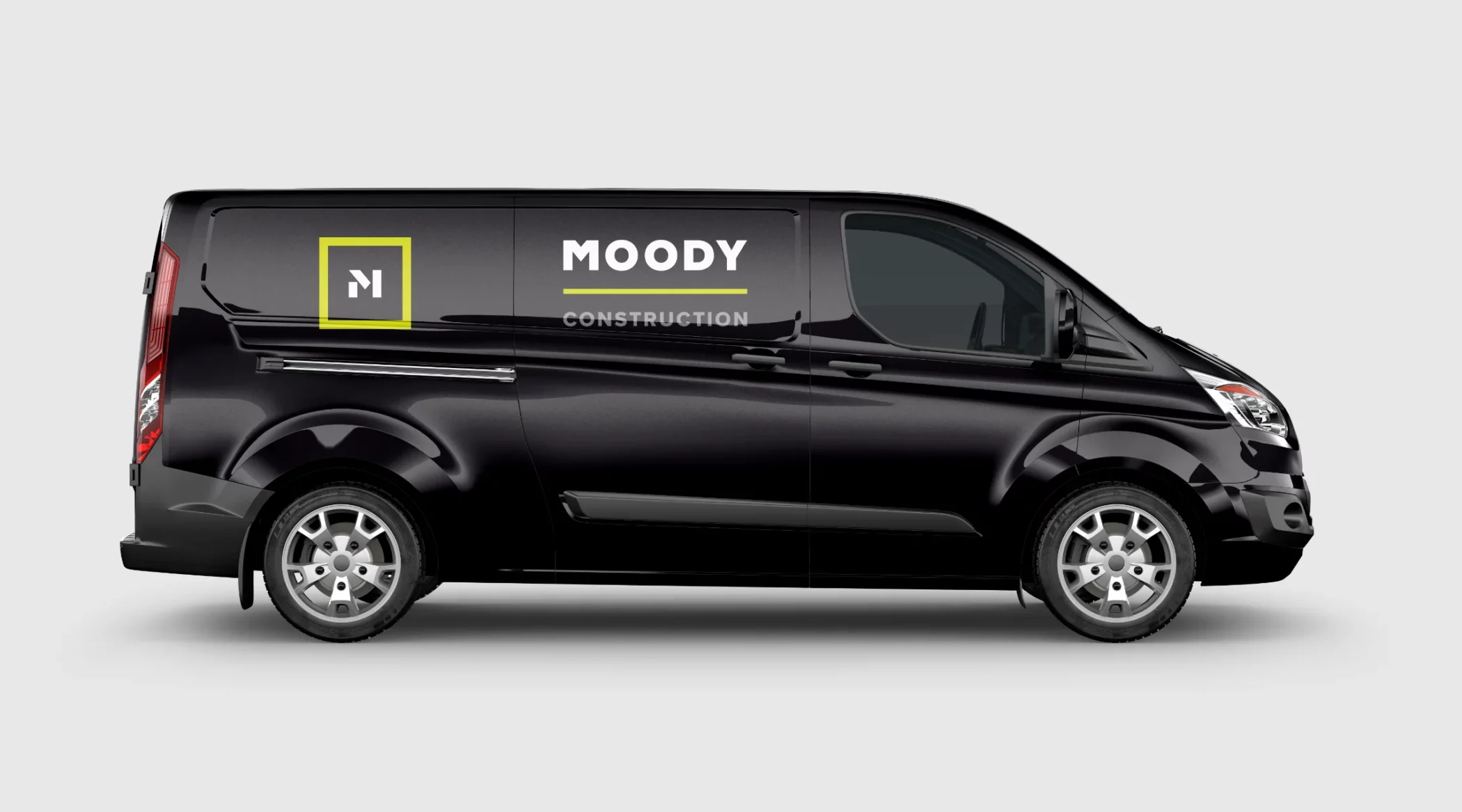
The final logo is the letter ‘M’. Minimal in design and stylised using bold blocks and shapes to evoke a feeling of strength and stability. The bright, simple use of colour re-enforces the concept behind the logo, giving the newly named Moody Construction a much more modern and contemporary identity.