The Lovely Lindsey at Lovely Stuff for Lovely People sells all-natural Body Shop products at home.
When approached by Lindsey, she had nothing she could call an identity, just something she had quickly cobbled together when starting the business. As her business evolved and her customer base rapidly grew, she became more aware that her identity looked amateurish and very inconsistent across all applications. My challenge was to develop an entirely new consistent identity that could be easily applied across all customer touch-points.

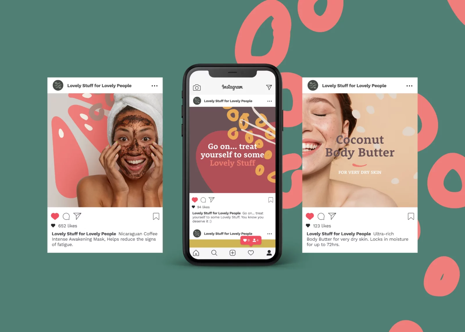
After researching the business and products that Lindsey sold, I wanted this to be a big part of the identity. Equally, I wanted to develop an identity that reflected Lindsey and her community; with a significant engagement on social media and many personal connections with her customers, I wanted to create something fun, friendly and fresh.

“I went to Rich at Rebus Design after being highly recommended by a friend. I’ve got to say; I wasn’t disappointed; he brought my vision to life, he came up with the idea of using the products I sell to create my new identity, which I love. Rich has helped me steer my business in the right direction, and I’m so excited about the future, I can’t recommend Rich enough”.
Lindsey Stockdale, Owner Lovely Stuff for Lovely People
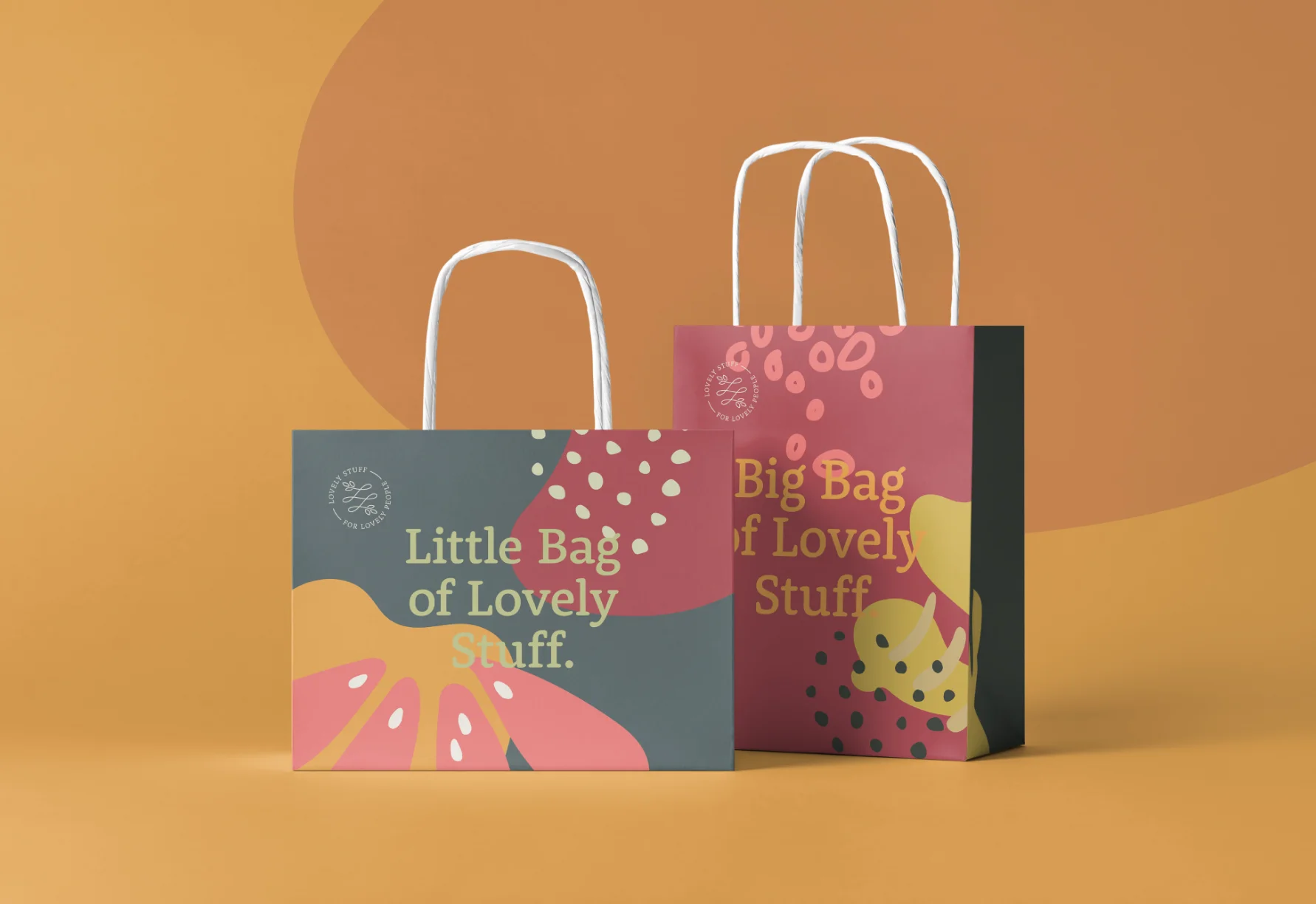
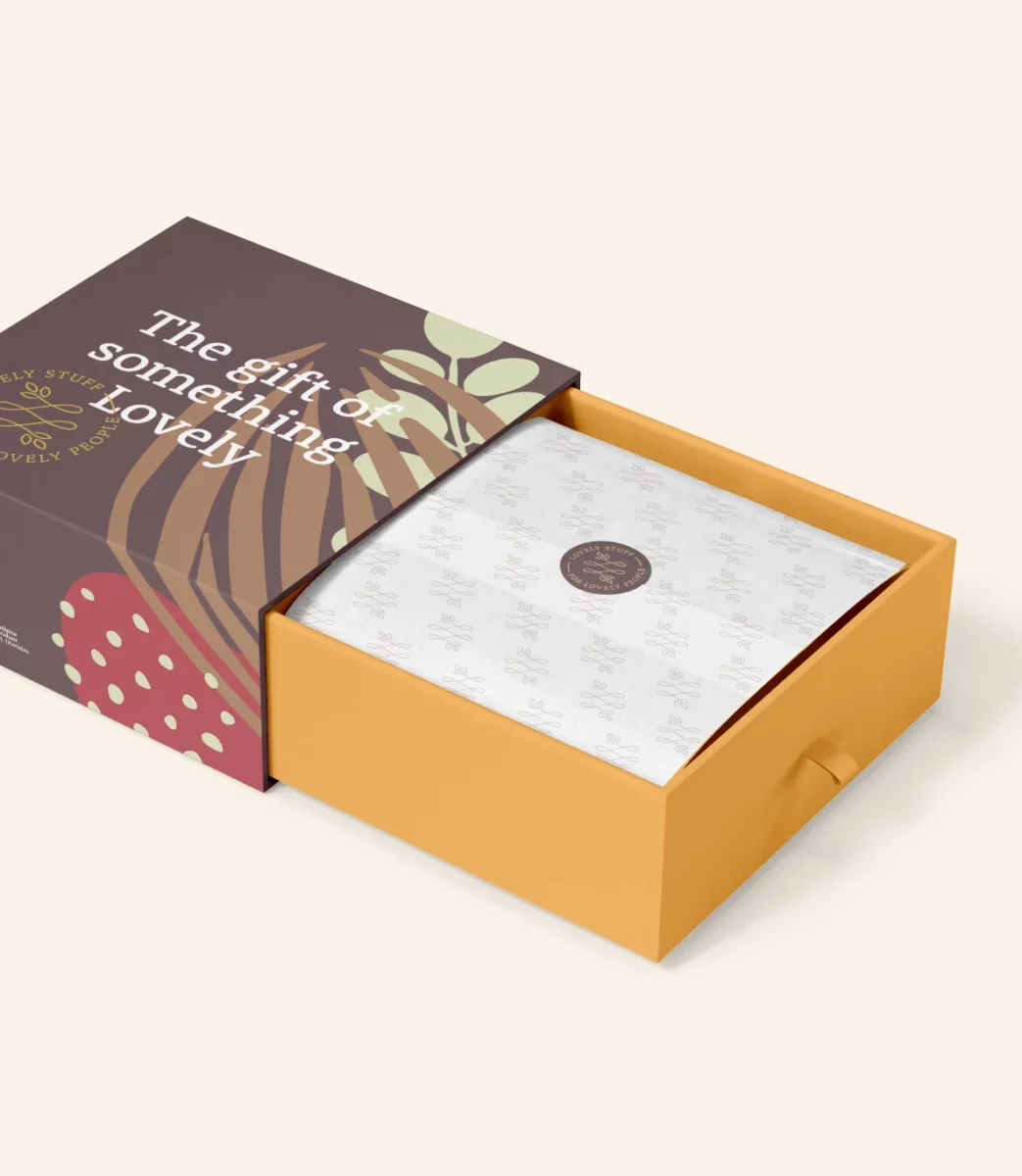
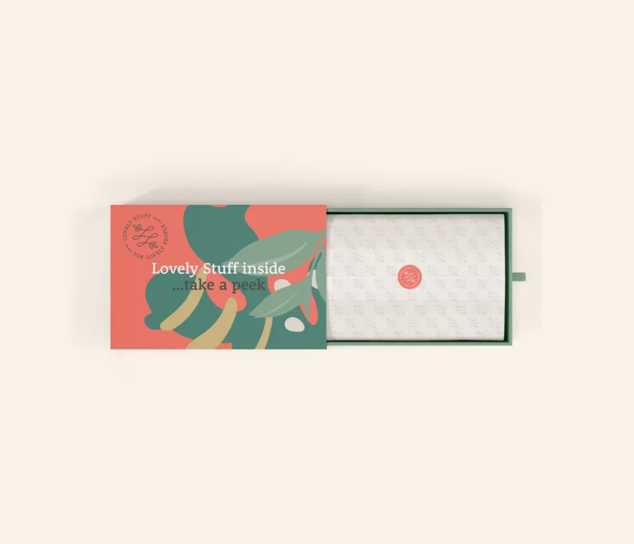
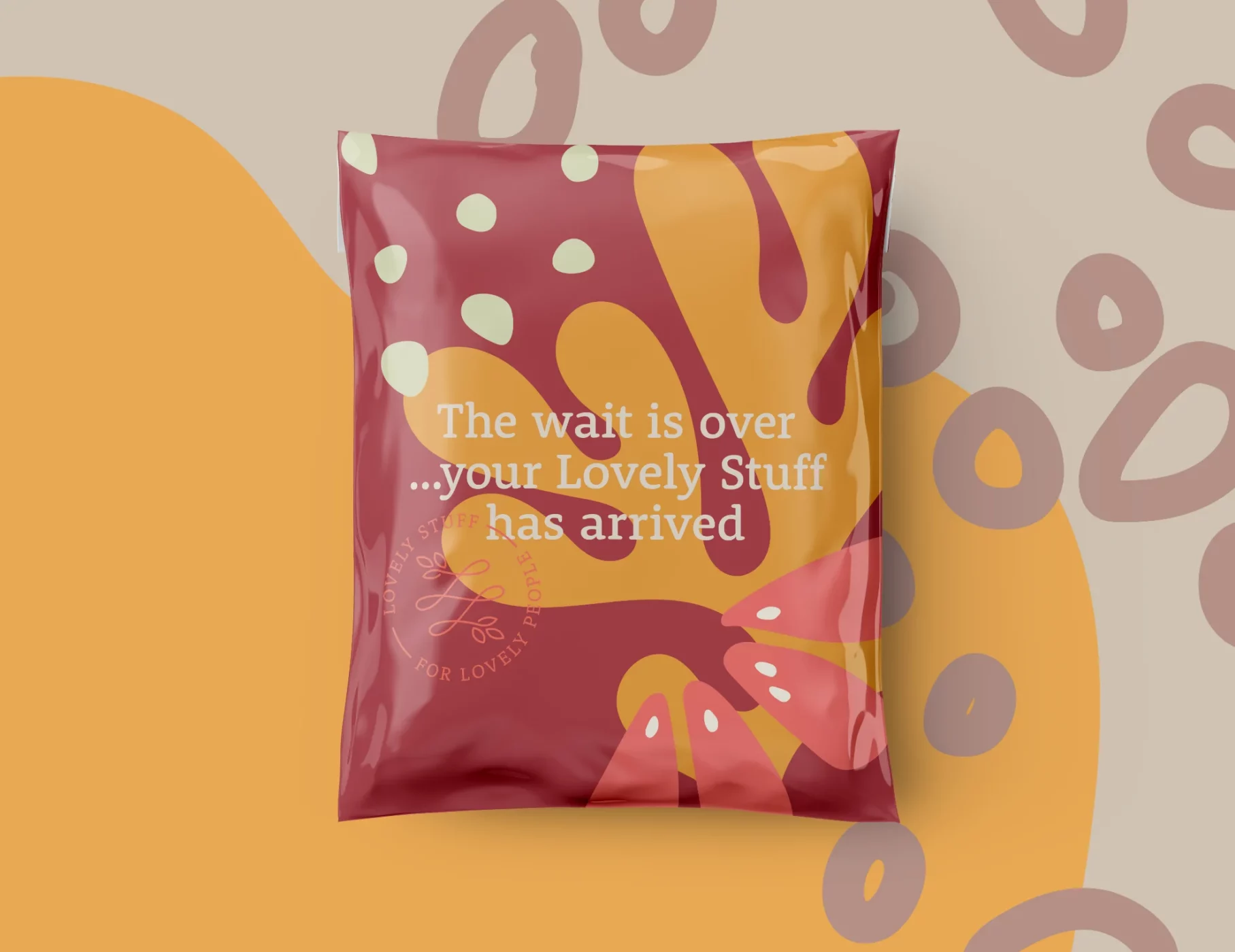
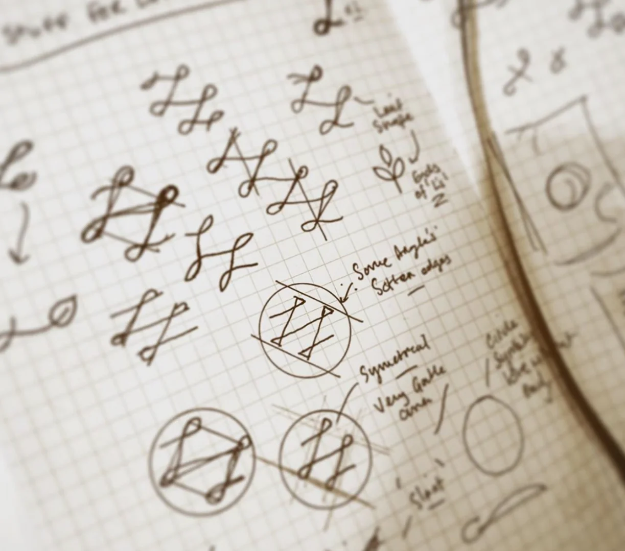
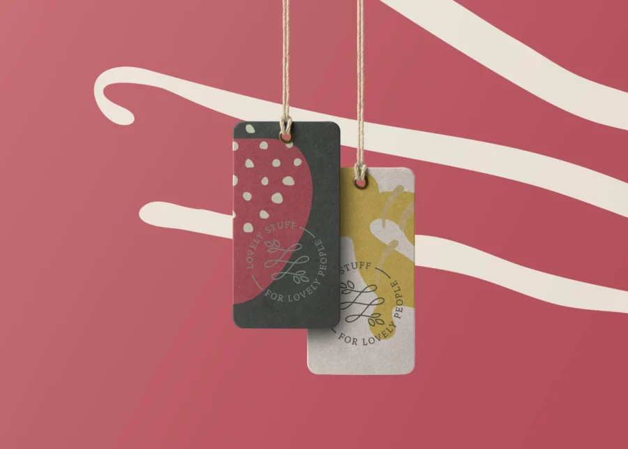
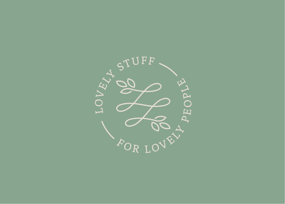
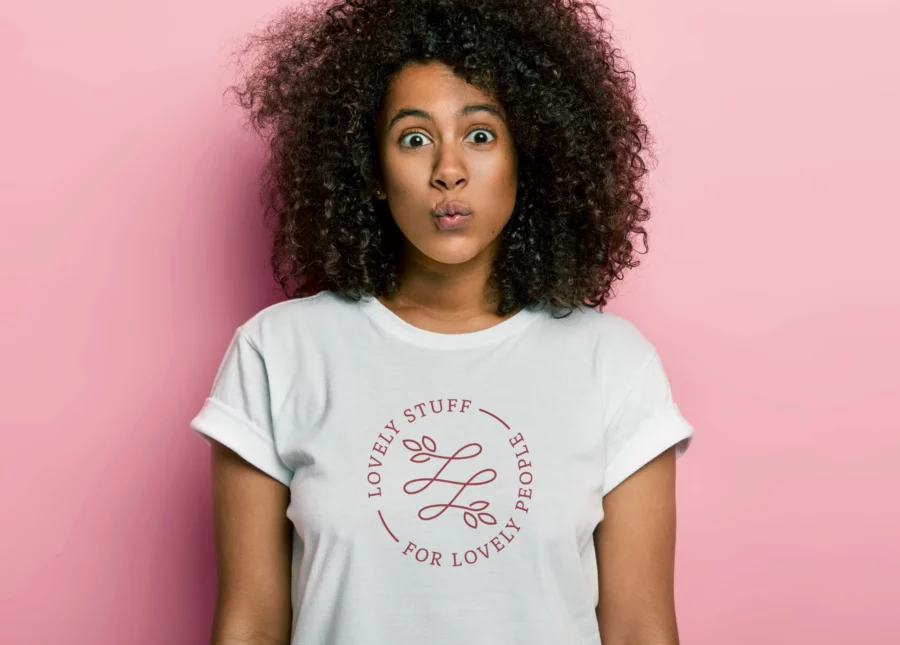
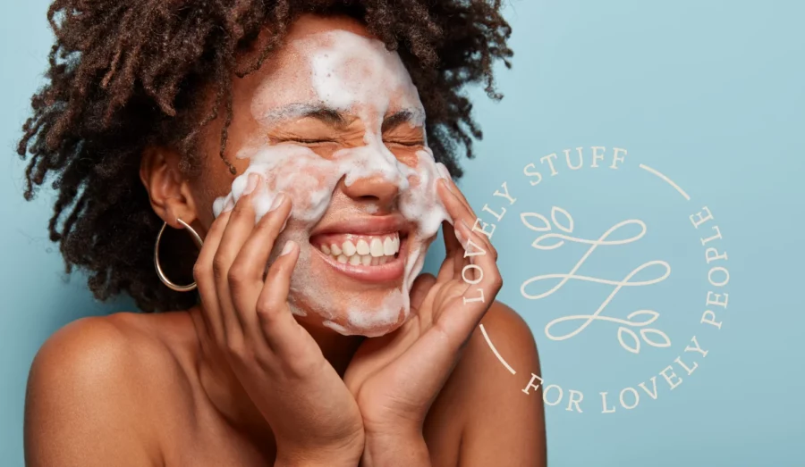
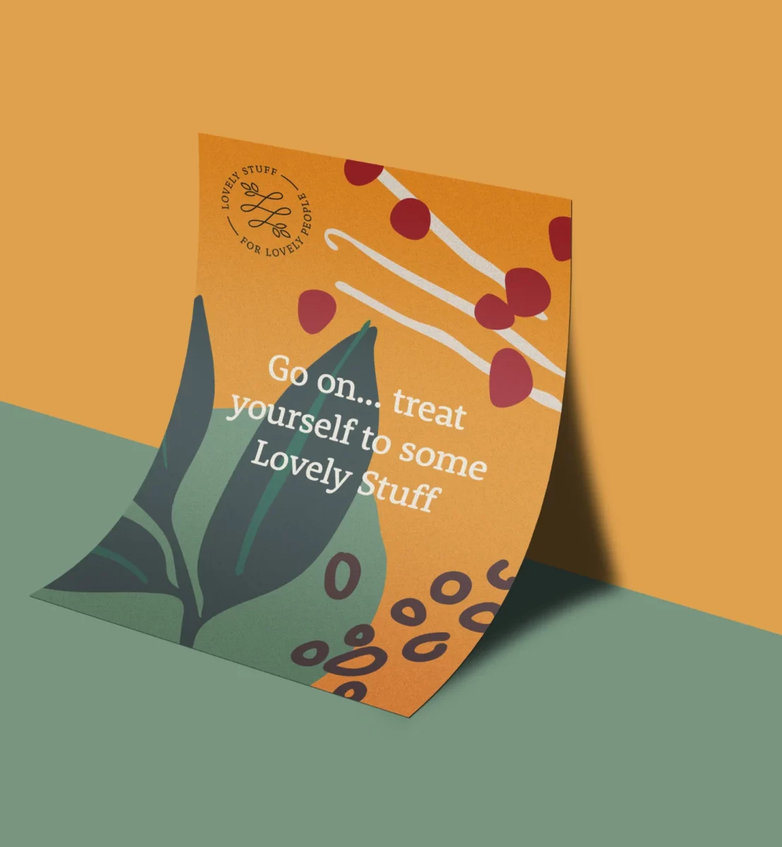
The logo design incorporates the two ‘L’s linked to create a unique mark representing Lovely Stuff & Lovely People. The ends of the mark are finished with simplistic leaf/plant shapes to symbolise the natural products that Lindsey sells. And finally, the logo was purposely designed in the form of a circle to express unity, love & community to represent her lovely group of loyal customers. The overall personality of the logo feels natural, friendly & feminine, which appeals to Lindsey’s customers.
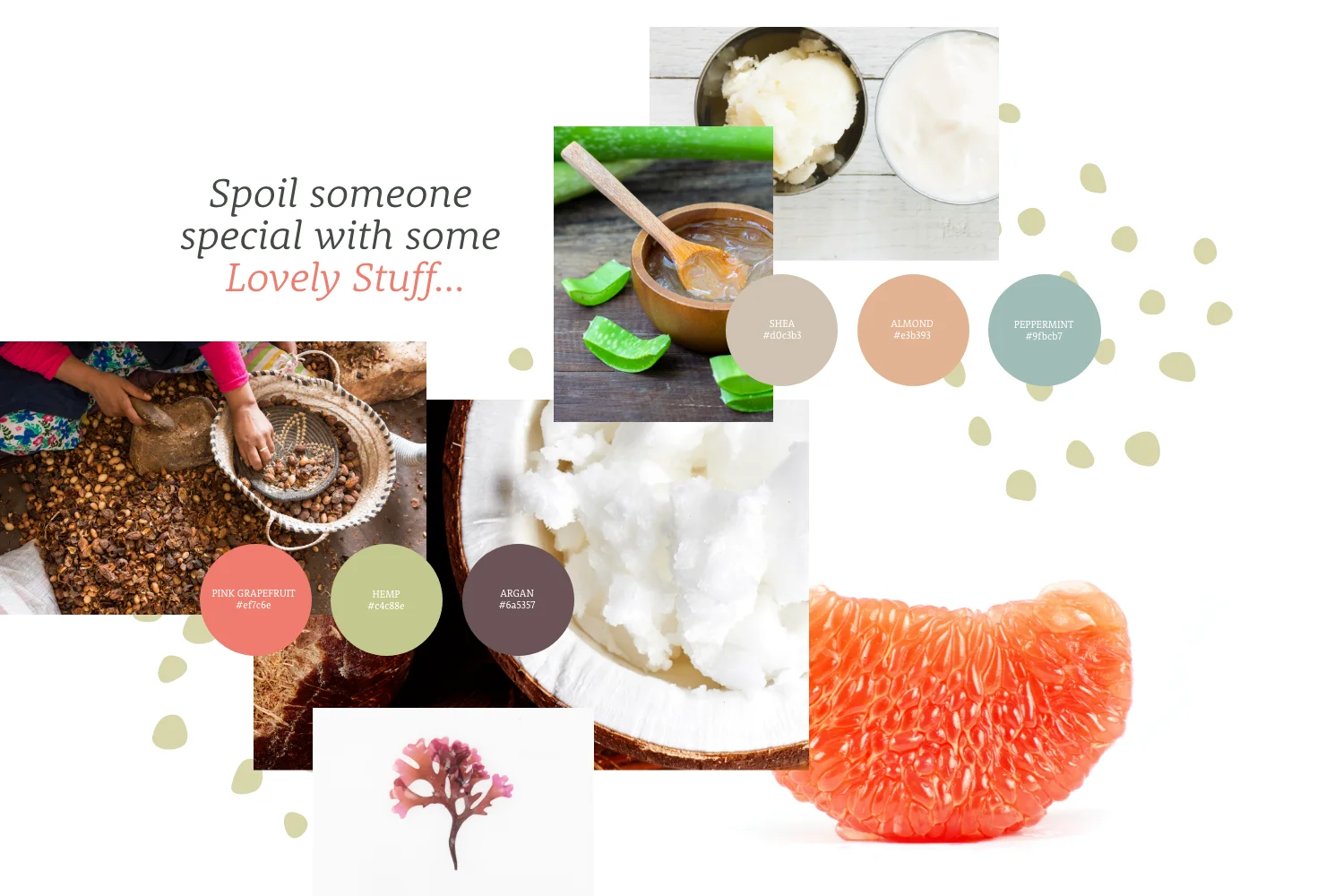
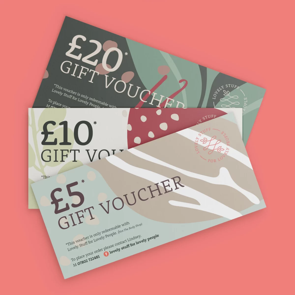
After designing the logo, I developed an identity that reflected herself and the products. An extensive colour palette was created that ties nicely into the main ingredients that go into making the products, for example, Argan, Mango and Pink Grapefruit, to name just three. I then took this one step further and designed illustrations for each of the 16 colours and ingredients; this gave a great library of assets to play with when developing the bags, vouchers and mailers Lindsey needed to kickstart the new brand. The elements created have been left flexible in choosing whichever shapes or colours we want. The whole purpose of this brand identity is to create fresh, natural imagery while having total flexibility and fun.