Personal Training is all about staying motivated, getting the results you want in a realistic time frame. At Harrogate Fitness Formula, they recognise that every client is an individual and appreciate that every client requires a bespoke programme to achieve their personal goals.
As well as not having any confidence in his current identity, Andy didn’t think that the generic logo he currently owned accurately represented the bespoke and individual services he offered. To reflect this, I was asked to develop a logo and a standout brand identity that was much more bespoke.
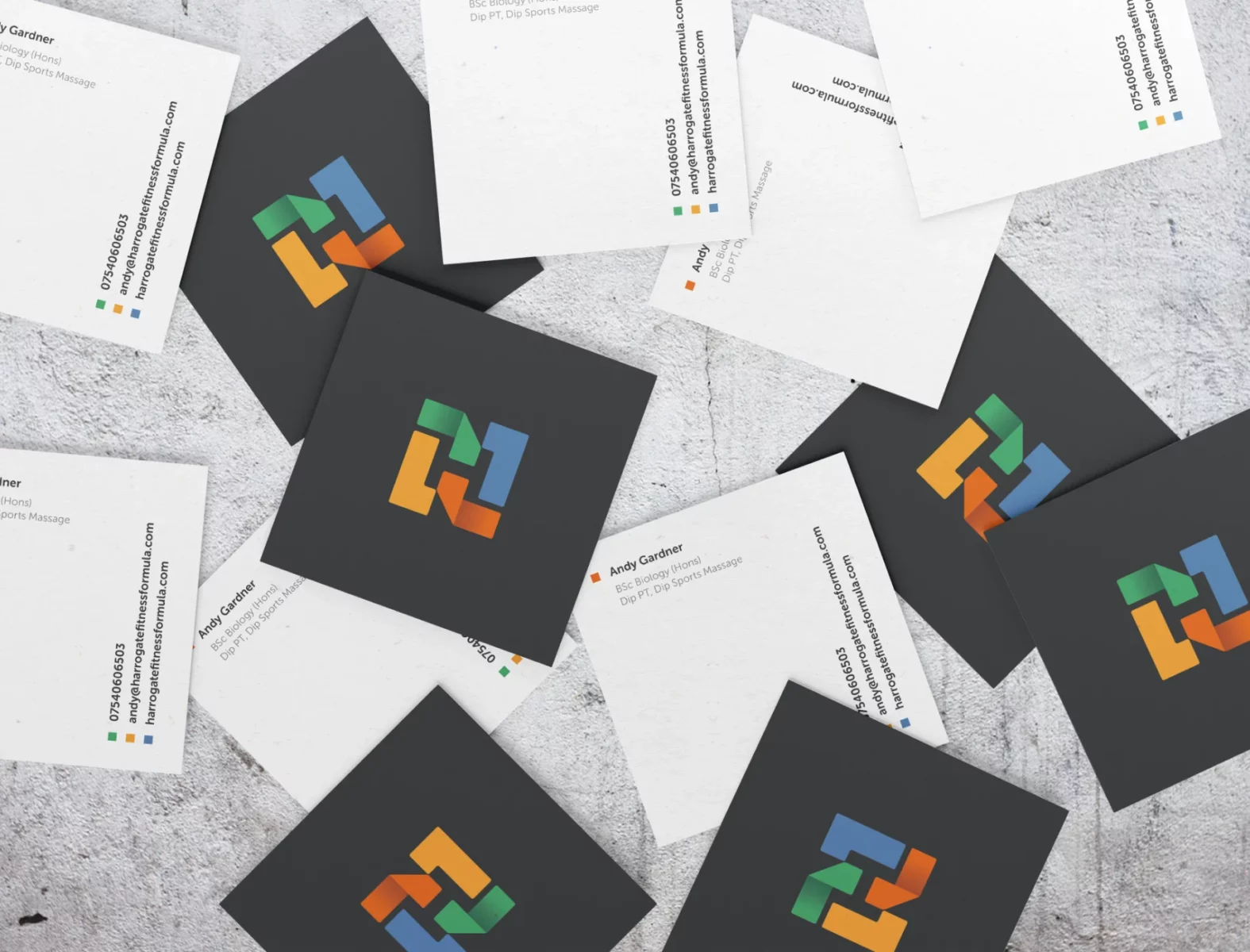
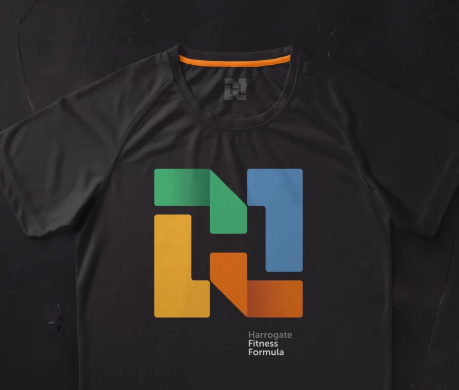
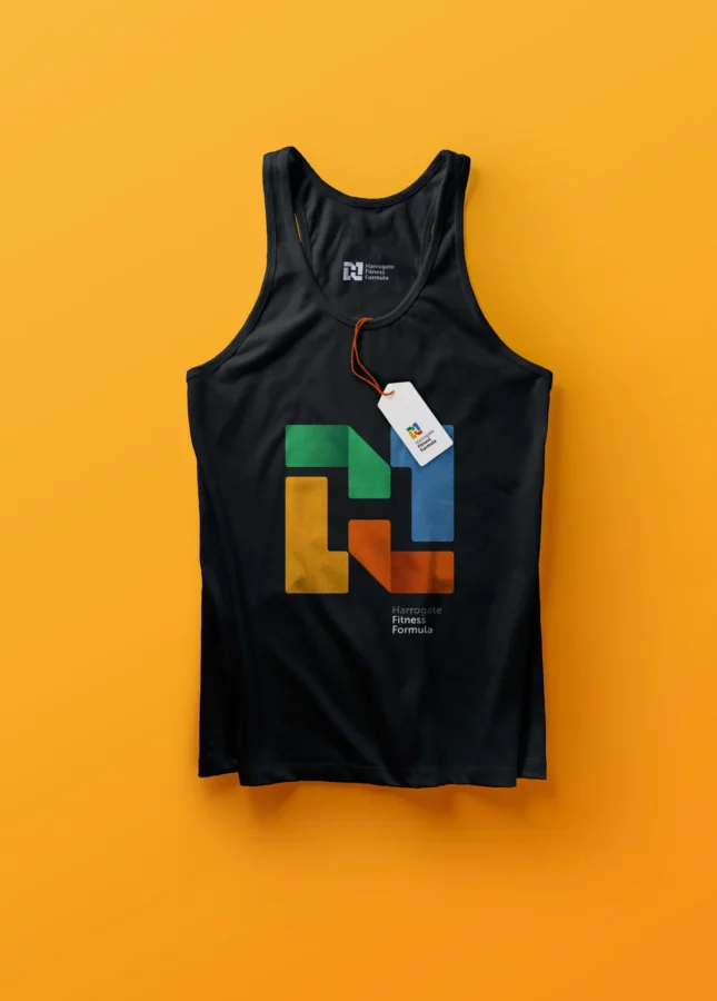
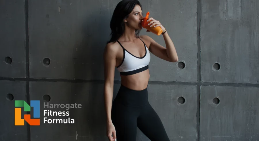

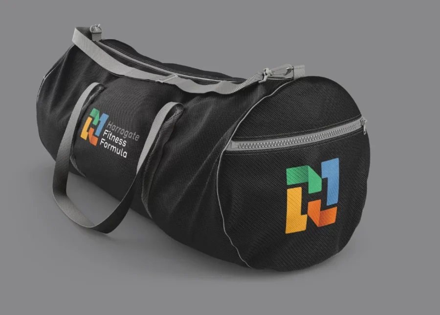
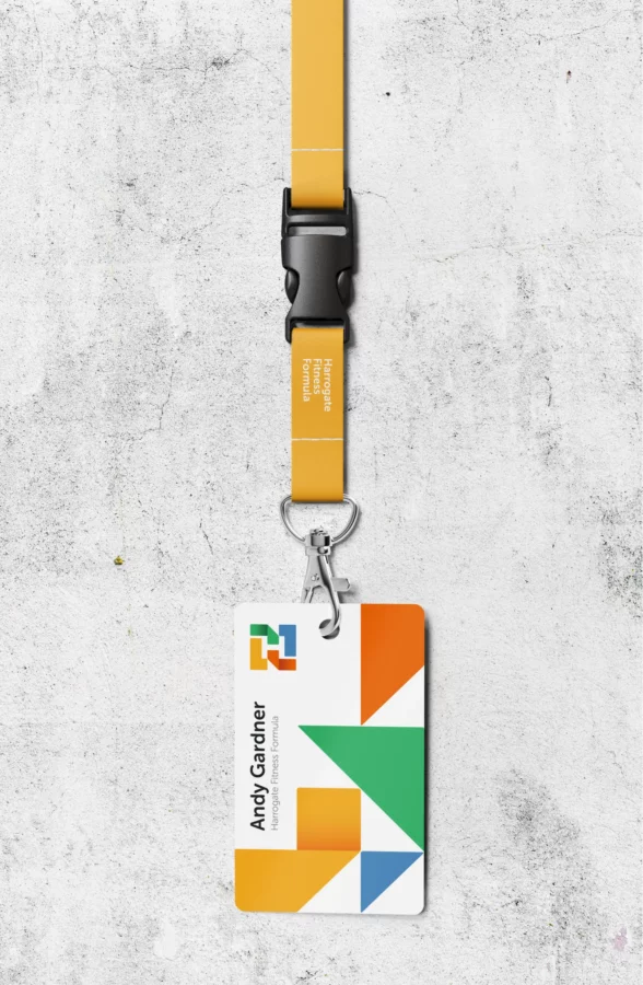
I created an identity system that was very simple in construction to give me total flexibility over any application.
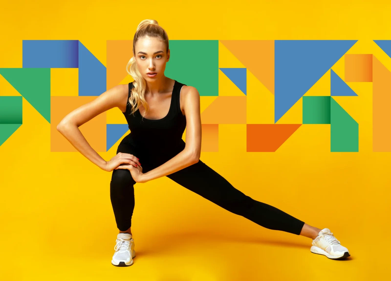
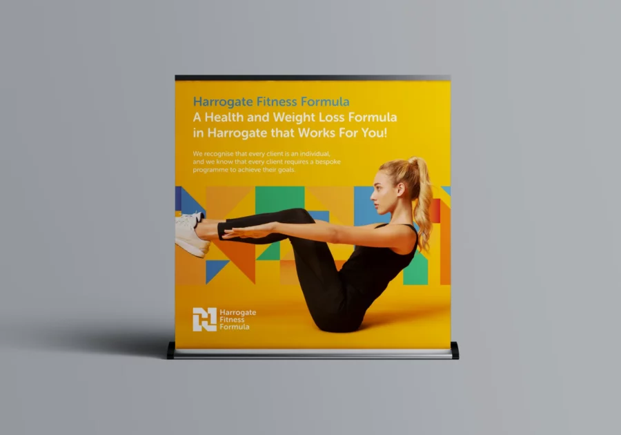
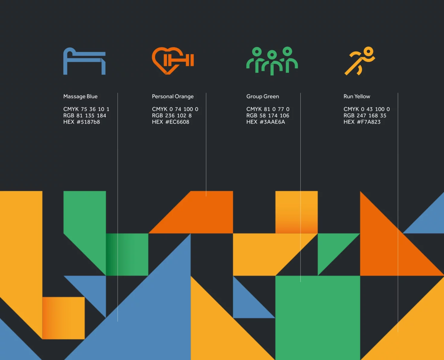
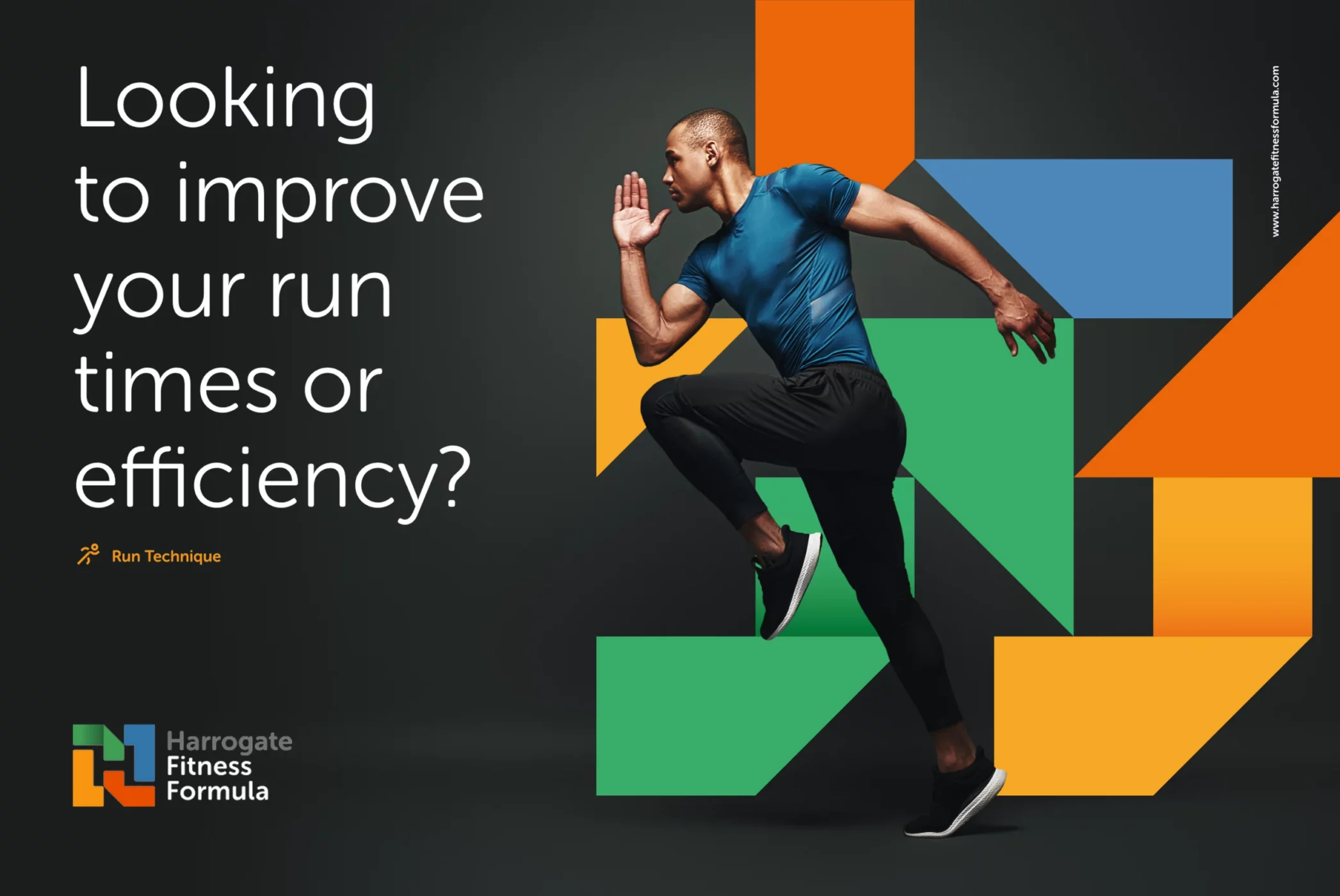
With Andy’s new identity, I wanted it to be bright, vivid and better reflect the four primary services he offers; personal training, run technique, group training & sports massage.
“Richard at Rebus listened to the brief and produced a brand that has given me the confidence to project myself to the clients I aspire to work with”.
Rachel Auty, Head of Communications Harrogate Theatre
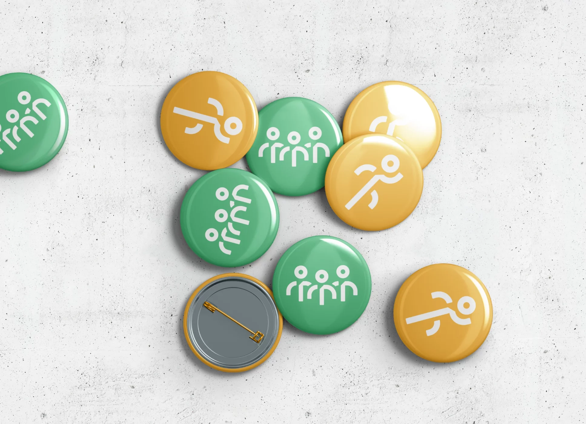
The final result was a resounding success. I created a new logo that was bright, fun, engaging and energetic, which perfectly captured Andy and the services offered at Harrogate Fitness Formula. Off the back of the new logo, I wanted to create a bold and lively identity that would not fail to get noticed!
I created an identity system that was very simple in its application but very effective. Using only the shapes I made with the logo, I built a library of elements that could be dropped onto a grid and moved around to where they fit best. Different colours within the colour palette could be used depending on the application. This identity was created to be highly flexible so you could have fun with it.