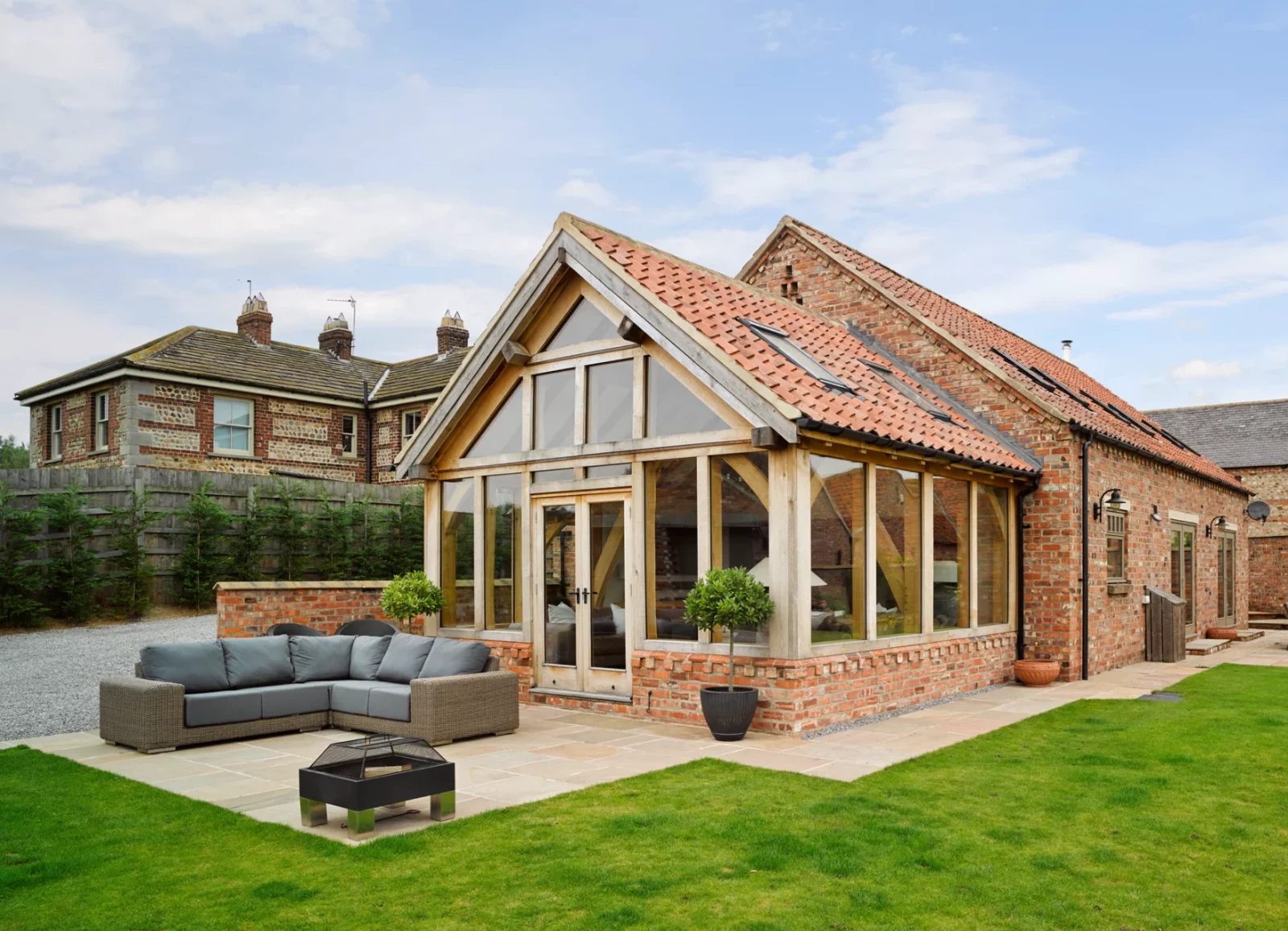
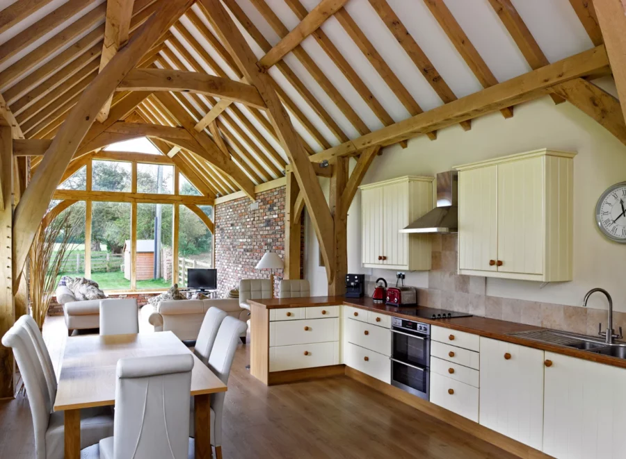
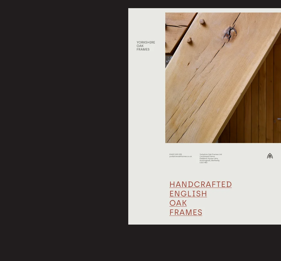
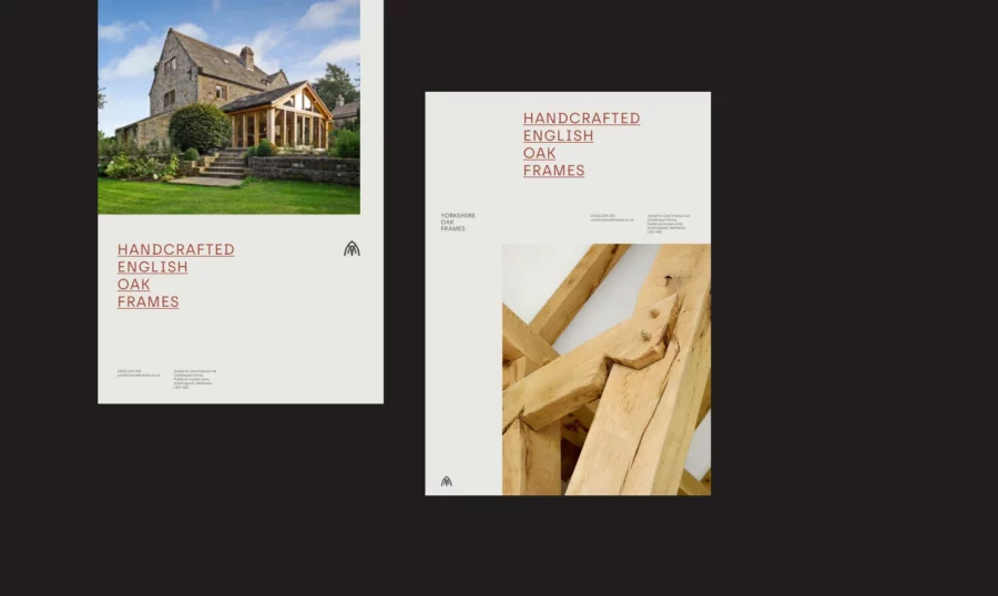
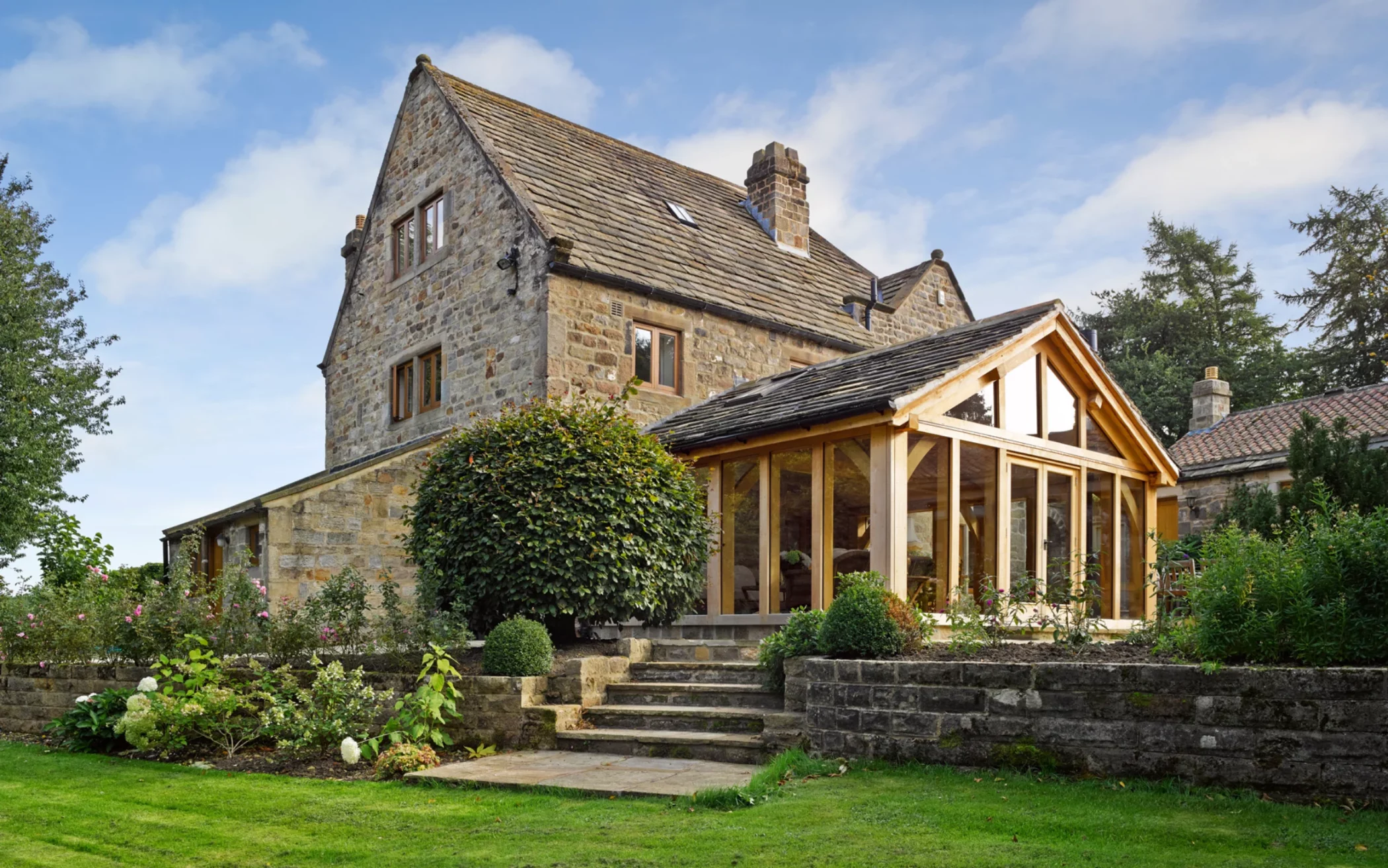
Yorkshire Oak Frames is one of the region’s leading oak frame and structural carpentry specialists, operating to traditional values and proper old-fashioned attention to detail.
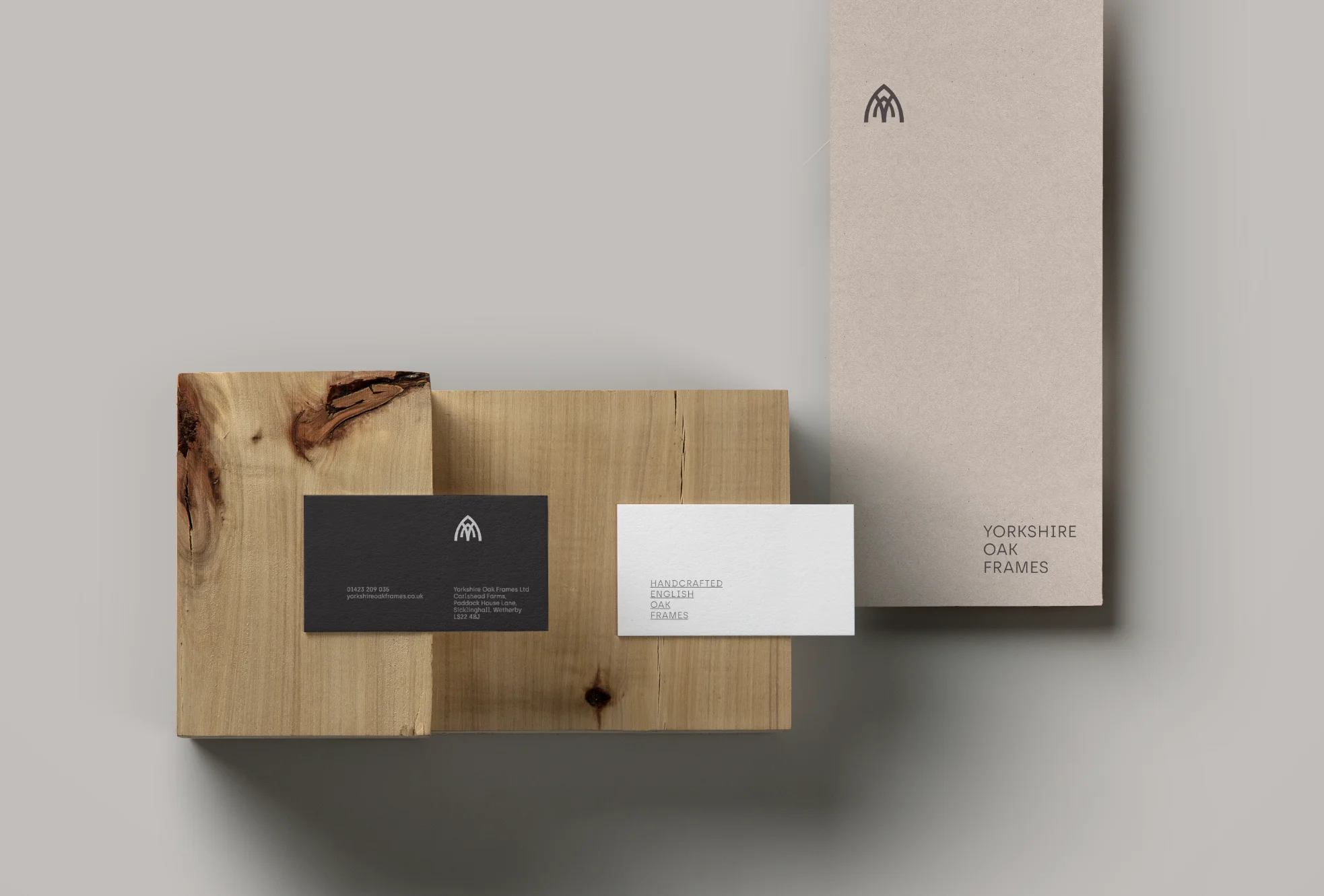
The team at Yorkshire Oak Frames wanted me to capture the essence of the beautiful structures they design and construct through a simplistic logo and communicate the quality of the finished product.
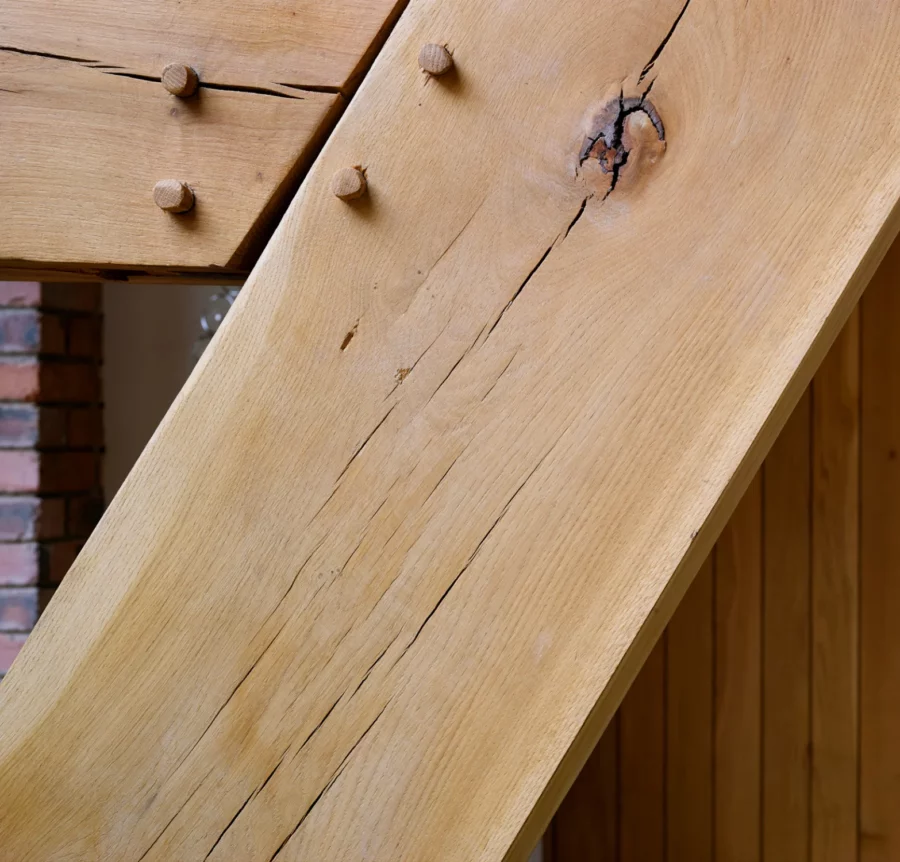
As you can see, my inspiration simply came from the shapes created by the structural framework of their handiwork.
I created a simple mark and identity that reflects and captures the essence of Yorkshire Oak Frames.
“We use Richard at Rebus for his exceptional attention to detail & ability to think outside of the box”.
Adam Walker, Managing Director Yorkshire Oak Frames
I spent some time working on the idea and look of their new logo, which incorporates and exploits the shape and style of traditional roof trusses and timber frames while simultaneously integrating the letter ‘Y’ from Yorkshire. A simple logo that genuinely reflects the essence of what they do, giving them a clean, modern look, with still a touch of traditional as a nod back to the age-old methods still used today to build these beautiful structures.