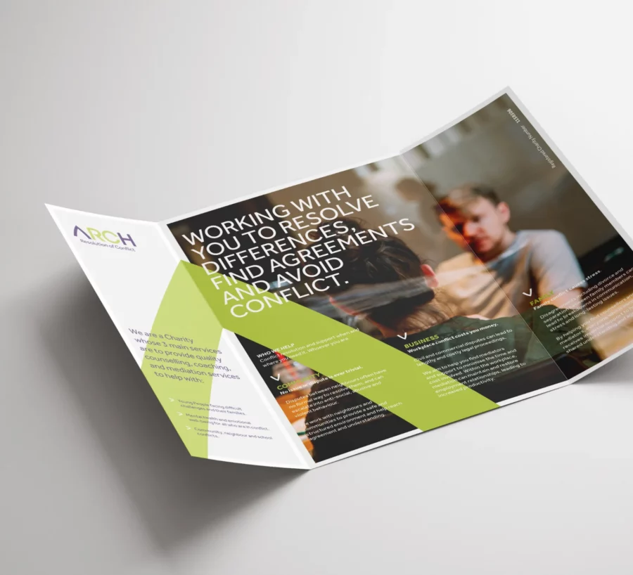
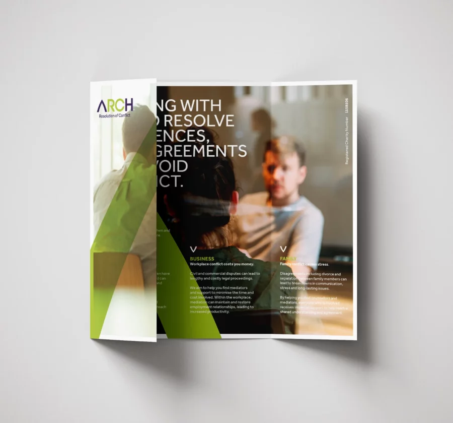
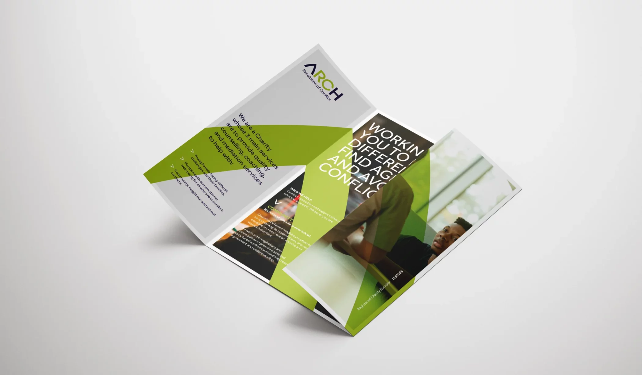
A registered charity whose 3 primary services provide quality counselling, coaching, and mediation services to help: Young people facing complex challenges and their families. Mental health and emotional wellbeing for all who are in conflict. Community, neighbour and school conflicts.
When contacted by ARCH to look at a rebrand for the company, they had an inconsistent, unprofessional image in place. My task was to create something new, modern and professional to replace it.
Although they wanted a professional appearance, they also didn’t want it to look too business-like, as the range of clientele ranges from children and families to large corporate companies.
“Having worked with Richard at Rebus on several occasions, he always comes up with creative solutions to any brief. He is a pleasure to deal with and never fail to impress”.
Caroline Barr, Marketing Consultant Arch Mediation
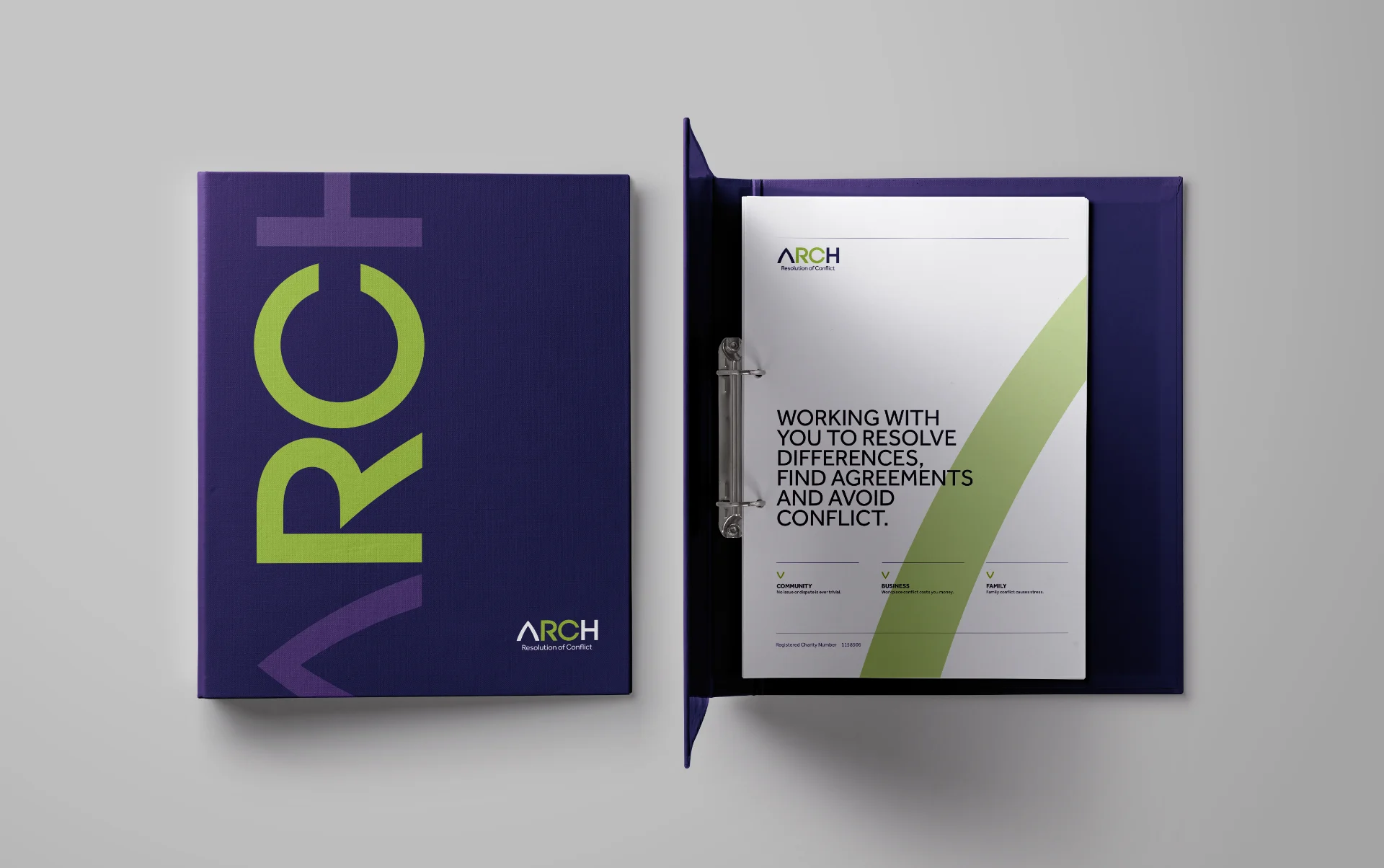
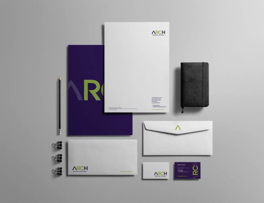
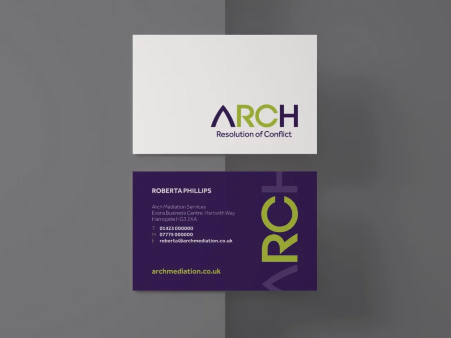
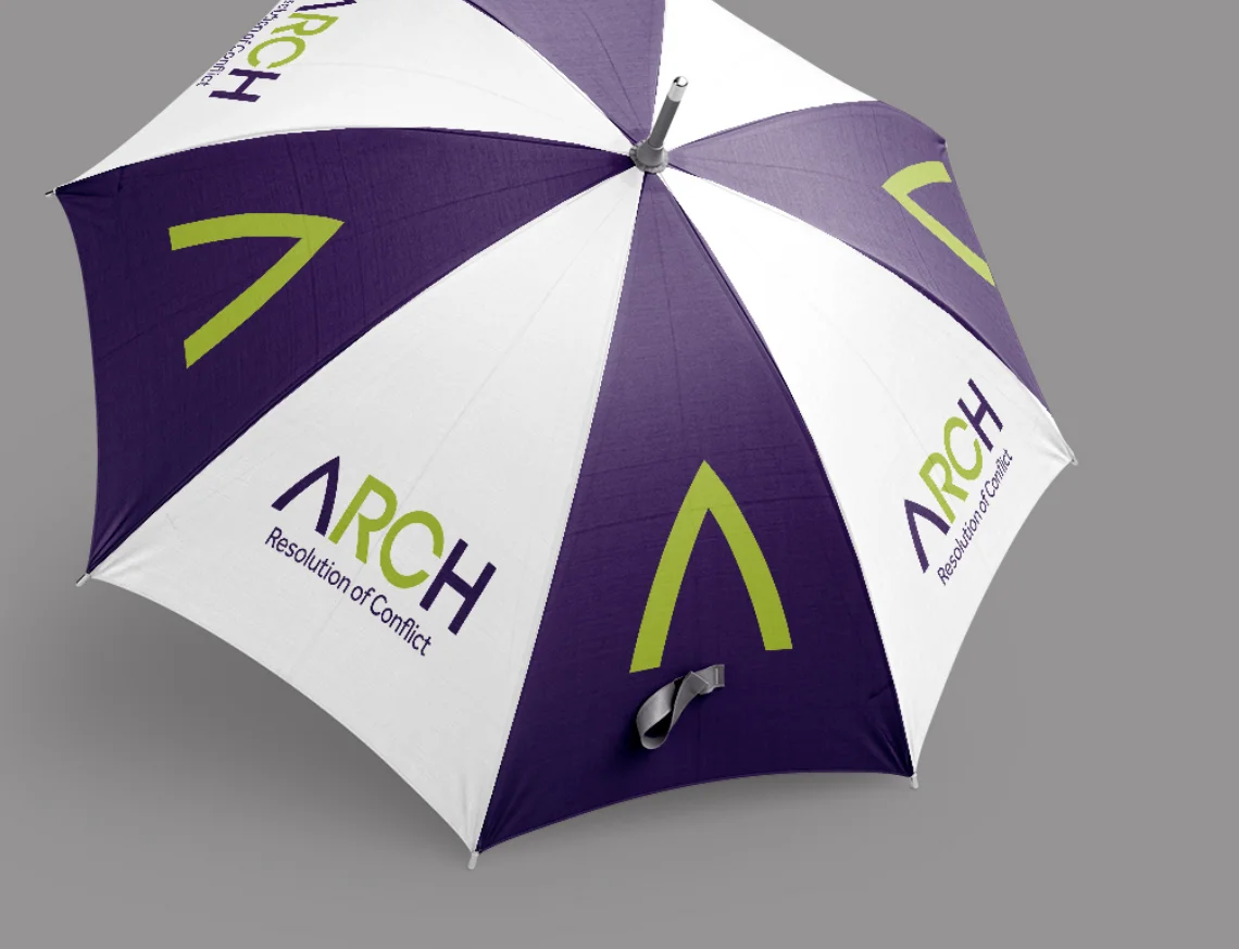
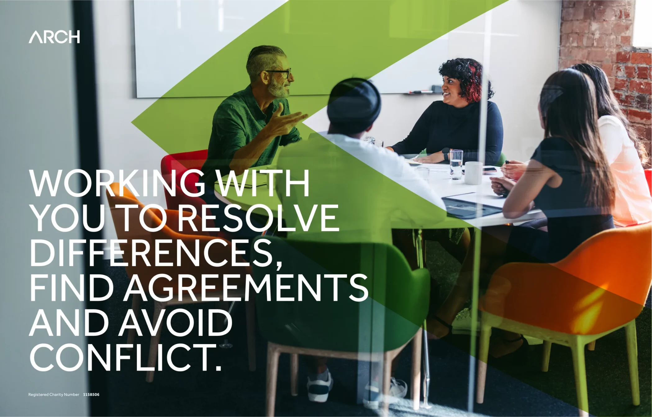
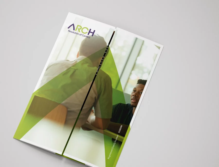
I created a modern, clean, professional identity for ARCH by initially designing the new logo using bespoke hand-drawn lettering to make the iconic letter ‘A’ to represent strength, sturdiness and the ability to carry enormous weight. The arch also symbolises openness and a gateway or path to a new beginning, perfect for a company wanting to resolve differences and avoid conflicts.
The iconic ‘A’ shape created has become the responsive mark of the company. The new purple & green colour palette makes it less corporate and more approachable and memorable.