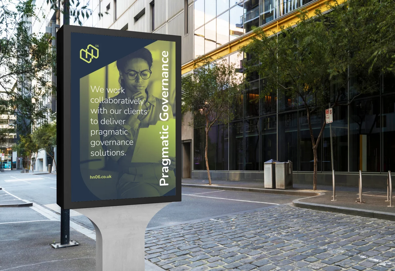
HN06 Limited works collaboratively with its clients to deliver pragmatic governance solutions.
I was contacted by Husband & Wife team, Helen and Nathan to help them create a new logo and identity for their new business HN06, offering pragmatic governance solutions. They did not want to give the impression of being a large corporate, instead, wanted to deliver a more approachable and individual experience as they intended to keep the business small and about them and their personal skills. Because of this the couple decided to name the new business HN06, after their initials and the year they were married, and they somehow wanted this to be reflected in the logo.
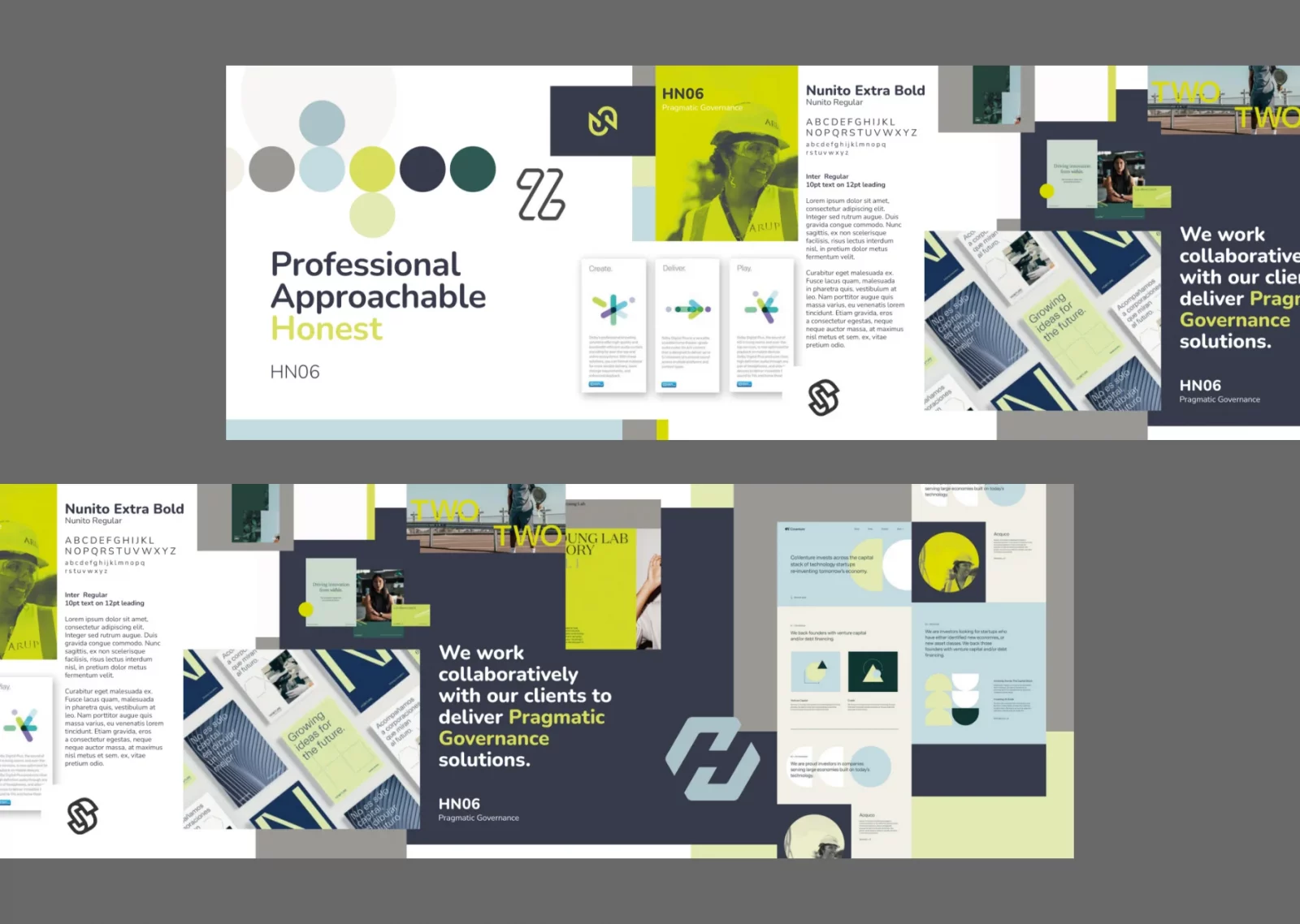
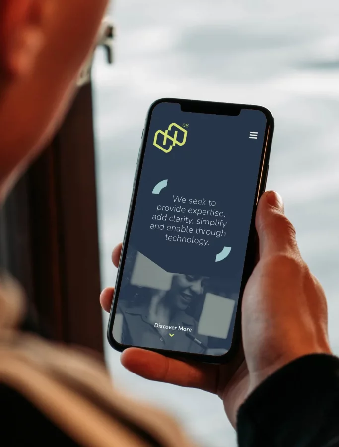
The logo was created by combining the letter N and the letter H to represent the two Directors and married couple, Helen & Nathan, coming together to make ‘HN’. The ’06’ represents the year they were married, and finally the logo is designed using a connected line representing continuity, togetherness and collaboration.

“As we set up our new consultancy business, we knew having a strong, recognisable brand was essential. Richard worked with us to establish what identity and values our brand needed to convey. Following this, he presented us with options regarding typeface, colour palette and messaging, from which we chose the elements we liked. Richard then developed a suite of assets, including logos, social media banners, PowerPoint and letterhead templates, business cards and icons.
We were thrilled with the brand identity he developed and found him very easy to work with. We would definitely work with him again”.
Helen & Nathan Baker, Directors HN06
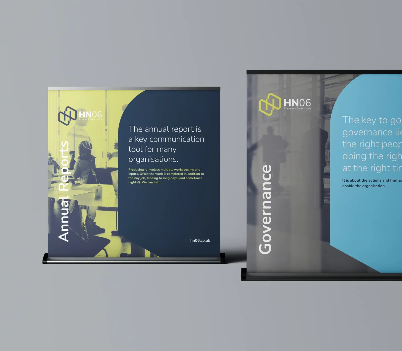
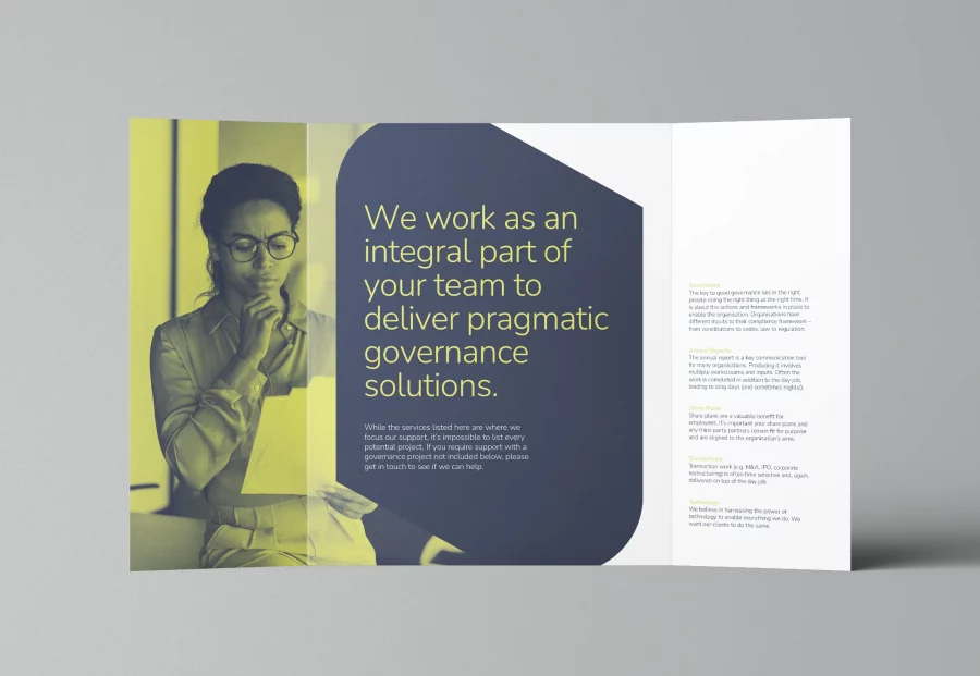
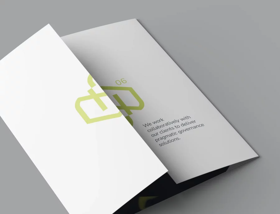

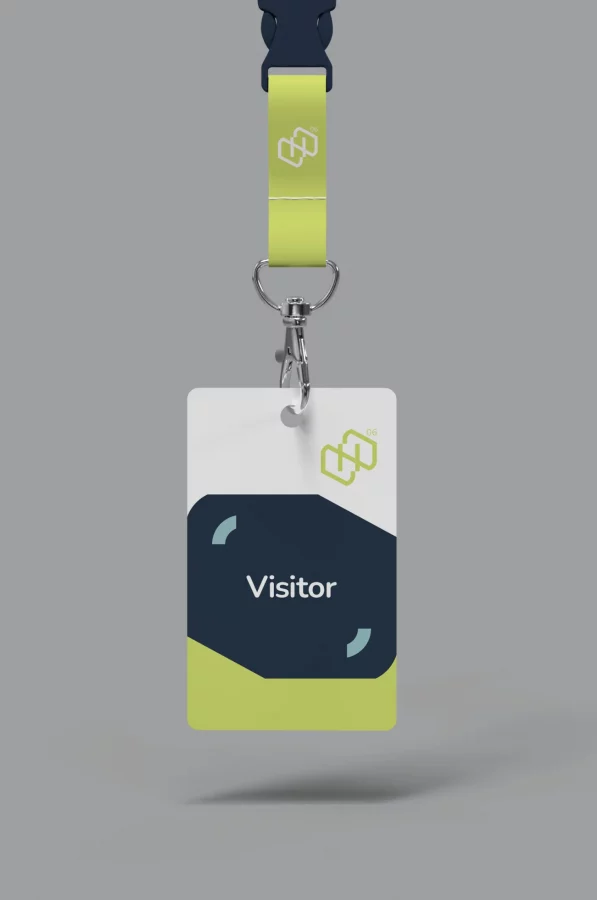
The result is a simple, clean and modern identity that is flexible enough, using the individual shapes devised from the new logo to a adapt to any application. The overall look and feel is one that still sits well within their corporate world, but by using a very different colour palette and application of imagery to any of their competitors, it definitely gives them a unique and identifiable brand.
