Started by founders Toni and Mark Kitchen, Positiply is a ‘positive only’ website on a mission to help repair society starting in their home town of Harrogate. They know that’s a big statement, but why not start big? There is so much hate in the world today, from negative posts on social media to vile hate speech. Toni and Mark want to change that and create a tool that could fill the world with love and kindness instead. Positiply is for ‘social good’; it’s a place where you can safely praise others, knowing that your kind words make the person feel valued, appreciated and empowered.
During Lockdown V1.0, Toni and Mark, with their girls, all stood out on the doorstep clapping for the NHS, but what about the care home workers, retail workers, bus drivers and everyone else that had to carry on and put their lives in danger to keep the country running?
They wanted a website that would be a safe place for members of the public to say Thank You! Not only to the Key Workers but also essential workers in hospitality, non-food retail, beauty, events and many more. They were losing their jobs, careers, and self-worth, not to mention the much-needed tip income. But first, Toni and Mark needed an identity that reflected the positivity of their new venture.


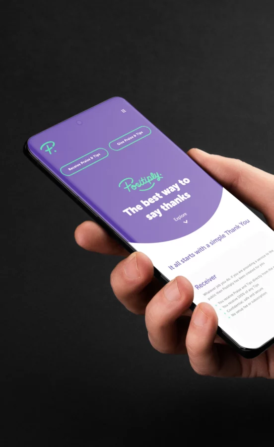
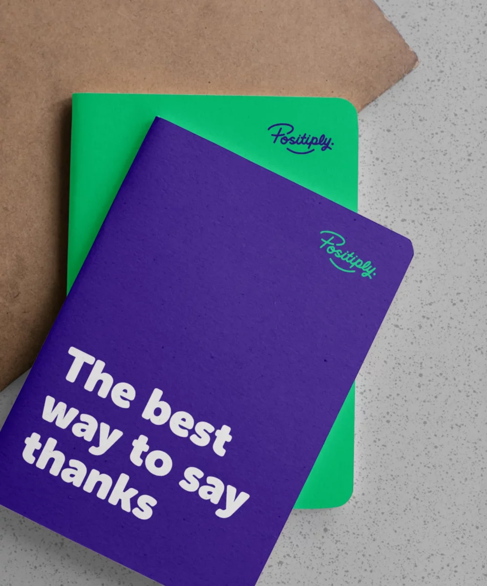
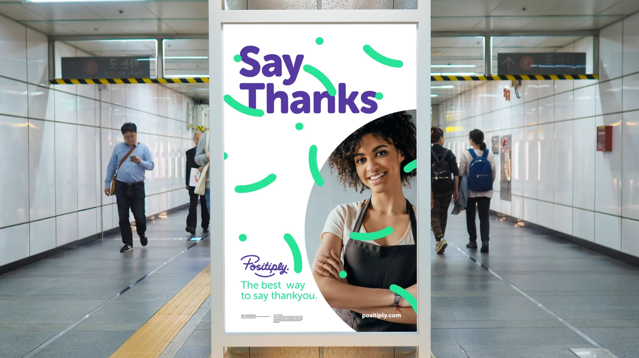
With Positiply being a website to leave tips and praise, I wanted their new identity to have a friendly and cheerful look and somehow have a feeling of celebration. After all, Positiply was born out of a need to thank those key workers and the many more working in hospitality who deserved it.
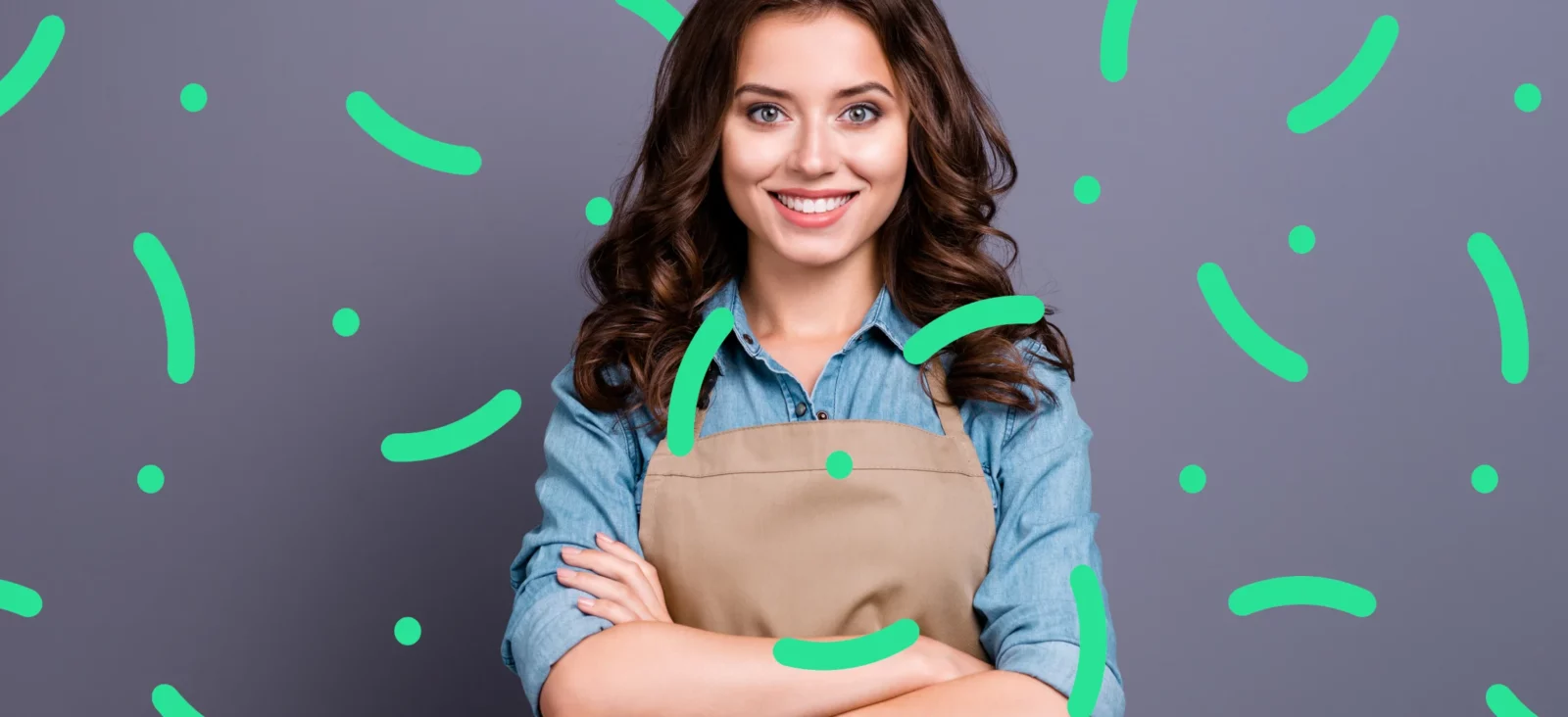
With elements from the new logo, I created an abstract pattern that resembled confetti to symbolise a celebration.
I developed a brand identity that focused on the celebration of saying thank you to the amazing people who deserved it. A simple, effective and most importantly, identifiable graphical elements were designed not only to tie in with the new company logo, but to resemble confetti… traditionally how wedding guests say ‘congratulations’, with a lifetime of luck and happiness.
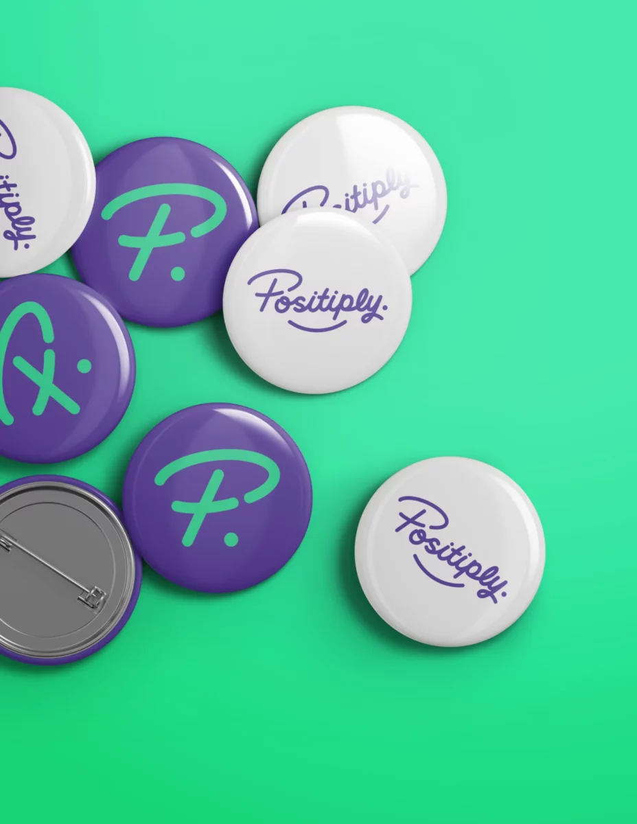
The logo itself was designed to feel like a signature, and represent the individual themselves; the plus symbol was also designed into the P to express the positive only nature of the business. This also helped me make a strong responsive mark.