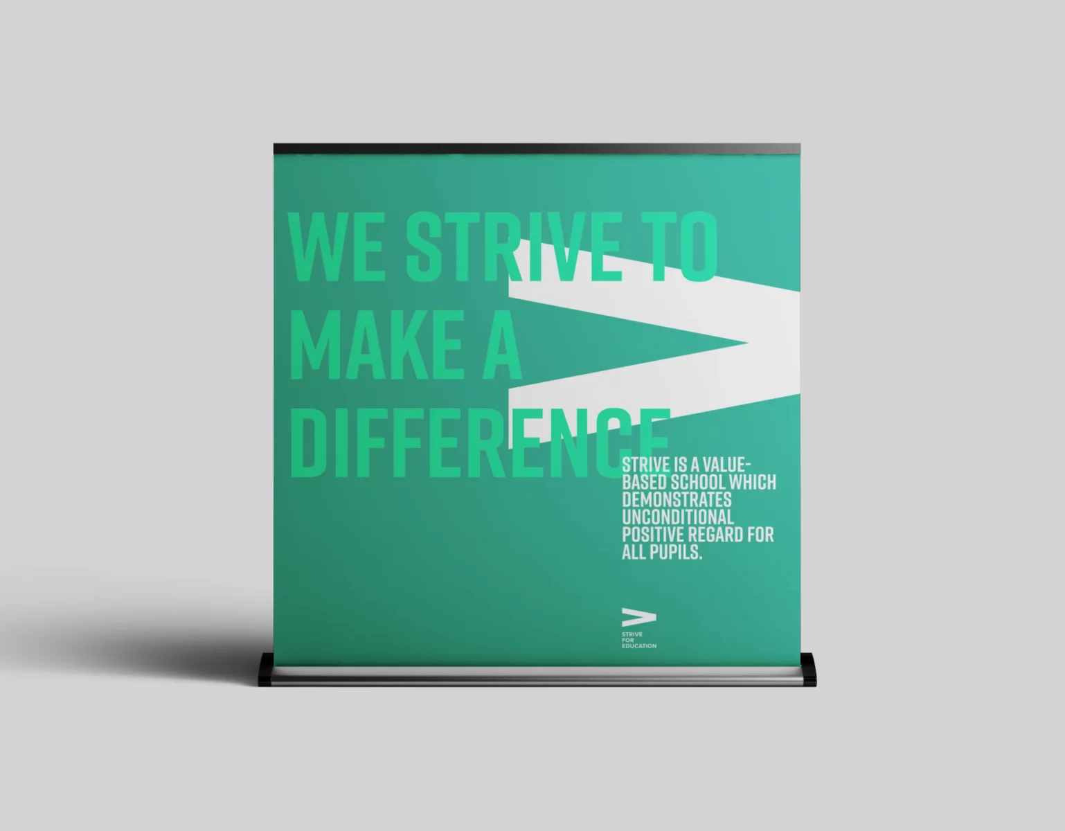
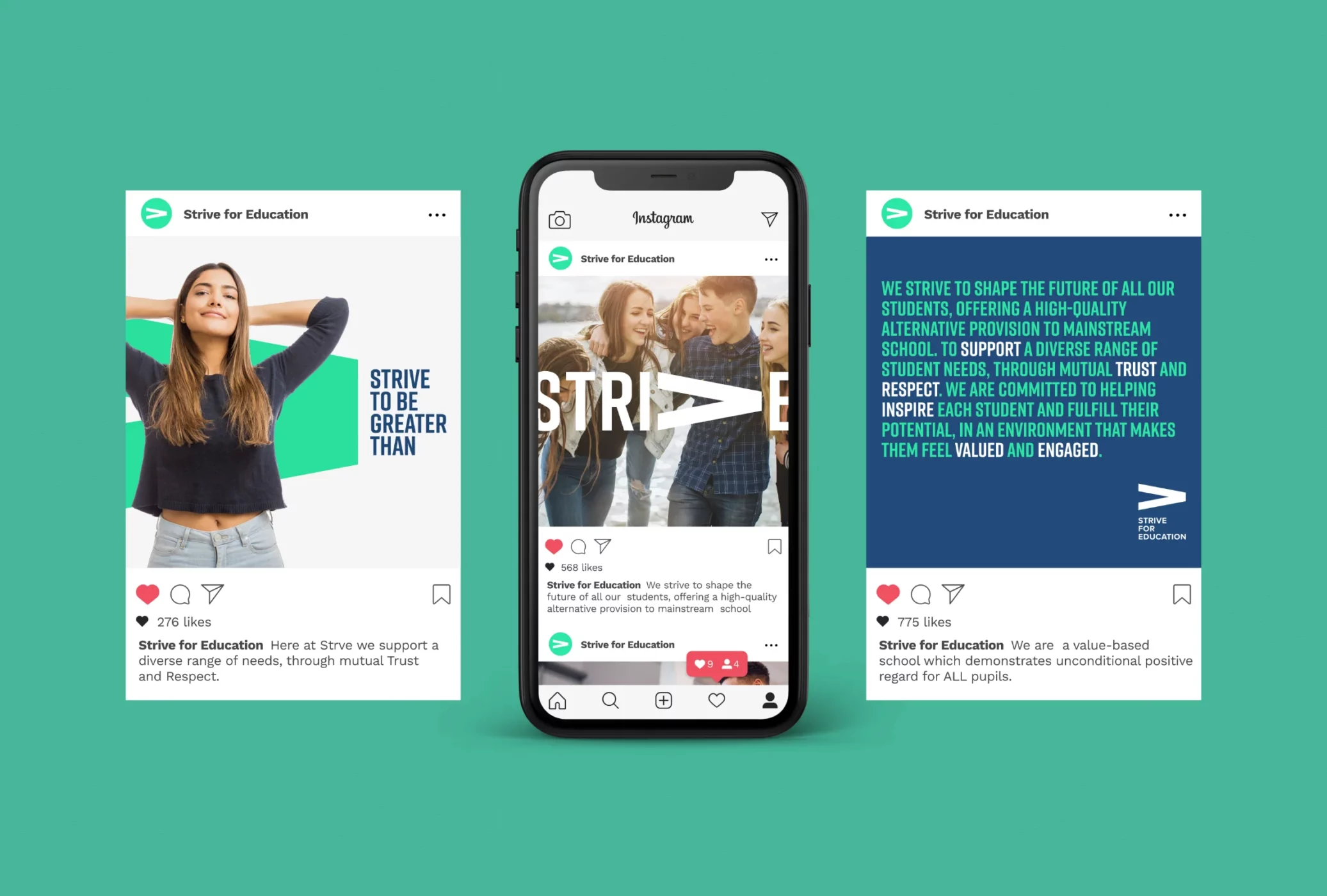
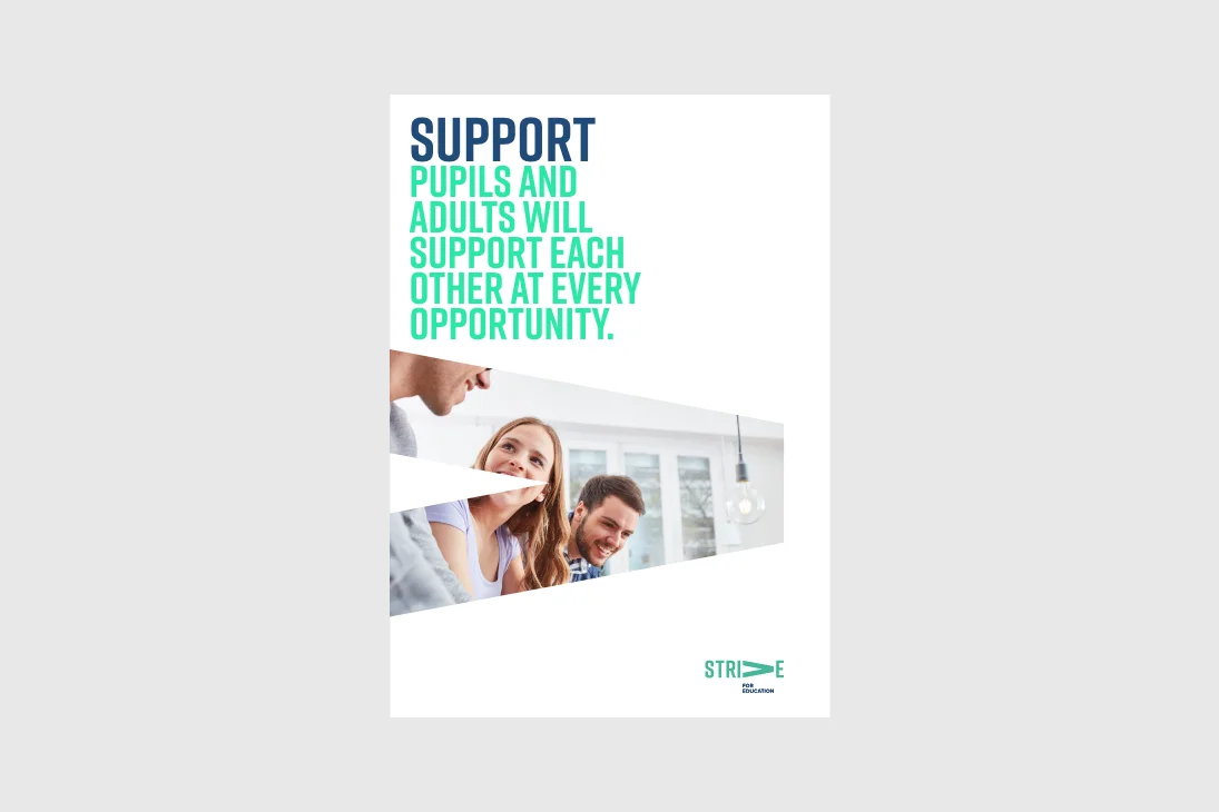
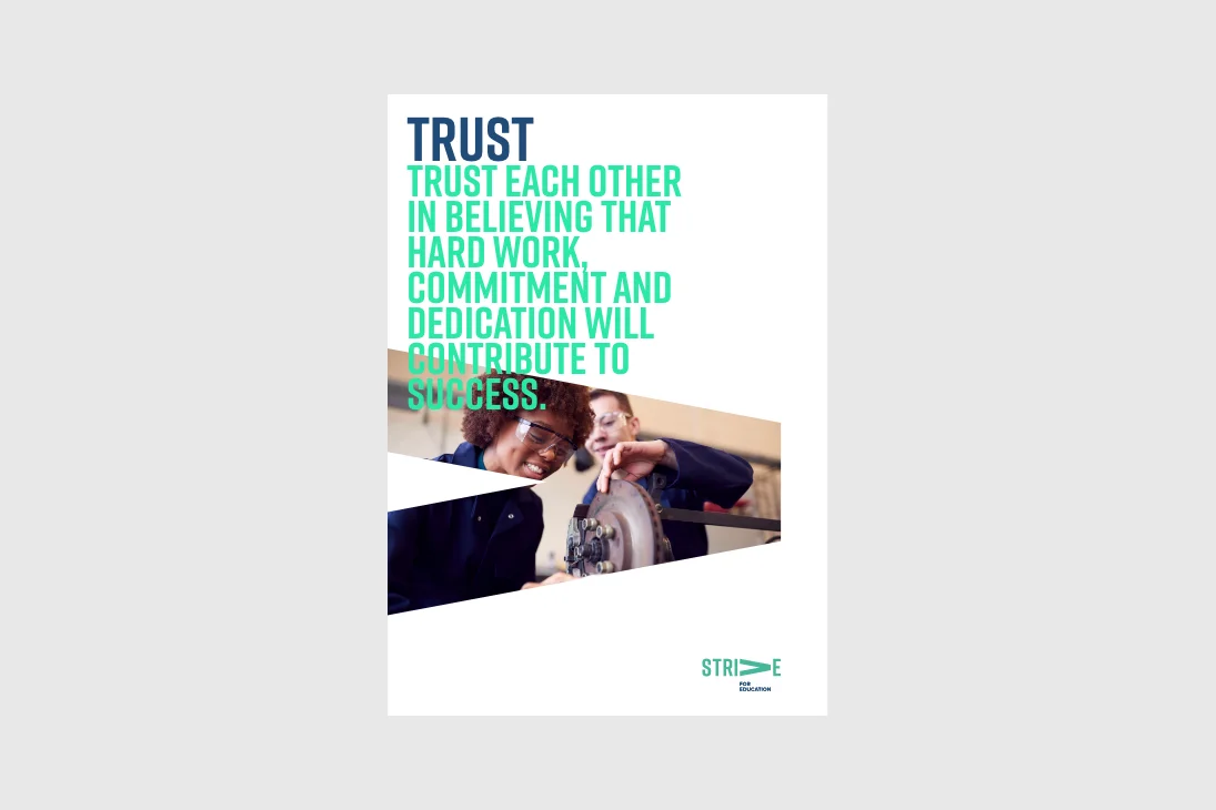
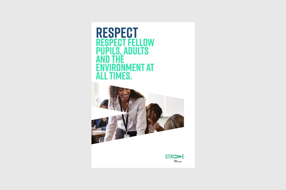
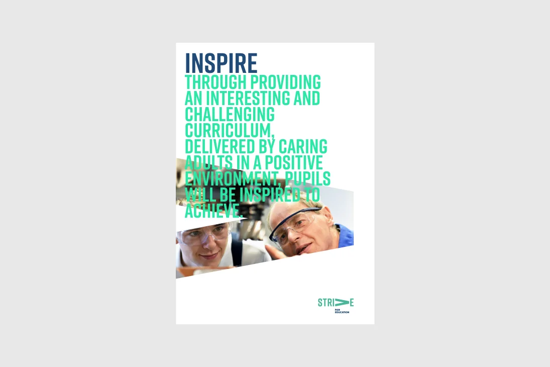
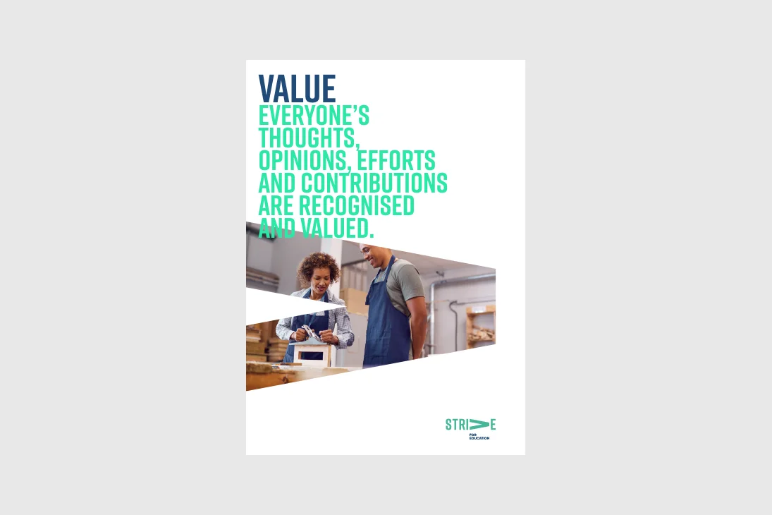
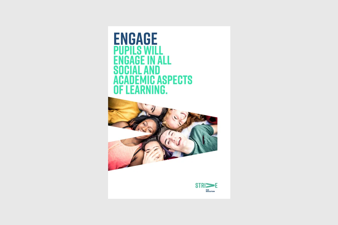
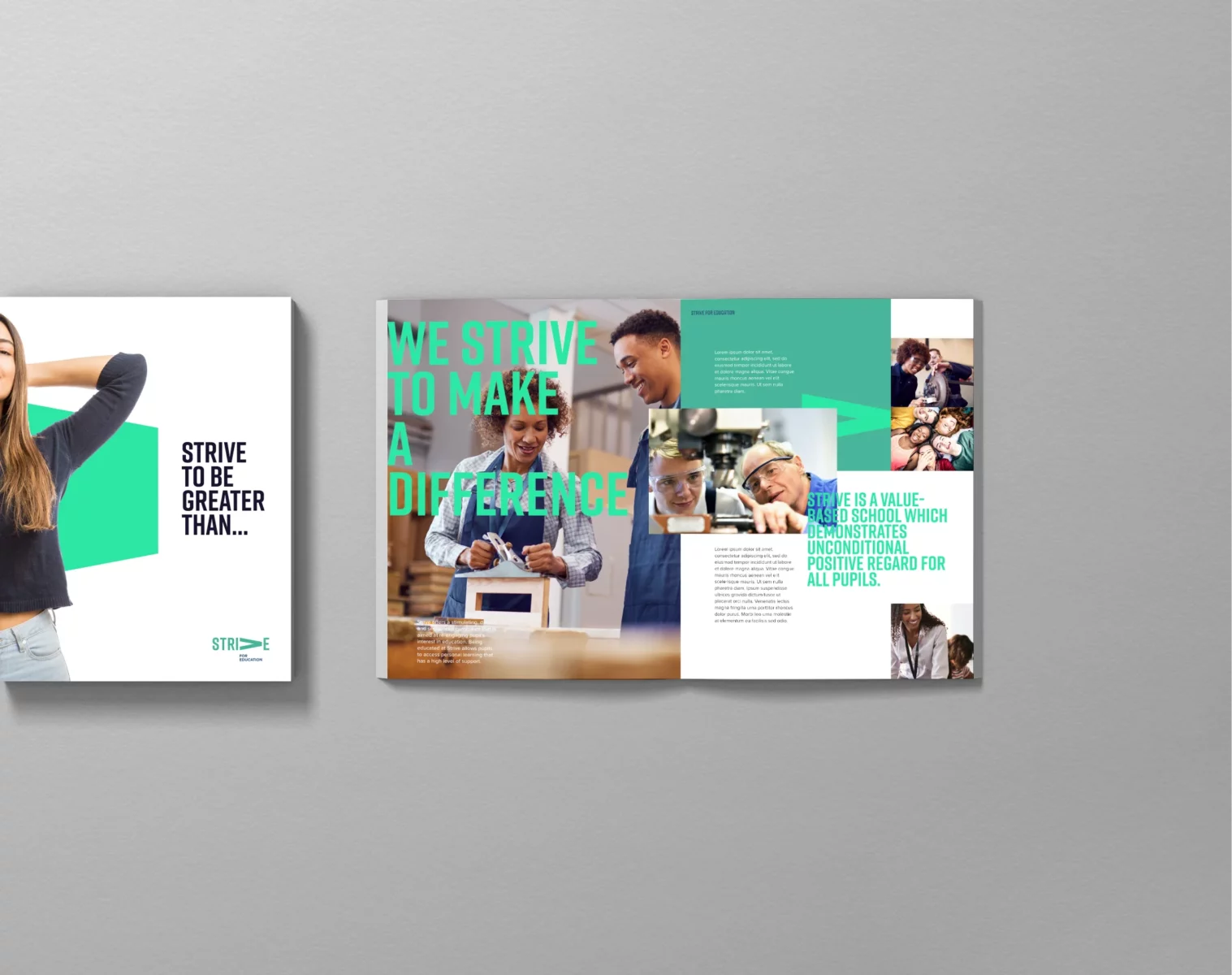
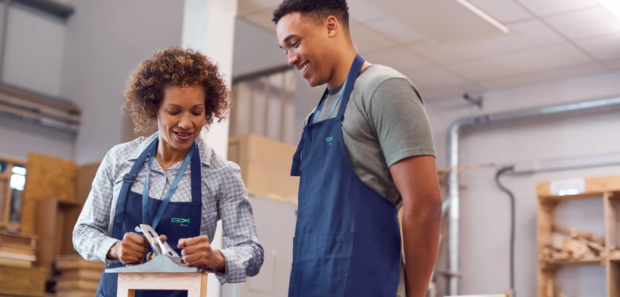
Strive is a value-based school that demonstrates unconditional positive regard for all pupils. They focus every effort at every opportunity to identify, manage and reduce times of dysregulation by aligning pupils with their school values. SUPPORT, TRUST, RESPECT, INSPIRE, VALUE, ENGAGE.
Strive for Education is a new venture by Andy and Sonja Brown, passionate about helping children who need an opportunity and additional support to access their learning. My challenge was to create a new brand identity to reflect this new business’s positive and inclusive culture. As part of the brief, I needed to create a visual identity that appealed to Head Masters, Governing Bodies and Educational Institutes and engage with the children they will be teaching.


Strive for Education is an Alternative Provision based in Harrogate, providing education for young people who do not attend mainstream school on a full-time basis.

I initially sat down with Andy and Sonja for a few hours to discuss their new venture, goals, aspirations, and vision for this business. Out of this the core values for Strive were born – ‘S’ Support – ‘T’ Trust – ‘R’ Respect – ‘I’ Inspire – ‘V’ value – ‘E’ Engage. The creation of these core values helped massively design a brand identity that visually represents them and their vision for the future.
“Richard at Rebus Design was instrumental in the birth of our company; he did so much more than create our logo, branding and website. He took the time to learn about what we do, how we do it and helped unearth our core values. These core values have become the central heartbeat of the business, and Rich enabled us to understand what they are and how to portray them. We highly recommend working with Richard”.
Andy Brown, Managing Director Strive for Education

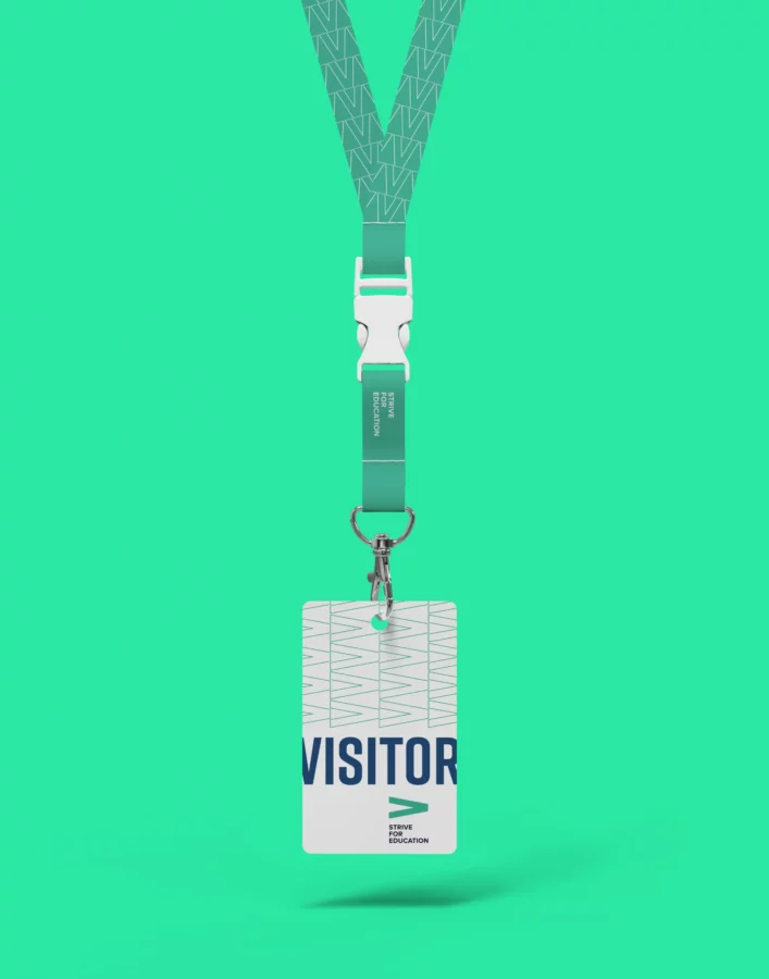
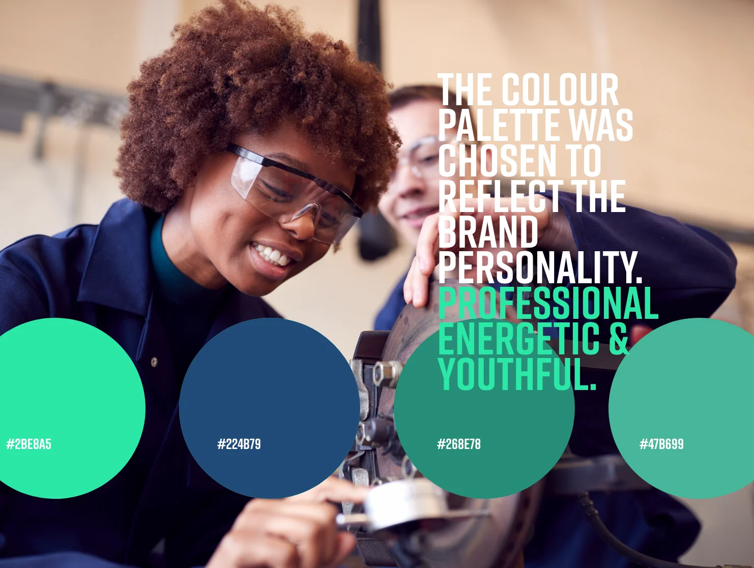
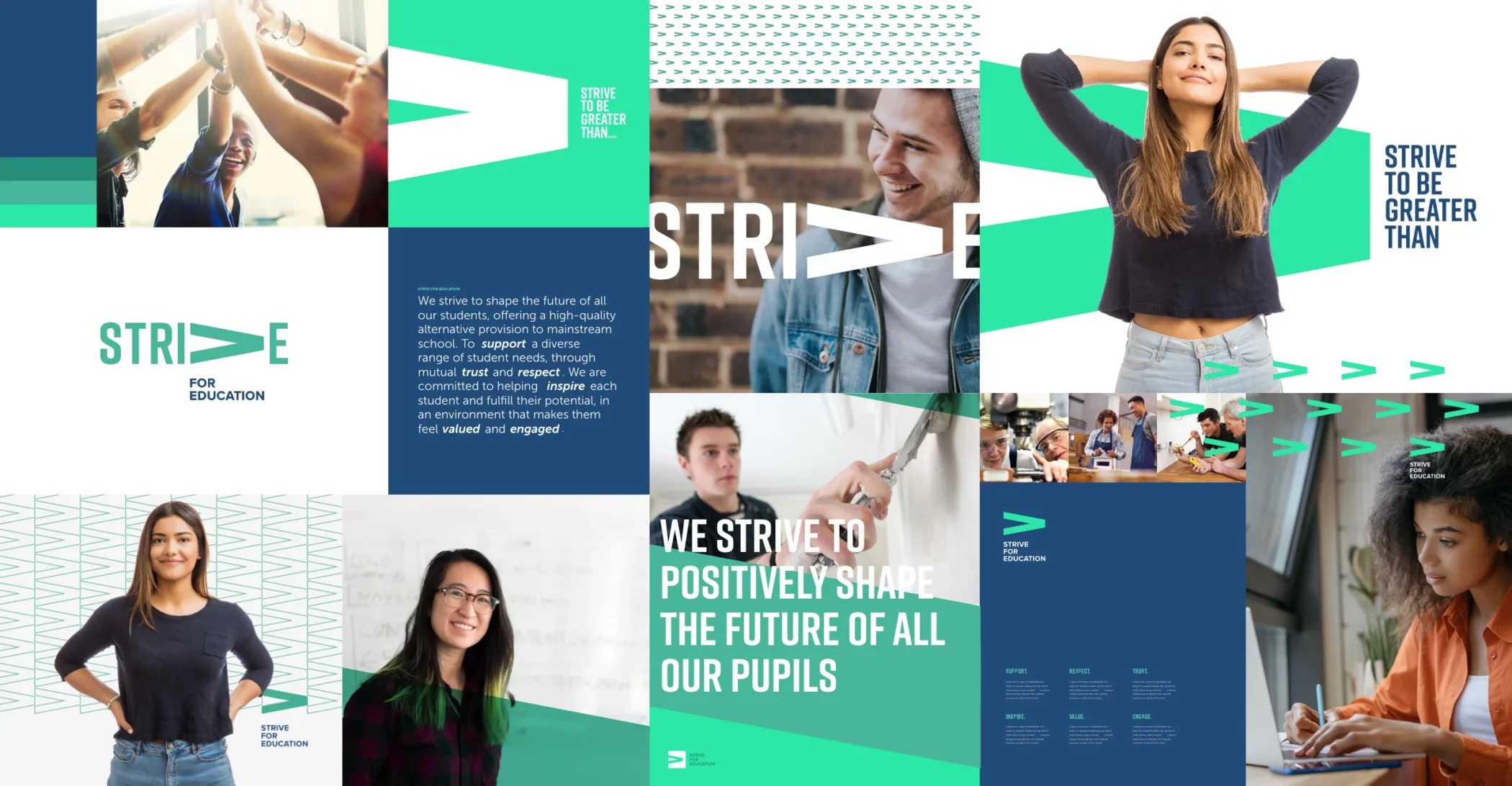
I developed a bold, robust, unique and very simple wordmark with a meaning behind it that perfectly captured the essence of change and growth, precisely what the company is striving to achieve. A responsive logo was developed focusing on the ‘V’ turned on its side, which symbolises ‘greater than’. A strong, simple typographic and visual style is used to reflect the wordmark and generate bold, inspiring and engaging imagery that grabs attention. Great people to work with and a great project to work on; I wish every success to this venture and hope they inspire and change the fortunes of many children for many years to come.