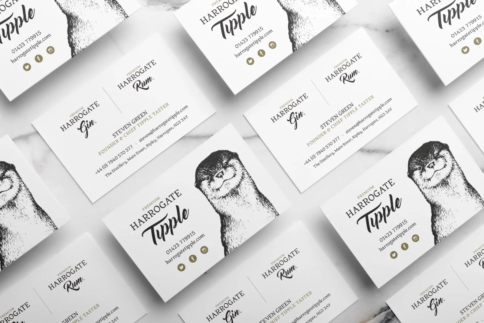
Harrogate Tipple is a family-run, small-batch distillery based in the beautiful Ripley Castle Estate in Harrogate, North Yorkshire. The majority of their botanicals are grown in the 750-year-old gardens within the castle walls. The owners are incredibly passionate about their location, the environment and keeping everything as local as possible.
When I was first approached by Sally at Harrogate Tipple, her issue was that she only had a pencil sketch and scan of Donnie the otter, the beloved face of the brand. The problem came when they wanted to print in specific scenarios and when scaling to larger sizes; it simply wasn’t possible. So, my first task was to drag Donnie into the 21st Century and vectorize him.
An elegant and sympathetic colour palette was developed to connect and differentiate the products.
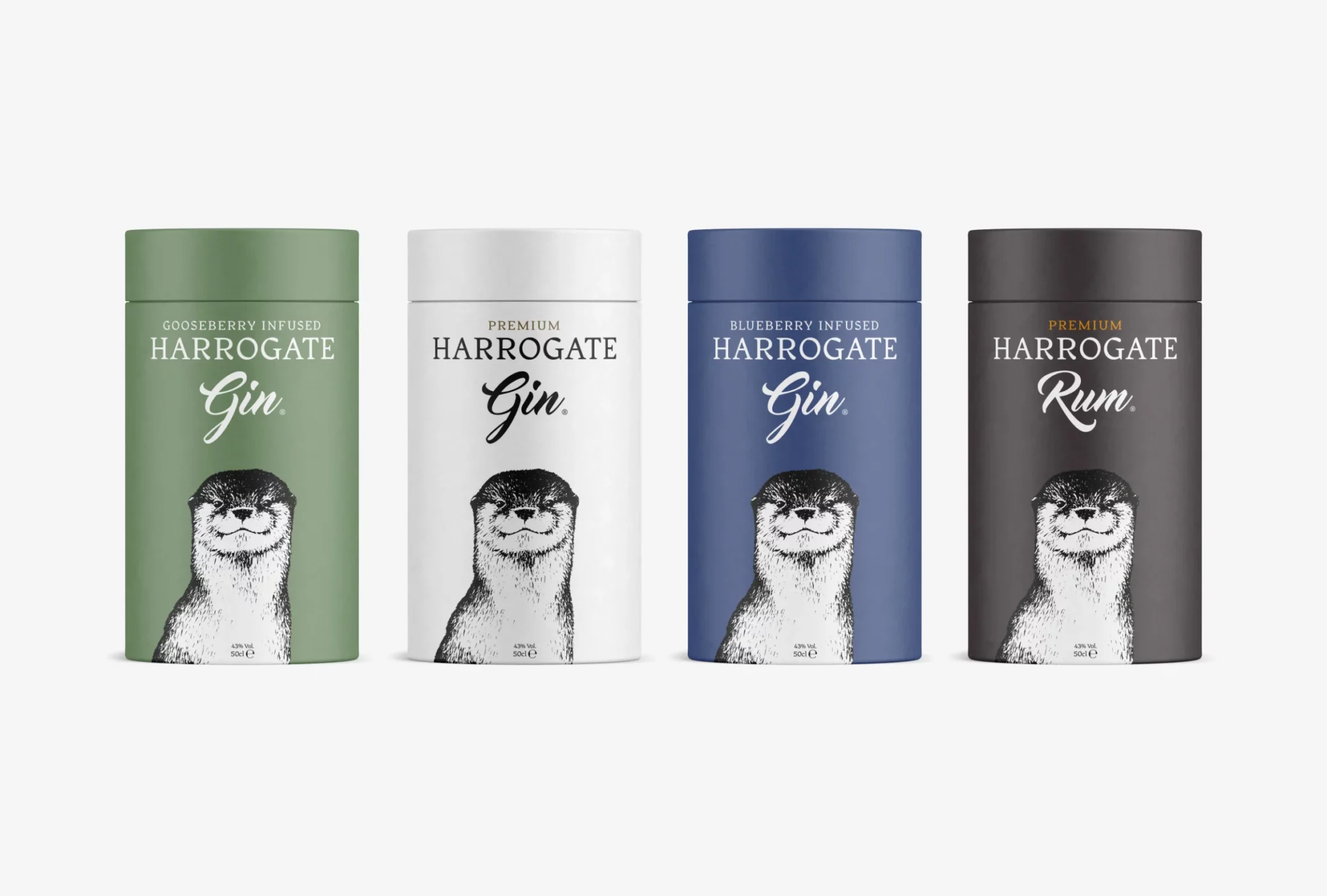
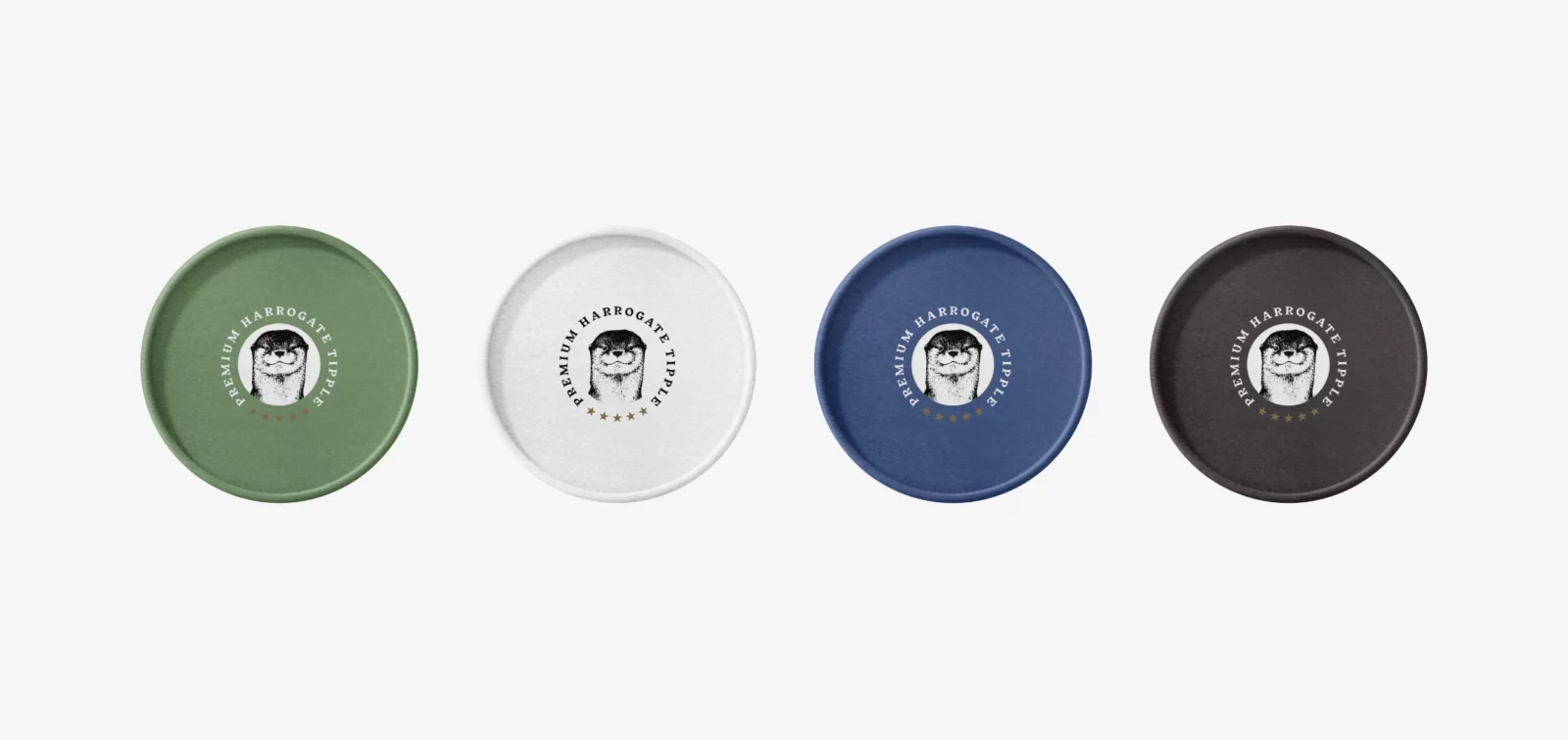
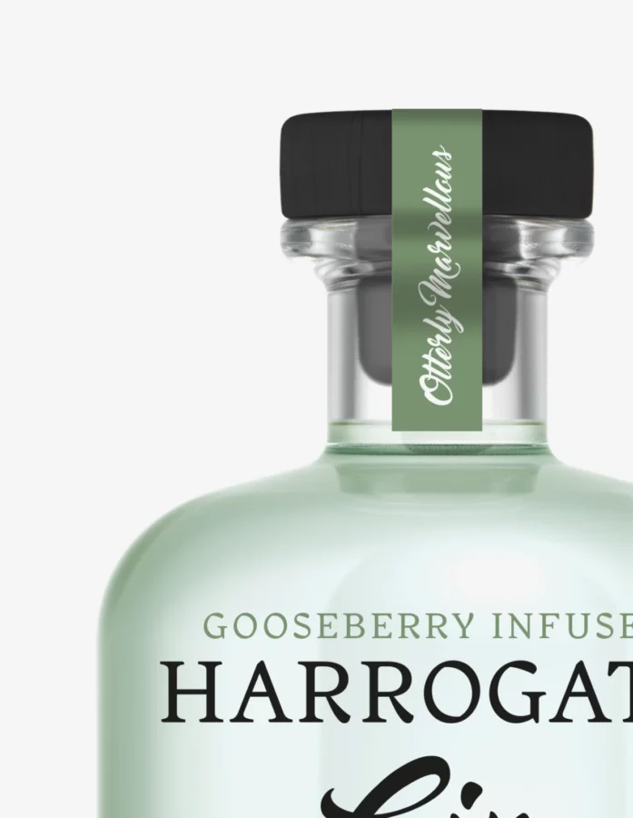
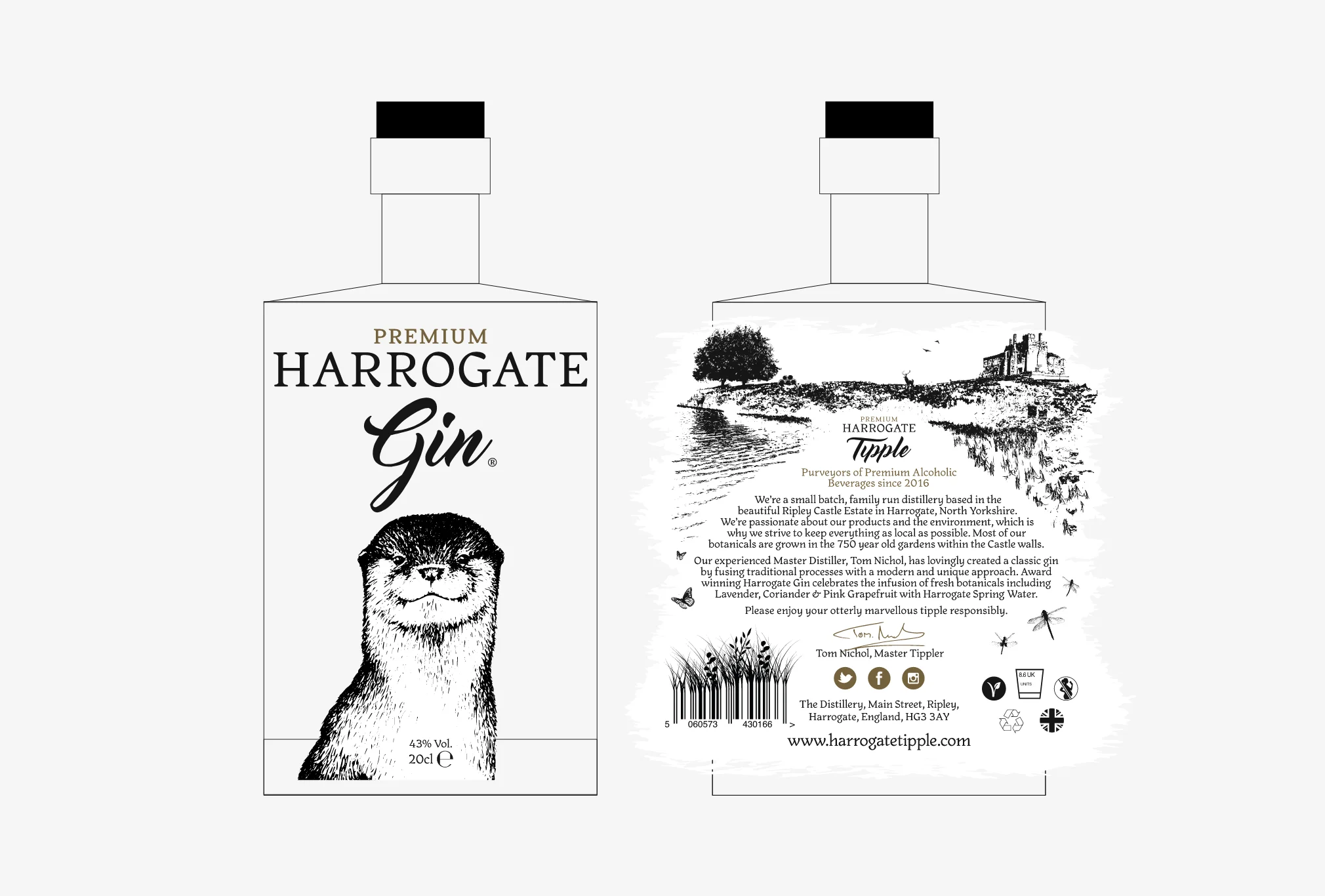
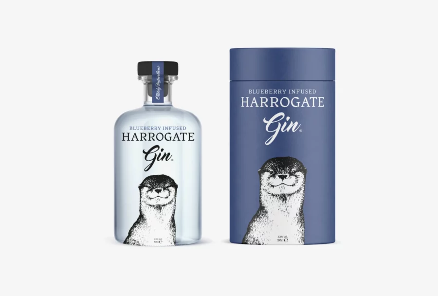
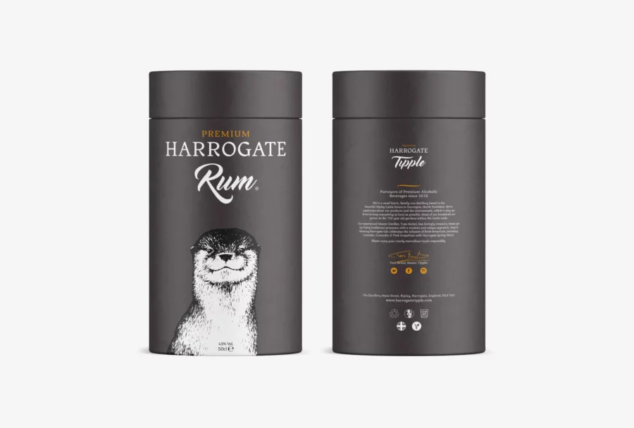
After scanning, tracing, and tweaking, a more modern, clean and crisp Donnie was born. The new Donnie now could be scaled to the size of a building if needed. The next task was to help create new labels and product packaging across their range of Gins and Rum. I kept the designs very clean and minimal for the bottles and their tubes, which gave them a premium and luxurious look and feel. Something a little different was designed for the back labels, a bespoke illustration of Ripley Castle and the 750-year-old gardens within the Castle walls, where most of the botanicals used are grown. Finally, a sympathetic colour palette was chosen to connect and differentiate between the products.
