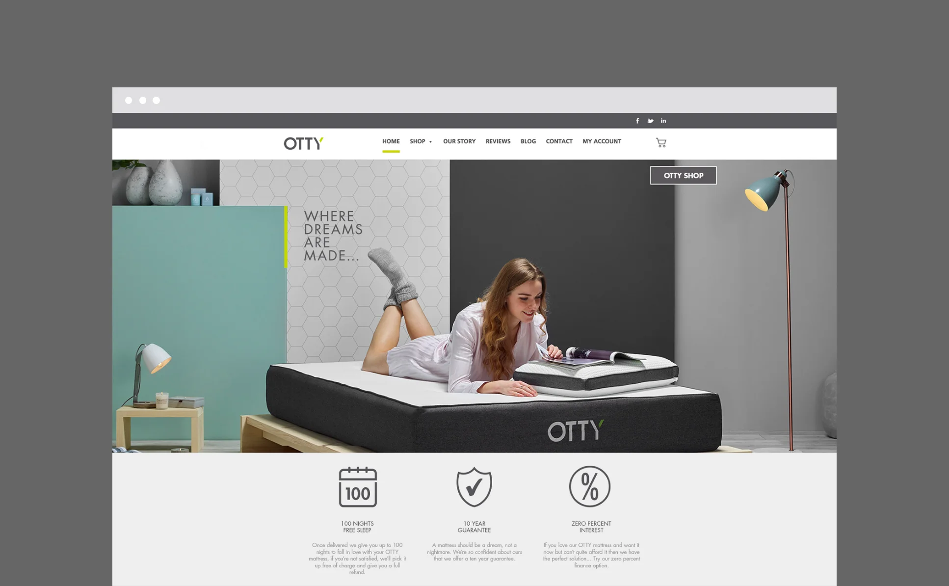
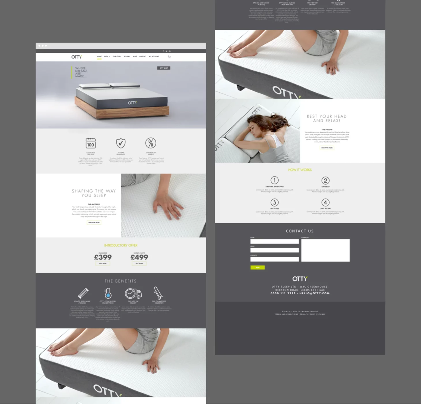
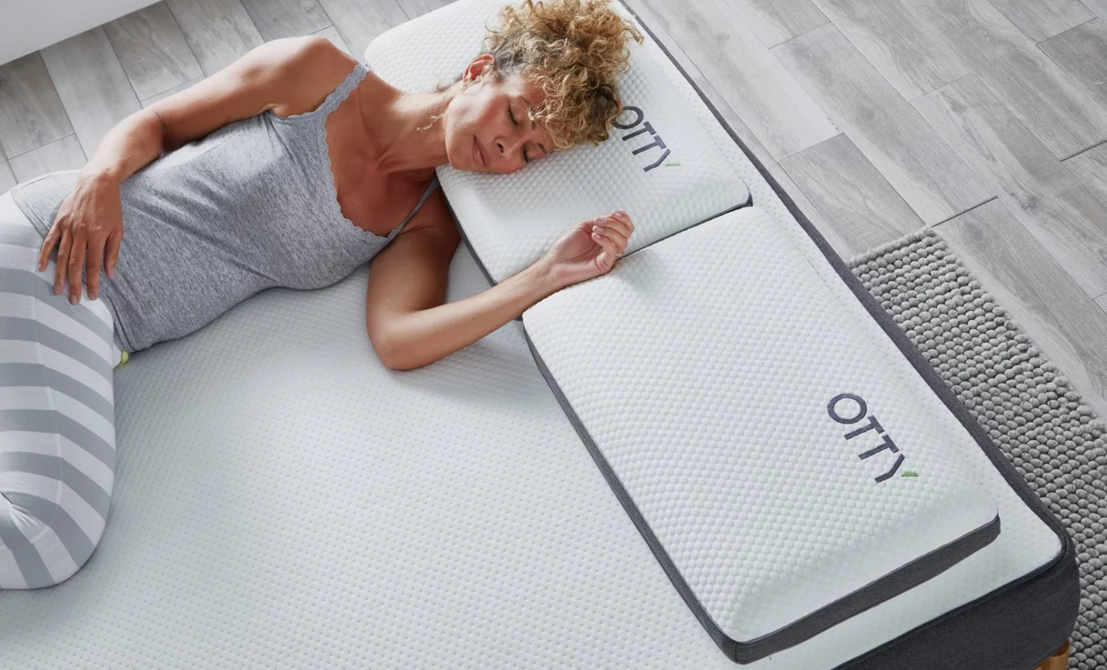
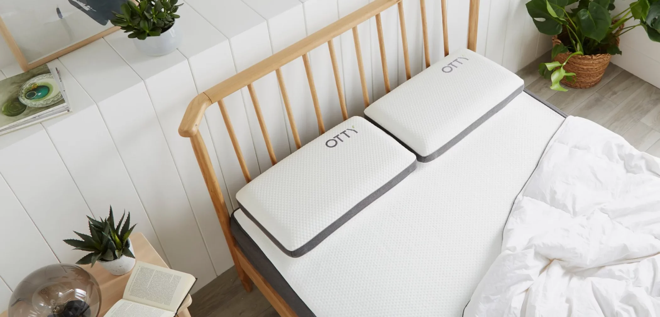
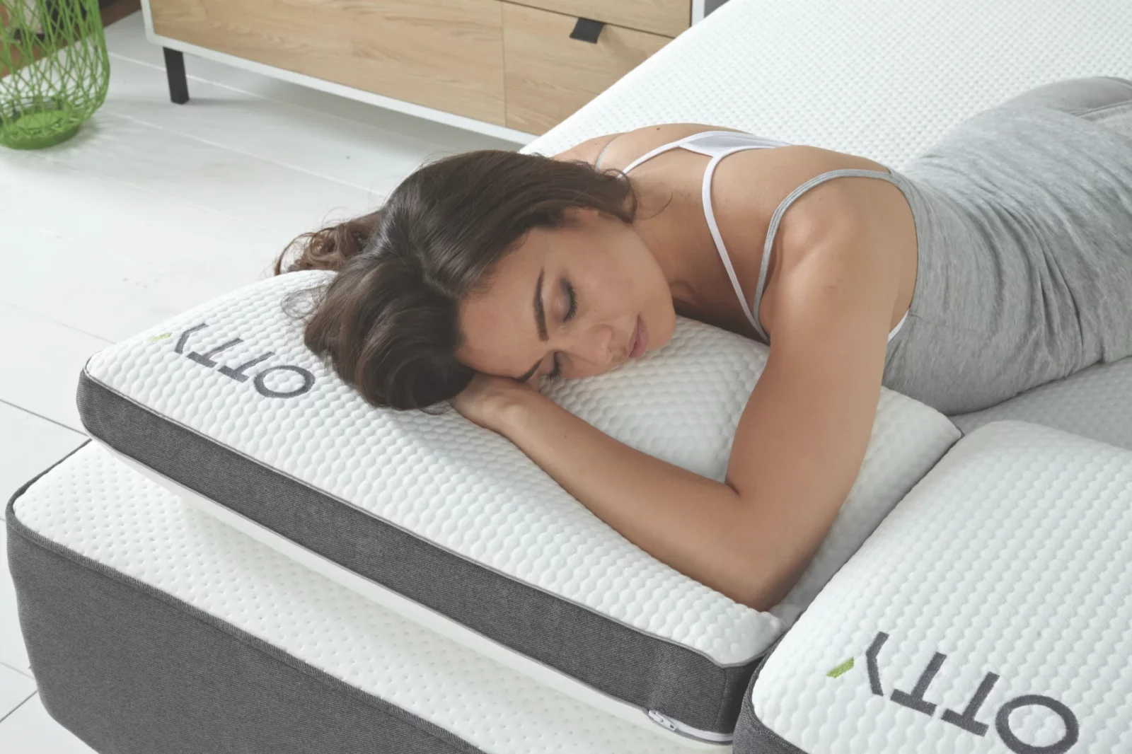
After discovering the optimum balance between memory foam’s proven comfort and regulating temperature for a blissful night’s sleep, OTTY developed their ‘Cool Blue Gel’ revolutionary mattress!
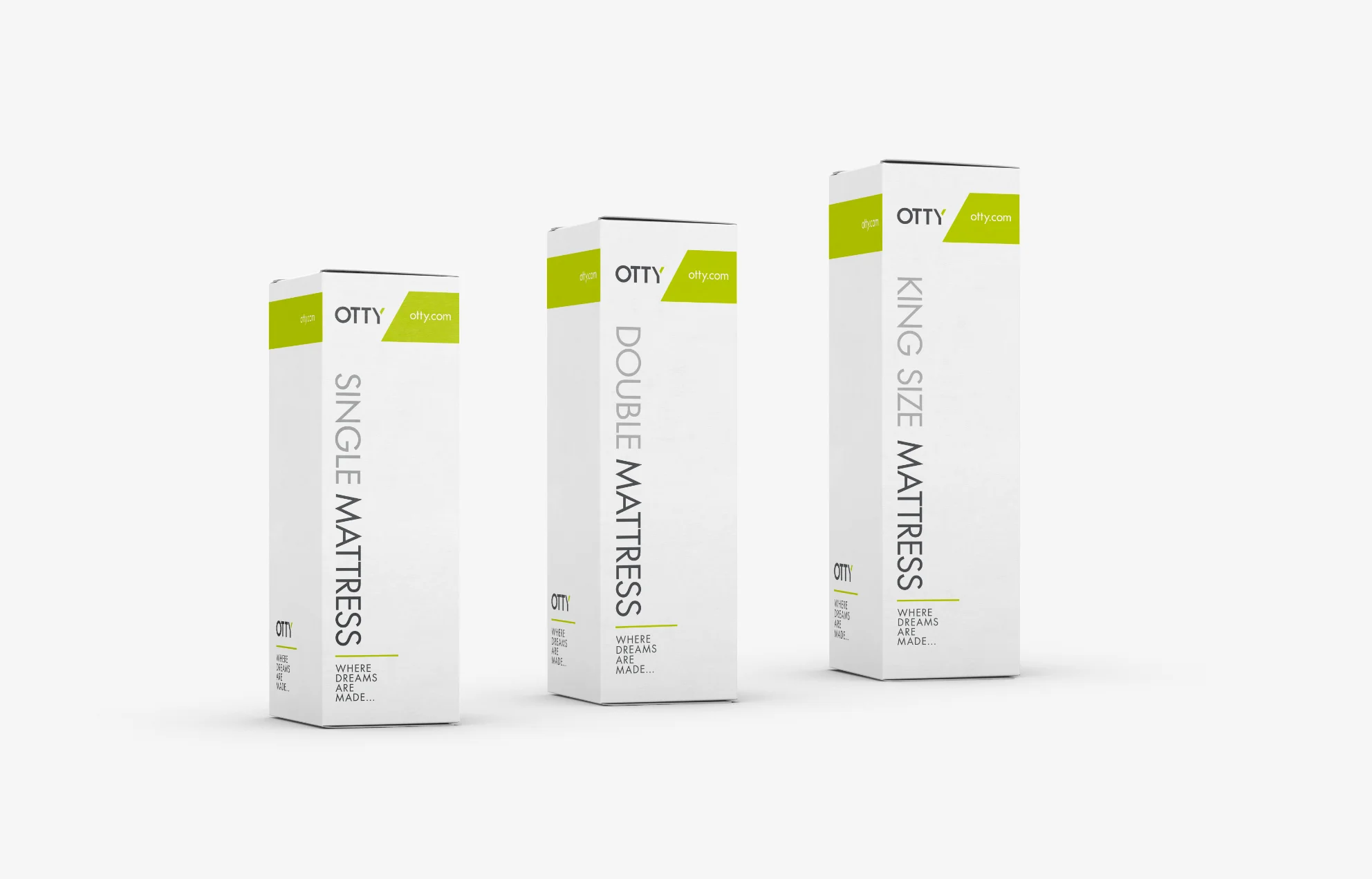
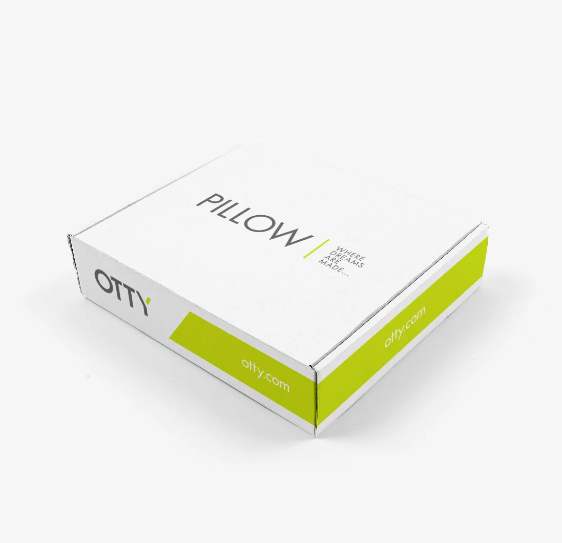
With an ambition to become the world’s number 1 sleep brand, the new brand identity for OTTY needed to communicate the company’s unfussy, honest and straightforward approach as well as differentiate it from the competition in a marketplace that is becoming increasingly crowded.
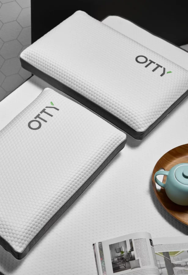
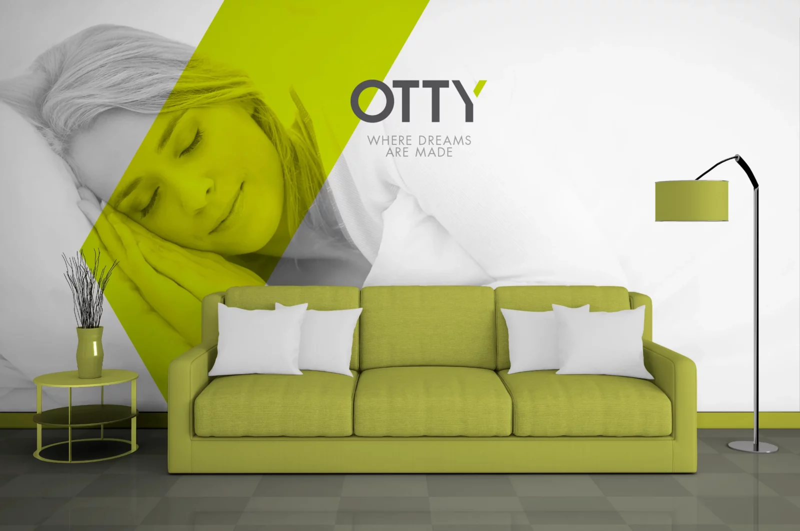
My idea was to keep the new logo as simple as possible but still distinctive. With the OTTY name being short and snappy, the client and I were keen to create a simple wordmark from the outset. My initial inspiration came from creating a bespoke shaped name tag to be stitched onto the products.
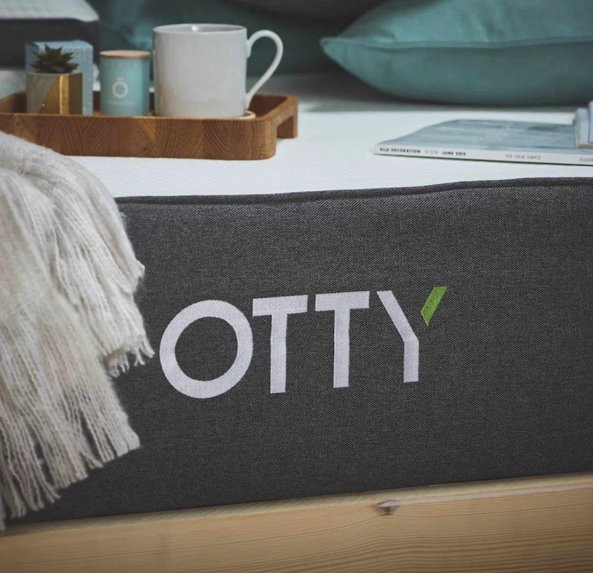
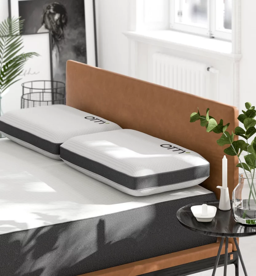
The straightforward hand-drawn typography and use of shapes were chosen to give a contemporary feel to the identity. At the same time, the vibrant green colour was selected to symbolise harmony, freshness, and fertility. Green also has strong emotional correspondence with safety, and where do you feel safer than in bed?

“Richard took the time to listen and understand our vision fully and quickly became part of our family; he is driven by creating excellent results, hugely responsive, quick learning and full of brilliant ideas. Our vision to build the world’s number 1 sleep brand quickly became his too”.
Michal Szlas, Managing Director OTTY Beds